Here are some proposed graphics.
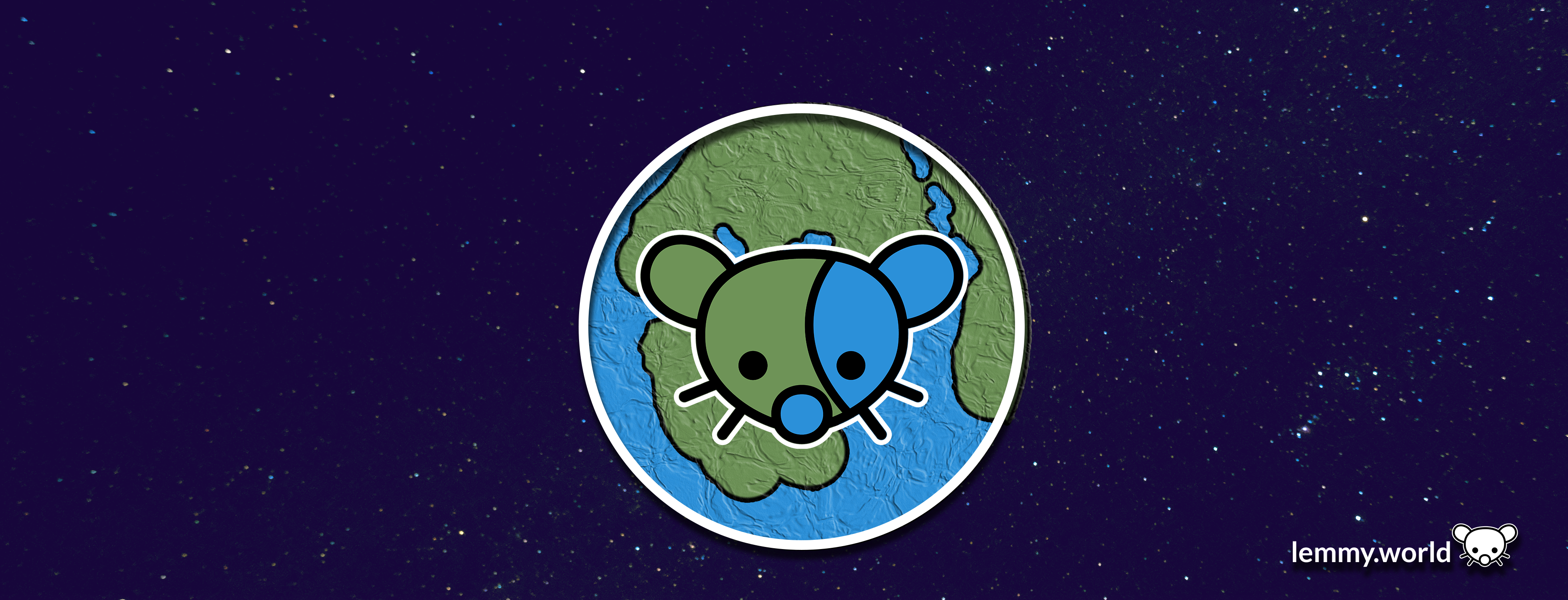


EDIT: I've now made a repository on GitHub, so that you can download the graphics and use them for your communities and projects. There's even an Etsy store selling stickers now.

Welcome to the official Lemmy.world Support community! Post your issues or questions about Lemmy.world here.
This community is for issues related to the Lemmy World instance only. For Lemmy software requests or bug reports, please go to the Lemmy github page.
This community is subject to the rules defined here for lemmy.world.
To open a support ticket
You can also DM https://lemmy.world/u/lwreport or email [email protected] (PGP Supported) if you need to reach our directly to the admin team.

Here are some proposed graphics.
EDIT: I've now made a repository on GitHub, so that you can download the graphics and use them for your communities and projects. There's even an Etsy store selling stickers now.

Biblically accurate lemmy
A bit overwhelming on the eyes. But that’s only a personal opinion.
Try making the left ear blue and the right one green.
Yeah, otherwise the lemming's face is camouflaged.
Agreed, that would look much better!
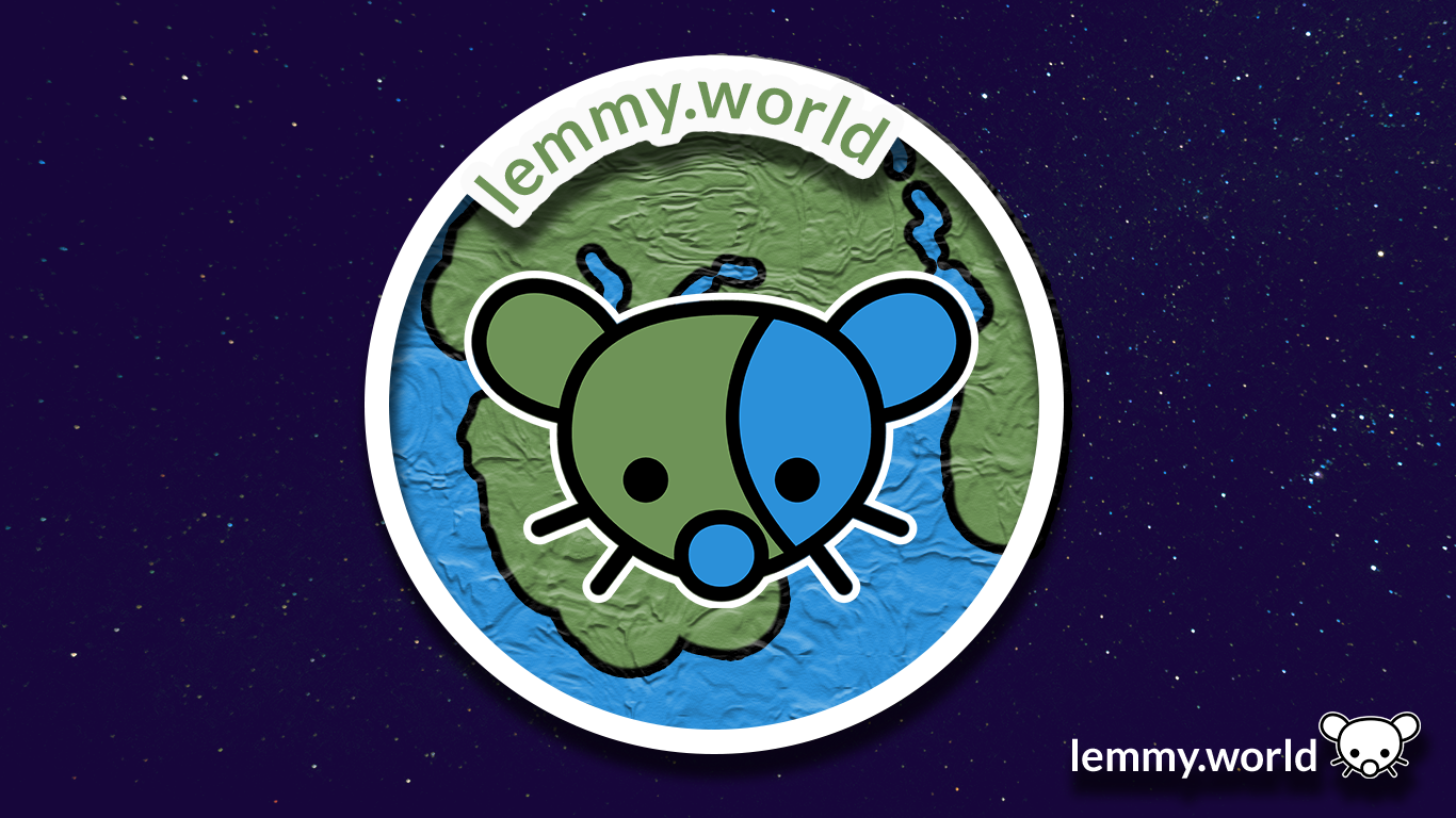
The bottom two would make a nice favicon on my bookmarks bar!
Just wait until Ruud turns on custom emojis! Then we will really be cooking with gas.
As a bit of a post script, I also made graphics for the Mastodon.world instance. So if these look familiar, well, it's because they are familiar! Thank you have having me here, Ruud, and to the whole Administrator team!
website seems to be down
Oh dear. That's concerning. I'm... going to go check on my hosting.
You: Which one do you like?
Me: Yes.
The first is by far the best. A logo is not a name tag. You don’t need to have lemmy.world written in it.
Idk I like the design but the plastic wrap filter in the planet makes it seem too busy
These are great!
My best idea for a logo was the lemming-gerbil humping the shit out of a planet. It was... not a good idea.
Nice. These should be the defaults.
Yeah any of these are honestly better than the current one.
I love it
idk why but it reminds me of Little Big Planet, especially the second one
anyway they all look pretty good, but if it will be displayed on the page next to the title, I think only fourth one will be visible clearly without getting close to the screen or opening image in a new tab
I like the first one the best, but the second one is also great. But they all look awesome.
this looks great imo!!
I like the simple one with white bg.
I’m digging the last two. Simple and minimalist.
Both 1 & 2 look better on a web browser but on mobile the globe has a weird texture look to it. I like #1 as a banner and #5 for the icon. I will say I also like the current icon.
If we're talking about the logo, I vote for #4
For banner, I'd say #1 or #2
Dont really like any of them. They are to busy for no real benefit. The logos are not unique enough that you would instantly recognize them. Because they are not better than the current generic earth picture I say we just leave it.
Any logo is better than the current one tbh.
I like the 3rd one as it looks like a lemmy world in space and doesn't get muddled by a background. Much better design aesthetic overall but the clarity helps a ton.
I like 2 and 4. 2 Because it keep the "world" style globe.
#2 and #4. I like the detail and little extra going on for #2. #4 is nice because of the simplicity. Not too much going on but still looks good.
I like the one with white (transparent?) background.
The 4th one is definitely the most readable regardless of sizing.
I like the last two, although the "world" part is less obvious.
I like the three last most in order 3 5 4. I do also really like 1 and 2 but the texture on the planet makes them difficult and a bit weird to look at in a small size, at least from the look at the post thumbnail.