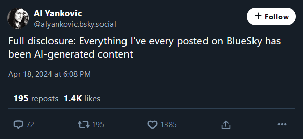
AL-generated content. I get it now
A place to share screenshots of Microblog posts, whether from Mastodon, tumblr, ~~Twitter~~ X, KBin, Threads or elsewhere.
Created as an evolution of White People Twitter and other tweet-capture subreddits.
Rules:
Related communities:
AL-generated content. I get it now
I really do hate that sans serif completely fucks I l | o O 0 among others.
I should have those things on top and bottom l should have a curl. But no...
Fwiw Verdana is the currently the recommended best ADA font.
Helvetica (and it’s clones), not all sans serifs.
DIN has nice little feet on the l, as do:
Thank you for listening to my Typeface Talk.

"Is that an English letter in your pocket or are you just happy to see me?"
Or : a lesson in typography, and why lower-case L ought to have a serif or curve.
Fʀᴀɴᴋʟʏ, I'ᴍ ɴᴏᴛ ᴇᴠᴇɴ ᴄᴏɴᴠɪɴᴄᴇᴅ ᴡᴇ ɴᴇᴇᴅ ʟᴏᴡᴇʀᴄᴀsᴇ ʟᴇᴛᴛᴇʀs ɪɴ ᴛʜᴇ ғɪʀsᴛ ᴘʟᴀᴄᴇ. Sᴇᴇᴍs ᴛᴏ ᴍᴇ ᴛʜᴀᴛ's ᴊᴜsᴛ ᴀsᴋɪɴɢ ғᴏʀ ᴛʀᴏᴜʙʟᴇ.
I read this in the voice of Death from Discworld. I didn't even realize I had an internal voice actor assigned to him.
Christopher Lee
After reading this comment, I too read the comment it was responding to in the voice of Discworld's Death. Something both warm and somewhat metallic.
Minuscule letters were invented to write on paper and similar materials, because curved strokes had lower probability of tearing the material (as opposed to majuscule letters' angular features, adapted to carving in stone or similar materials). Now that we're not restricted by materials, might as well only use one case
lower probability of tearing the material
Is that well documented? I thought it was just because it makes writing more fluid, and people tend to evolve towards fluid movements when they repeat the same ones all the time as it requires less energy. Ex: high-level musicians or sport practicionners.
They tried documenting it, but the material kept tearing
I've heard that that's the reason alphabets from languages in the South East Asia (like Thai or Khmer) is all about circles as to not tear the writing material back in the day - leaves.
I'm a big fan of Chinese seal script used for stone engravings just like the look
Make Writing (adapted for) Stone Again
Come to think of it, is there actually much of any point to capital vs lowercase letters? You know what the first word of a sentence is anyway because of the period before, and names can be identified by context. Why do we even have capitalization in the first place?
It's a plot by Big Typesetting to sell more letters. Wake up sheeple!
As I mentioned in another comment, the original reason we have majuscule and minuscule letters is the difference in materials they were written on. Having them persist in the typesetting is in fact more of a historical artifact
Hmm. Still harder to read and comes across as yelling, even when the capital letters are itty-bitty...
𐑯𐑴𐑐. 𐑿 𐑒𐑨𐑯 𐑛𐑵 𐑢𐑦𐑞𐑬𐑑 𐑤𐑴𐑼𐑒𐑱𐑕 𐑓 𐑖𐑫𐑼.
It should be illegal to have a font where Il| are not all easily distinguishable.
lI|
Also, O and 0. And there's a special place in Hell for font designers that make 1 look like I
O.0
And lose jokes like Al's?
Sure all that fraud sucks, but there are tech fixes (which also have problems - SSL certificates prevent old computers from using the internet without a translating proxy)
Ah yes but that font looks kinda ugly tbh :(
Careful, the programmers may rise up!
Discord solved it by giving l the same tail that t has, I wish more sans-serif fonts did that
If that's an official account, that's actually amazing. Also an amazing comment.
Seems to be official. He hasn't set up the domain but a bunch of prior posts and interactions make it seem real enough
Oh Al, you little scamp!
Generated by the state of Alabama?
Aluminum?
You are telling me that one of the most prolific and influential artist of our time, 5 time Grammy Award winning musician Weird Al Yankovic, would run his own social media account on a niche platform to crack jokes and shitpost on the Internet, as if celebrities are just regular people at the end of the day?
I don't know, maybe this is one of those "novelty account" I've heard so much about here.
every posted
I ran into this exact scenario with an acquaintance on Facebook back when I engaged in such silly endeavors.
Her name was Al and I couldn't figure out for the life of me if it was Al or AI. I think I finally did ask, but damn I could NOT figure it out on my own. I suppose there must've been some way to copy paste it into word and configure to all caps, but the thought never occurred to me.
On PC, you can open the browser console and type in
("your string").toUpperCase()
it's usually on F12.
>> "Al".toUpperCase()
<- "AL"
Simply pasting the string would give you the answer as the console uses a programming font
What a weird guy.
This is the best pun I've ever seen in my life.
Big Al is just not as bad is regular AI
God dammit.
It's easy, just need to look at the context.
Then look again.
And repeat.
I know it's a joke but there is a sliver of truth to it since there have been multiple reports of these tech companies ignoring copyrights to feed their algorithms and I'm sure his works are included.