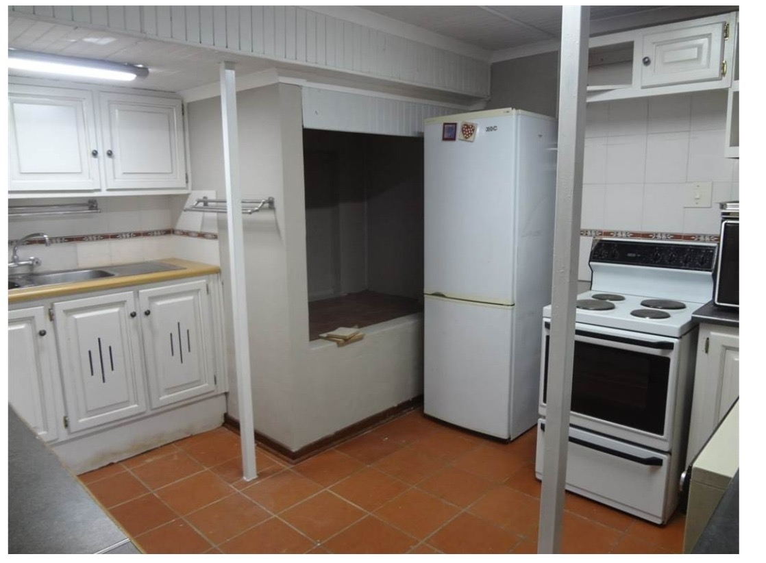
Pretty sure that's wood.
Terrible Estate Agent Photos
Terrible photos listed by estate agents/realtors that are so bad they’re funny.
Posting guidelines.
Posts in this community must be of property (inside or out) listed for sale which contains a terrible element. “Terrible” can refer to:
-
the photo itself (finger over the lens, too far away, people in the shot, bad Photoshop, etc.)
-
the property (weird layout, questionable plumbing, unsound structure, etc.)
-
the interior (carpeted bathrooms, awful taste interiors, weird mannequins/taxidermies/art, inflatable pools indoors, etc.)
-
the actual listing itself including unusual descriptions and unrealistic pricing. However, this isn’t a community to discuss the housing market in general. This is a comedic community - let’s keep it light.
-
Photos can be sourced from anywhere and be any age, but please check they haven’t already been posted.
-
Censor any names/contact details of private individuals.
-
Mark the post NSFW if it includes nudity or sensitive content
Rules.
This community follows the rules of the feddit.uk instance and the lemmy.org code of conduct. I’ve summarised them here:
- Be civil, remember the human.
- No insulting or harassing other members. That includes name-calling.
- Respect differences of opinion. Civil discussion/debate is fine, arguing is not. Criticise ideas, not people.
- Keep unrequested/unstructured critique to a minimum.
- Remember we have all chosen to be here voluntarily. Respect the spent time and effort people have spent creating posts in order to share something they find amusing with you.
- Swearing in general is fine, swearing to insult another commenter isn’t.
- No racism, sexism, homophobia, transphobia, xenophobia or any other type of bigotry.
- No incitement of violence or promotion of violent ideologies.
The pieces of wood shaped like slices of bread are disturbing.
But if you zoom in, they aren't. It's shadowss.
If you then enhance, you notice it is actually painted.
Lol. That would make more sense!
Cutting boards to be more specific.
The more I look at this the worst it gets
Is that a door behind the wood/bread in that enclave? This room is nightmare fuel.
Whats with the little gimp nook behind the fridge? The spiders in there are probably so big they have names.
I was trying to think of the words to describe that area and you came up with something much better than I could have.
gimp nook
I don't know when I'll get to use it but I'm stealing it.
Cellar spiders have more relative square footage in their loft than we do in our entire apartments
I would walk into those pillars multiple times per day
Are those pillars structural ?
It looks like it’s in the basement.
The fact it is underground makes the goblin hole even more disturbing.
Purely cosmetic, just like the inaccessible space next to the fridge
Only one way to know *grab axe*
Yeah those pillars are horrible. It generally feels very claustrophobic in there, super low ceiling, I wouldn't feel comfortable there at all
There's a pillar directly in front of the oven too. I guess the tenant can just forget about cooking anything bigger than a pizza bagel.
As luck would have it, though, when pizza is on a bagel, you can have pizza anytime. So, ya know, at least they won't starve... They'll just be incredibly malnourished as a result of their structurally imposed dietary restrictions.
I'm glad I'm not the only person who remembers this jingle.
I think that's just the perspective and cropping of the picture. It looks like the nearest pillar is in the same row of tile as the further pillar, so there are three rows of tiles between the oven and the pillar.
This has strong "student housing in someone's basement" vibes.
Looks like it might be converted from a restaurant kitchen, with the supports and the tiles used.
It puts the lotion on its skin or it doesn't get any more bread
Feng shuin't
This feels like 3D objects that loaded inside of another object in a video game or something
You've no-clipped into the backrooms.
As a kitchen designer I can't look away. I know it's still there if I don't look.

The whole picture feels like that kitchen was made by aliens to put abducted humans in it and make them feel like home.
I think those are terribly placed clipboards with sheets of paper on them.
How does this happen? Why would anyone build this kitchen this way?
You start with a house old enough to have the kitchen designed around a wood stove (which goes in that alcove). Someone eventually rips it out and tries to modernise the kitchen, leaving a weird space and a kitchen layout which is a bit off. The original walls and room layout are often messed with as well, which doesn't help.
That tile is doing this room no favors.
Gotta say… the comments about it being in the basement have gotta be correct. No windows… weird layout like too many appliances crammed into any available spots.. the creepy wall hole for… idek. And the beams that 100% Stubs your toe with every midnight snack mission…
And those magnets yo…
Looks like a couple of used, dusty sponges, weird sponge clothes to me. I'm more worried about: Everything else.
Looks a bit like an old apartment of mine
That you lived in voluntarily? Was it… nice?
My friend, one does not live in such a place, one merely exists.
No. It was terrible, it had roaches, mice, ants, all sorts of things. The meat chest in our landlords basement failed and they didn't know - they had a lot of meat rotting in there and it smelled like corpses as well as corpse flies all over.
So thankfully because we lived there we saved enough money for a substantial down payment for a nice home we've been living in phew!
None of this feels right, at all
Something sinister lives here
