this post was submitted on 27 Jul 2023
1811 points (98.8% liked)

Programmer Humor

32143 readers
105 users here now

Post funny things about programming here! (Or just rant about your favourite programming language.)

Rules:

founded 5 years ago
MODERATORS
 
top 50 comments
sorted by: hot top controversial new old
[–] [email protected] 301 points 1 year ago (8 children)

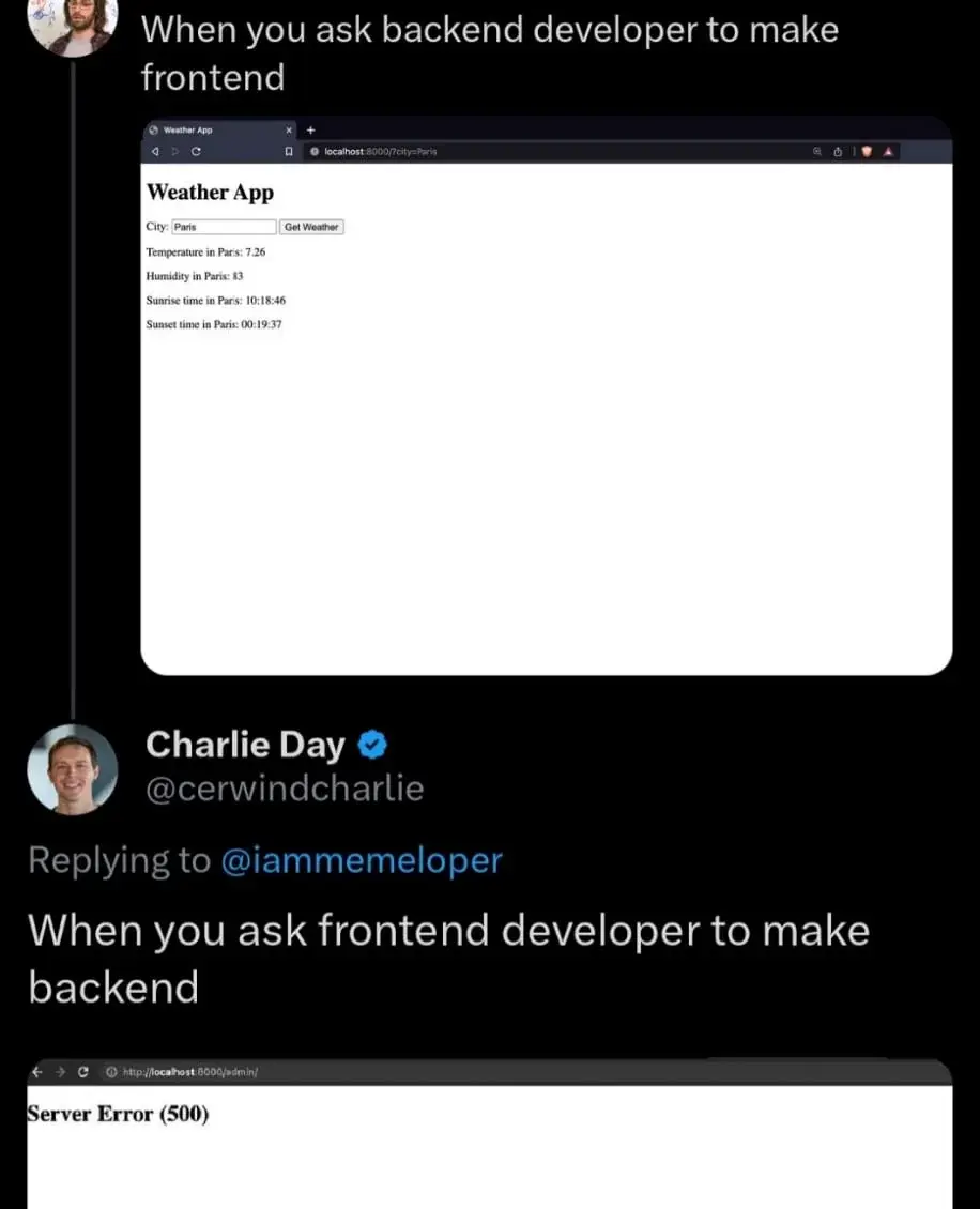
A highly compatible design with no ads, unnecessary images, videos, animations, scripts that goes straight to point delivering you exactly the information you need and nothing else? Something that's easily accessible even with old feature phones allowing older people to get information easily?
Simply something that loads instantly and just works?

Who would want that?
[–] [email protected] 118 points 1 year ago* (last edited 1 year ago) (1 children)

Found the backend dev. "CUT THIS AESTHETICS NONSENSE! GIMME THE VARIABLE CONTENTS ALREADY! WE'RE 3.54 NANOSECONDS BEHIND!"

[–] Dasnap 57 points 1 year ago (3 children)

Frontend: "Come on, this needs at least some flair. This isn't the 90s."

Throws React at it

[–] residentmarchant 12 points 1 year ago

React ugh, everybody is using NextJs these da- ....oh, what's that? We've moved on already?

load more comments (2 replies)
[–] chorkpop 10 points 1 year ago* (last edited 1 year ago)

No one who is going to pay you wants that. All they care about is user engagement.

load more comments (5 replies)
[–] ghariksforge 132 points 1 year ago (4 children)

The page at the top looks perfectly fine. It's useful, it gets the job done and it's lightweight.

[–] [email protected] 52 points 1 year ago (1 children)
[–] MajinBlayze 39 points 1 year ago* (last edited 1 year ago) (6 children)
[–] [email protected] 10 points 1 year ago (1 children)

That person must have his monitor in vertical orientation

[–] [email protected] 12 points 1 year ago* (last edited 1 year ago) (2 children)

Shorter lines are easier to read because it's easier to find the beginning of the next one. Rule of thumb is indeed a maximum of about 80 characters, go take a random printed book and see how long the lines are they're like that for a reason. (Newspapers are shorter because smaller print, also, more opportunities for headlinest).

The contrast and line spacing stuff -- debatable. But adjusting line-width is pretty much a must. Not doing anything somewhat worked on 4:3 monitors but it's definitely awkward on 16:9 and on 21:9 your head is definitely on a swivel.

Oh and those large margins are very useful for things like footnotes, btw, or meta-information about the text (like those textbook "this is an exercise" stylings, just move the marking over to the margin). There's also plenty of place for a hierarchical list of contents, always on screen, and various other nav stuff. None of that will degrade loading or runtime performance to any noticable degree.

Also of course note that that's for text-heavy content, stuff you read as in reading an article or book, not stuff you look at in the sense of "reading" a poster. In this case you can e.g. turn those bullet-points into rectangular areas (also come up with a sixth one, then) and display them in a grid, each containing, well, what they contain now but also a link to further information. You see that pattern all over the place on the modern web and it's a good one. Would need quite a bit more content than is present on those websites, though, otherwise you have more navigation shenanigans than content. You don't need a fucking library index for a post-it note.

Source: My HTML is rusty as fuck but I know TeX.

load more comments (2 replies)
load more comments (4 replies)
[–] [email protected] 19 points 1 year ago

It's almost fine. It needs to include units for the measurements.

[–] [email protected] 16 points 1 year ago (1 children)

You sound like a backend developer.

load more comments (1 replies)
[–] [email protected] 109 points 1 year ago (5 children)

Good, that we have specialists for both and nobody is advocating that everyone should be doing full-stack work... oh wait.

[–] [email protected] 51 points 1 year ago* (last edited 1 year ago)

Full-stack development and devops: When you need an entire IT department but only want to pay for one person.

[–] [email protected] 40 points 1 year ago (2 children)

As a full stack developer I can assure you I can easily produce the result displayed in both those panels in the image 😏

load more comments (2 replies)
[–] [email protected] 12 points 1 year ago

"Full-stack" is just a term invented by stingy employers who try to get 2 for the price of 1

load more comments (2 replies)
[–] [email protected] 95 points 1 year ago (3 children)
[–] [email protected] 22 points 1 year ago (2 children)
load more comments (2 replies)
[–] [email protected] 11 points 1 year ago

motherfucking website

One of my all time faves!

load more comments (1 replies)
[–] [email protected] 71 points 1 year ago (6 children)

what is wrong with this frontend? not enough ads? loads too quickly?

[–] adam_y 23 points 1 year ago

I would hire you as my lawyer.

[–] [email protected] 10 points 1 year ago (2 children)
load more comments (2 replies)
load more comments (4 replies)
[–] glorious_albus 64 points 1 year ago* (last edited 1 year ago) (3 children)
[–] DharkStare 62 points 1 year ago

As a backend developer who occasionally has to work on the frontend, that top image is pretty accurate although it requires bootstrap smeared all over to pretty things up a bit. After that it will have the "Good Enough" seal of approval.

[–] suodrazah 50 points 1 year ago* (last edited 1 year ago) (7 children)

in Paris

in Paris

in Paris

in Paris

What is this bloat? Trash site.

[–] [email protected] 15 points 1 year ago (1 children)

Honestly you don't even need to make the text field visible. If they can't touch-type that's on them.

[–] suodrazah 20 points 1 year ago (1 children)

I would prefer a dropdown list of all possible coordinate combinations.

[–] [email protected] 18 points 1 year ago (1 children)

Pfft just go there and feel the air yourself. Knowing the weather in advance is bloat anyway. If medieval sailors could launch ships without weather info and survive 30% of the time, you can too.

load more comments (1 replies)
load more comments (6 replies)
[–] [email protected] 46 points 1 year ago (1 children)

God I wish weather pages were more like that first one.

[–] [email protected] 35 points 1 year ago (3 children)

I like to use this one: https://wttr.in/

You can get info for a specific city by appending it like this: https://wttr.in/newyork

load more comments (3 replies)
[–] [email protected] 31 points 1 year ago

I can make HTML look alright if I have to and it's simple enough requirements.

The real hell is making it look good in an email. Oh, you used something from the last 20 years of HTML/CSS progress? Well fuck you.

[–] Matriks404 21 points 1 year ago* (last edited 1 year ago) (2 children)

After some time toying with CSS I have decided to fuck it and whenever I need to make a website I will just either:

  • Make a plain website with no virtually no styling.
  • Use bootstrap or some other similar shit.
load more comments (2 replies)
[–] nxfsi 17 points 1 year ago

No bloat, no Javashit, no problem

[–] [email protected] 17 points 1 year ago
[–] n3cr0 15 points 1 year ago (5 children)

From my experience, devs be like:

Backend, yay! Frontend, nay! ... and I the end, not even the backend works properly.

[–] InverseParallax 24 points 1 year ago (1 children)

So in the end, it doesn't even matter?

[–] CoolBeance 20 points 1 year ago (1 children)
load more comments (4 replies)
[–] jungekatz 9 points 1 year ago (1 children)

As a java/python developer who has been hooked to front end since last 3 years I feel this is apt !.😂😂

[–] eldritch_lich 11 points 1 year ago

I'd rather play pacman

load more comments
view more: next ›