
The noodle is just too iconic and unique to abandon.
this post was submitted on 12 Nov 2023
40 points (83.3% liked)
Space
9414 readers
185 users here now
Share & discuss informative content on: Astrophysics, Cosmology, Space Exploration, Planetary Science and Astrobiology.
Rules
- Be respectful and inclusive.
- No harassment, hate speech, or trolling.
- Engage in constructive discussions.
- Share relevant content.
- Follow guidelines and moderators' instructions.
- Use appropriate language and tone.
- Report violations.
- Foster a continuous learning environment.
Picture of the Day
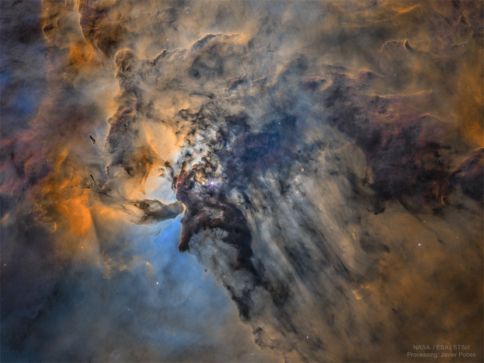 The Busy Center of the Lagoon Nebula
Related Communities
🔭 Science
- [email protected]
- [email protected]
- [email protected]
- [email protected]
- [email protected]
- [email protected]
- [email protected]
- [email protected]
- [email protected]
🚀 Engineering
🌌 Art and Photography
Other Cool Links
founded 2 years ago
MODERATORS
Didn't they try to retire it?
- But space fans just love it so much. The decision to drop it meant, paradoxically, that the logo proliferated and multiplied everywhere else. It was a sort of Streisand effect, instead of dying and slowly disappearing it became a retro symbol. So they brought it back.
Your comment got formatted as a numbered list! (At least it did on the client I'm using). I think you can fix it by putting a backslash before the period, like 1992\. But space fans..
The meatball is butt ugly. The font and the red wiggly thing don't look good.
But it's NASA, so I would happily get it tattooed on my face, should the need ever arise.
The worm, on the other hand, is perfect.
Maybe I'm too young but I love the meatball. It looks like exploration, adventure, science and fun. The worm looks too military to me.
The meatball definitely has a Star Trek vibe, which I'm here for.
The worm logo was heavily featured in Starfield. I liked how they incorporated actual NASA in the game. Same with the real books.
In the mid-eighties Jet Propulsion Laboratory updated its logo to match the worm. In the 1990s, NASA brought the meatball back due to popular demand.
Personally, I like the moon, mars and beyond logo, but that's a probe division logo.
Oh and Space Force's Asteroids arrow came before Star Trek as the USAF Space Command logo. Desilu borrowed and stylized it.