I don't think it's the distros job to look visually appealing. That's the job of the desktop environment. Seriously I wish distributions would just ship vanilla desktop environments. All of the themed variants always have some issues. Maybe I'm just old and stubborn but that's my opinion.
Linux
From Wikipedia, the free encyclopedia
Linux is a family of open source Unix-like operating systems based on the Linux kernel, an operating system kernel first released on September 17, 1991 by Linus Torvalds. Linux is typically packaged in a Linux distribution (or distro for short).
Distributions include the Linux kernel and supporting system software and libraries, many of which are provided by the GNU Project. Many Linux distributions use the word "Linux" in their name, but the Free Software Foundation uses the name GNU/Linux to emphasize the importance of GNU software, causing some controversy.
Rules
- Posts must be relevant to operating systems running the Linux kernel. GNU/Linux or otherwise.
- No misinformation
- No NSFW content
- No hate speech, bigotry, etc
Related Communities
Community icon by Alpár-Etele Méder, licensed under CC BY 3.0
Fuckin same. It took so long for me to realize a lot of issues I had wasn't because gnome was shit, it was because every distro fucks with gnome until it's unusable. I finally tried fedora and now gnome is my favorite DE and I love the workflow.
Yeah, distros should, at most, change the default accent color and some pannel icon, but no more than that.
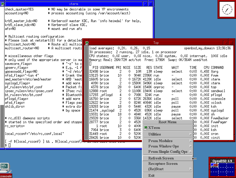
Definitely OpenBSD's default fvwm

Does OpenBSD really default to FVWM in 2024? Metal.
Yes, and not even the modern fvwm3, due to licensing issues.
A blast of the past.
You're asking about the desktop environment and its default settings, which may or may not be the same on any given distro.
But I have a tie between Plasma and Cinnamon (mint's DE). They both take only minor tweaking to get where I want them, and I can use them both out of the box with zero complaints.
Many distros customize the colour schemes and theming of their desktops. The out-of-the-box XFCE in EOS looks nothing at all like vanilla XFCE for example.
Garuda Hyprland edition. All the neon-RGB styling of Garuda gamer on top of Hyprland's smooth UI.
Upvoted. I forgot about this distro. I don't like its neon style at all but it's something different and pleasing for some people.
It's finally an opinionated distro I agree with. Of course you can get anything to look like anything but I just like how they picked a path and went so far down it to make their own unique out-of-the-box experience.
The new COSMIC desktop by System76 and Pop!_OS is very promising. I've been running the pre-alpha, and have been very impressed.
The current pop_os dark is already pretty damn good, it's a very refined theme
EndeavourOS has a pretty nice colour scheme and wallpaper going by default.
If I was forced to use a default distro look, it would be that or Linux Mint probably.
Fedora Workstation. Gnome is pretty great on the eyes, and there's a healthy Libadwaita apps ecosystem that is just *chefs kiss*
ElementaryOS also looks great for the system and core apps, although there's not really a third party app ecosystem that fits with the Pantheon theme, unfortunately.
I second this but after getting Hyprland setup to my liking I don’t think I’ll ever go back to gnome or kde
GNOME
I think GNOME looks very visually appealing with it's consistency. The Libadwaita library has a nice aesthetic and looks very clean with nice spacing for elements to "breathe".
I still prefer KDE since I can tailor the look to my needs and I prefer to have clutter over extra clicks. (I have top bar with "Opened programs", Launcher, System tray, Time and a global menu and KWin script for managing Activities)
I feel like modern era of design has gone a bit overboard with the "clean" direction. It can be contrasted with Windows XP where you click "All programs" and you literally get all programs in the start menu with options of how to run or open them. I prefer to do "Menu" - > "Submenu" - > "Thing I want".
Come to think of it I should probably make a launcher for KDE.
Pop!_OS
Gnome with a bit of a macOS twist. I really like it. I'm excited for Cosmic!
Linux Mint has a smooth, out-of-your-way look & feel to either MATE or Cinnamon that just makes me feel at home
deepin or zorin
Honestly, whilst I would not recommend this at all, I find CutefishOS (you could argue it doesn't even need to be a distro) incredibly visually appealing.
Perhaps I will get downvoted for being a sucker for modern visuals, but the theme is consistent, simple and easy on my eyes.
Although I like GNOME, the consistency bothers me and some of the design choices are inconsistent and don't make for a great user experience, looking at Nautilus for example.
You mean Desktop?
Distro, I think Lubuntu does LXQt better than Fedora LXQt.
But LXQt is a huge mix of mostly KDE Theming.
Pantheon desktop (Elementary OS)
LMDE (Mint Cinnamon)
My favourite looking DE is GNOME with the WhiteSur theme and SF-Pro system font
As one comment mentioned, it depends more on the DE. But out of the box, I’d say Peppermint, Elementary, and Mint.
I loved Peppermint. Has it been updated/does it work?
Used to use it but it crapped out on me and last couple of versions haven't worked or had printer issues.
Hmm there is stuff like Archcraft (maybe it has a different name now idk) that is made specifically for visuals. In terms of usable distros I'd say Xero is the best I know. It seems to be discontinued though. CachyOS has some nice WM setups too but the appealing visuals can't be consistent in that case because they are not full DEs and the unreasonably tiny calendar pop-up window from Xfce always ruins everything.
Xerolinux. It's basically a heavily themed KDE
Really depends on the desktop but in terms of default desktops that are shipped with distros I'm picking Fedora's GNOME (pretty much stock) and MX Linux's XFCE.
Just installed a USB boot for Mint (cinnamon) and MX (xfce).
Both are so much nicer than I expected.
Trying to figure out how to put together a sub-distro for friends & family that are considering moving away from windows.
MX ranks higher out of the box (comes with VLC installed).
Gentoo.
Distros aren't going to be visually appealing as they typically and just standard desktops or CLI
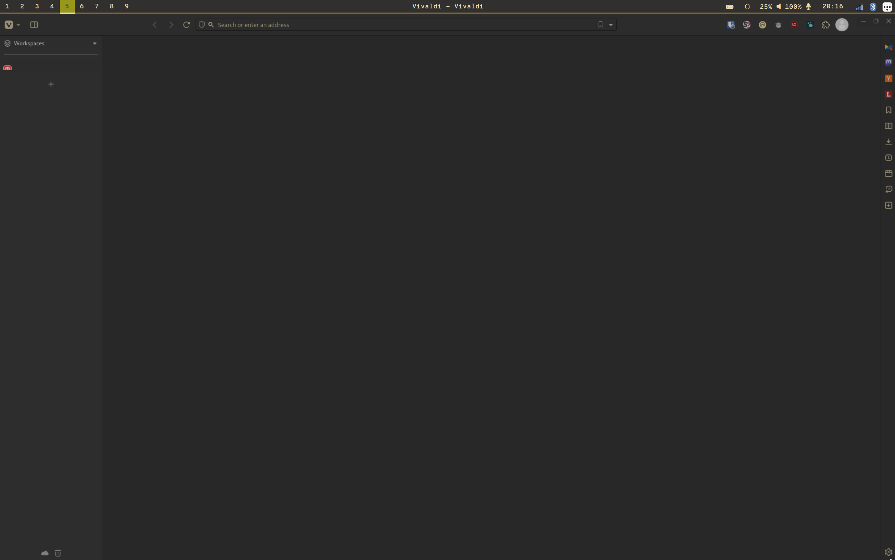
Out of the box, I love Vanilla OS's color scheme and wallpaper, with Fedora in second place for a default Gnome environment. I like the Pop_OS theme. I use River WM with a gruvbox theme (Vivaldi with no open tabs pictured), which is about as far from out of the box as you can get. Incidentally, I've been team light theme forEVER, but I've switched with gruvbox.

I've seen Gnome spiffed up to a level of polish I'd expect from an Apple commercial. I hate using it, but some folks get it looking nice.
Mint with Papirus icons and blue accent colour set to match the folder icons of Papirus theme.
Elementary has some very clean sober themes. I fell in the tilling windows craze and ricing so I'm sporting an Arch (I use it btw) with AwesomeWM, so very minimalistic.
I like the look of tiling wms with a top bar. Hyprland looks especially nice with rounded corners and color gradients. Too bad it's not stable enough to be my daily driver at the moment.