Photo Critique
418 readers
1 users here now
A community to critique photographs and learn from others.
Rules
- OC only for critique
- Film & Digital are both welcome!
- General photography questions are also welcome
- Critique requestor should critique their own work (it really helps!)
- Above all, be kind :)
Trying to create a similar space to /r/photocritique
founded 2 years ago
MODERATORS
1
2
I've been practicing more portrait photography lately and wanted to check in and see what I could be doing better. Looking forward to your replies!
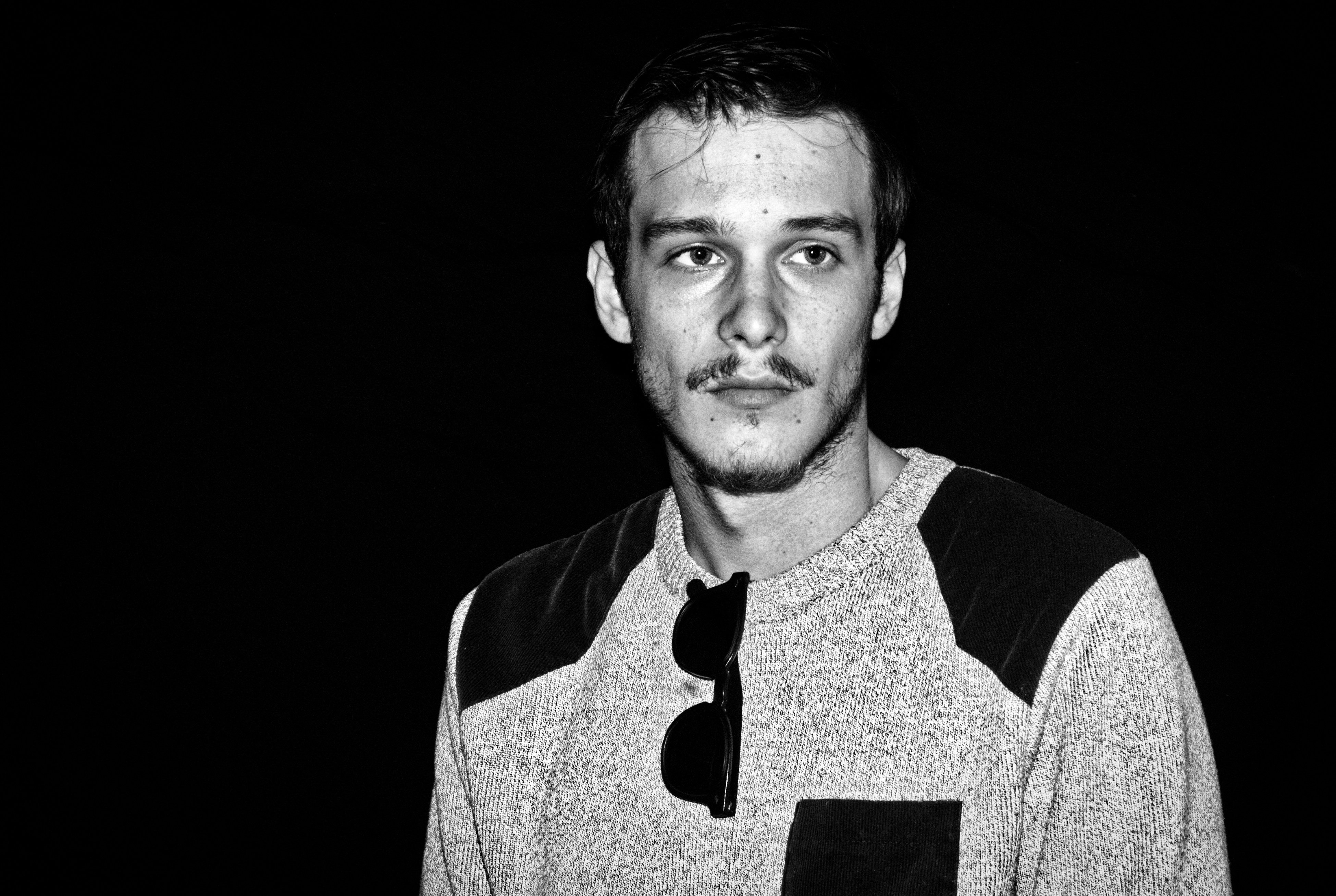
3
I am very happy with this shot. The lighting is very cool, I used a rather high ISO at 1600, but there is very little noise. It almost looks rendered in a 3D engine.
Any ideas of possible improvements?
Here's an alternative perspective (and shameless self promotion link): https://lemmy.ml/post/5981879
4
4
Not sure what I think about this one. It had potential, but I'm not sure if I like it or not.
(feddit.nu)
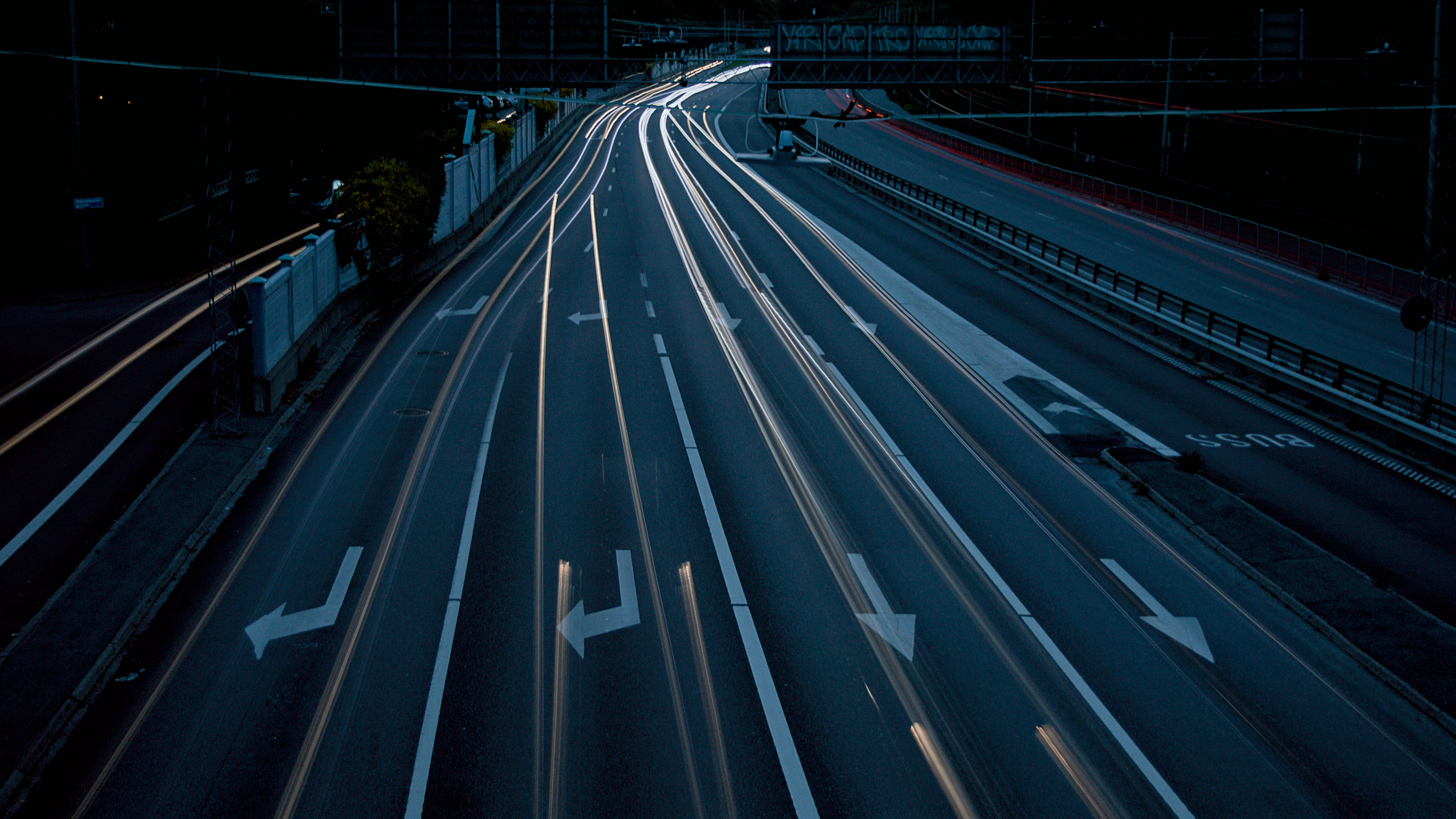
5
I wanted the road to not be as dark, but turning exposure up made the trails almost disappear in the fading contrast.
6
I feel like the shot is a little to dark on the right side and a little to bright on the left side.
I'm not sure if I would be able to fix this in post in a good way without making it seem unnatural.
Other than that maybe I applied a bit to much sharpening.
The exposure was for 1.6s with my hands resting on the railing of the bridge I was standing on. So the sharpening helped disguise any blur from shooting handheld.

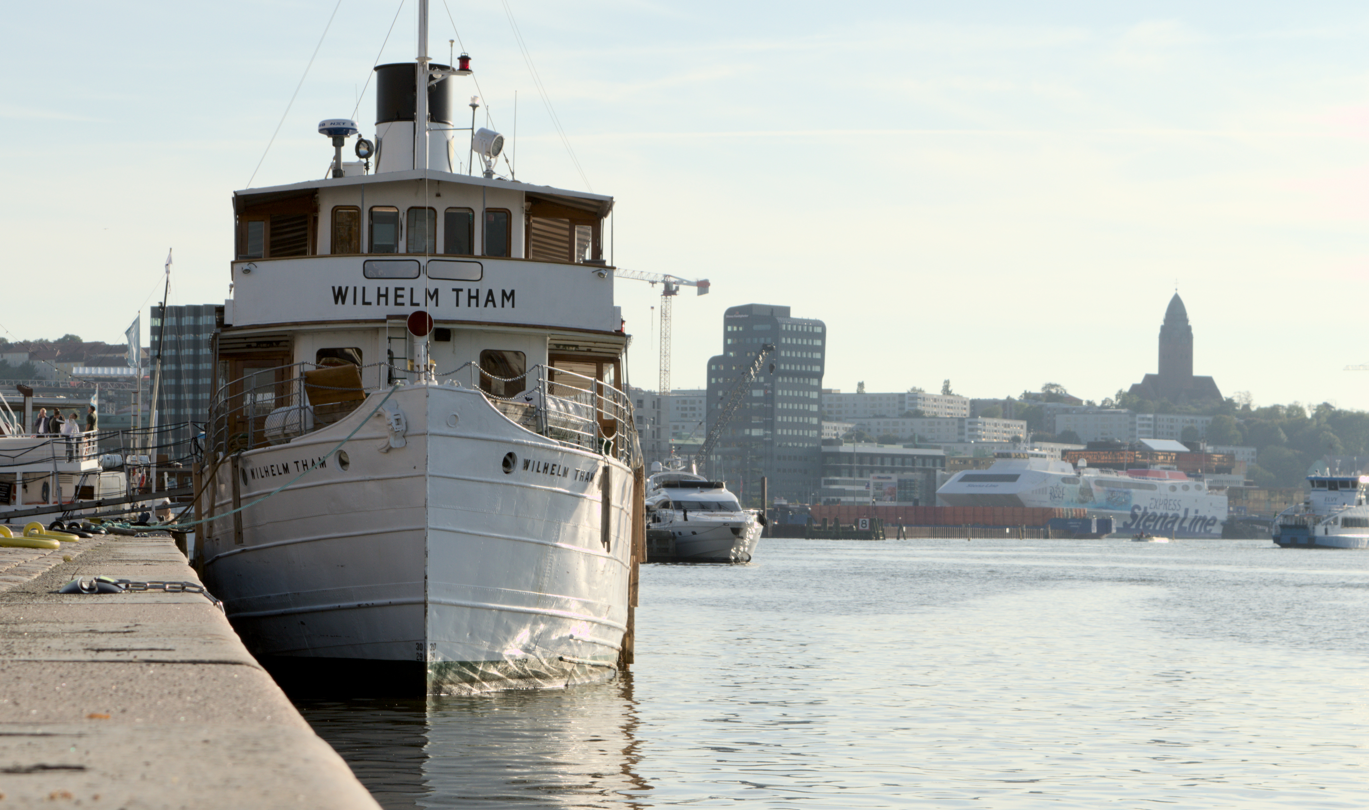
7
I can't really find anything I could have done to make this photo better.
I'm not saying it is perfect. Just that I, as a complete amateur, can't come up with any improvement.
I would like for the background to be darker, but shorter exposure would affect the boat as well which is not really okay.
Any critique welcome!
8
Looking back, I wish I had taken some steps to the left so that I wouldn't have gotten the shady side of the house and also making the corner of the house straight relative to the framing. Right now I have rotated the framing in order to level the text properly.
Any other advice is welcome!
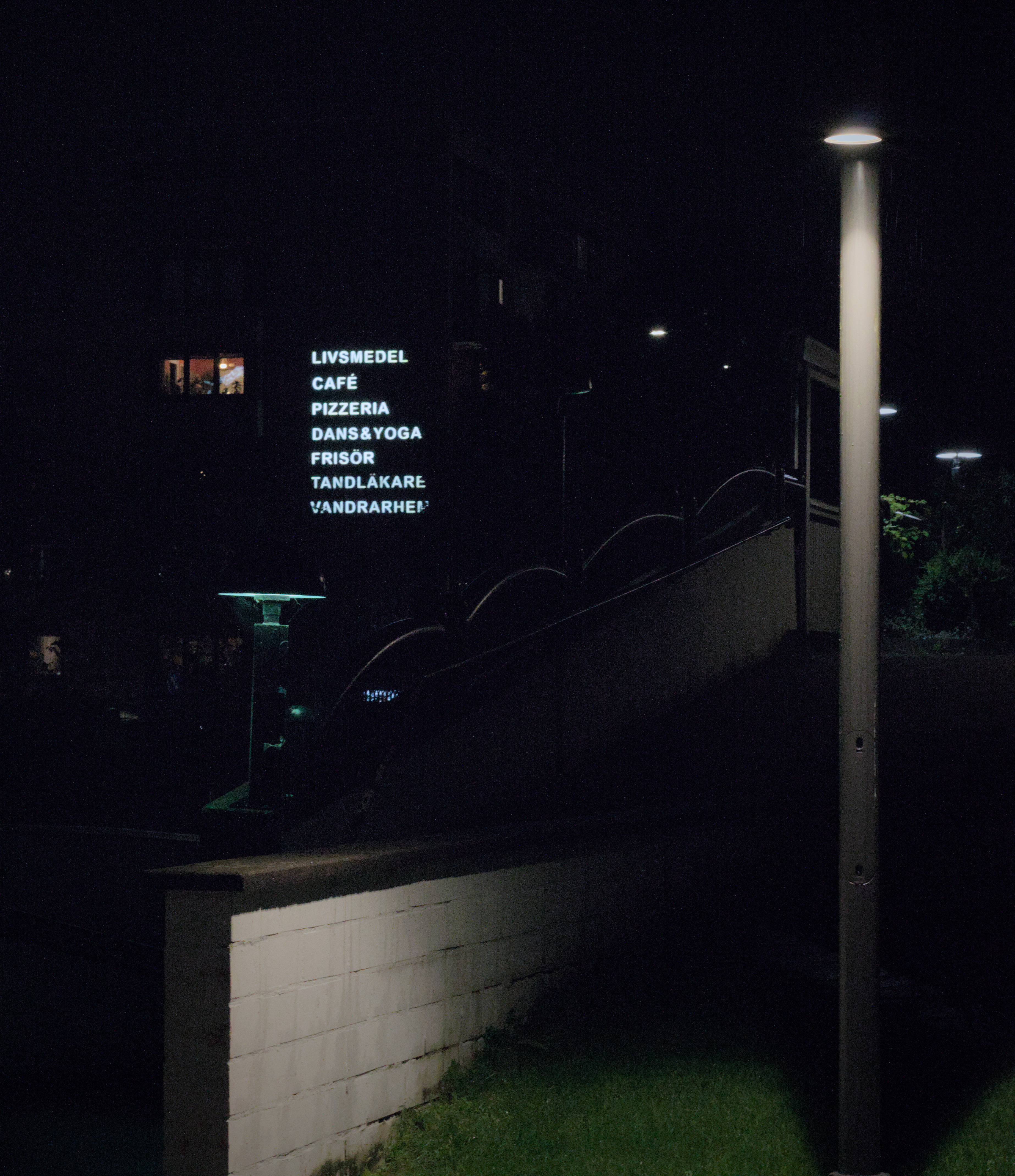
9
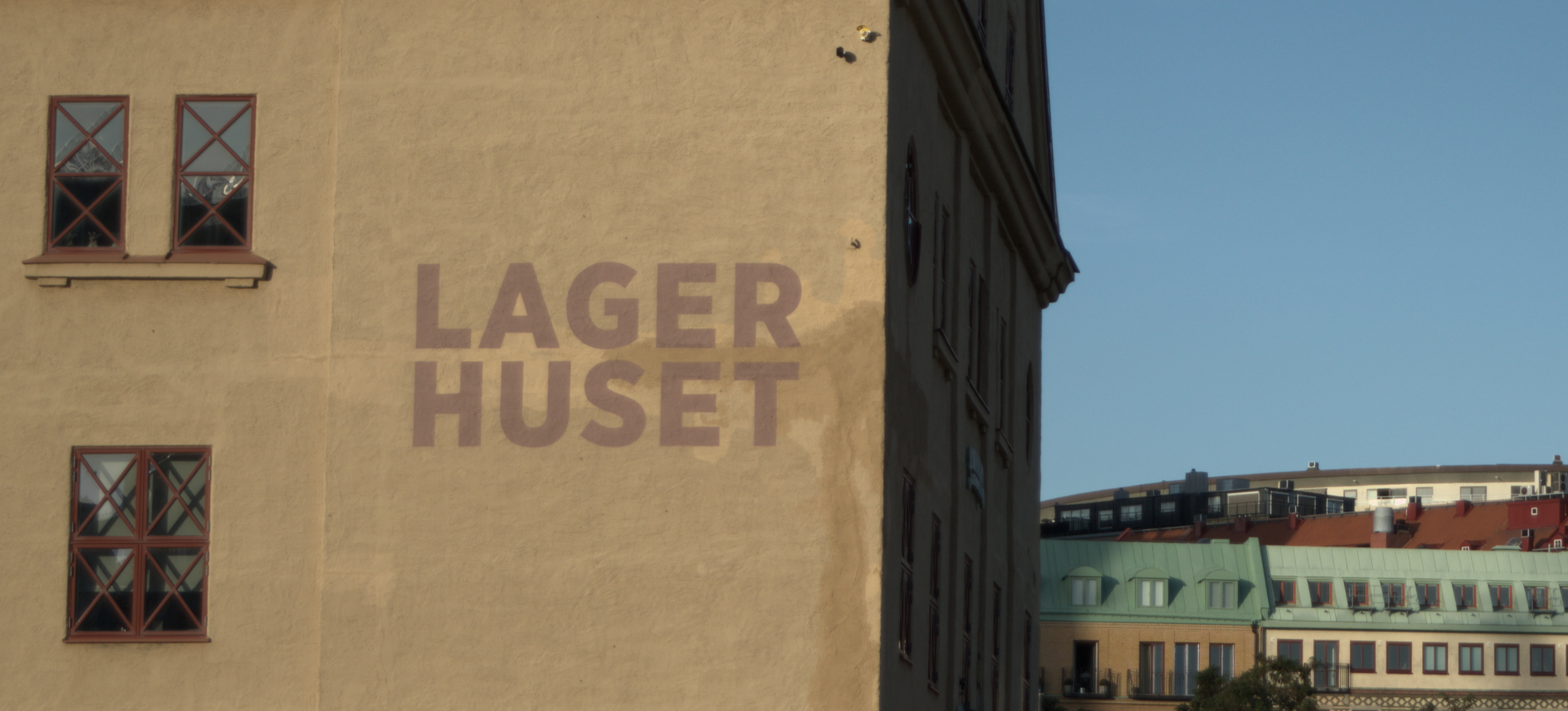
This is the first photo I've taken where I preferred the monochrome filter over having the colours present.
The sun being behind the building to the right (out of frame) makes the building seem darker and creates some glare that bleeds over the middle part of the photo. I've been thinking about whether or not this is a good thing, and I think I like it that way.
Any critique is welcome!
10
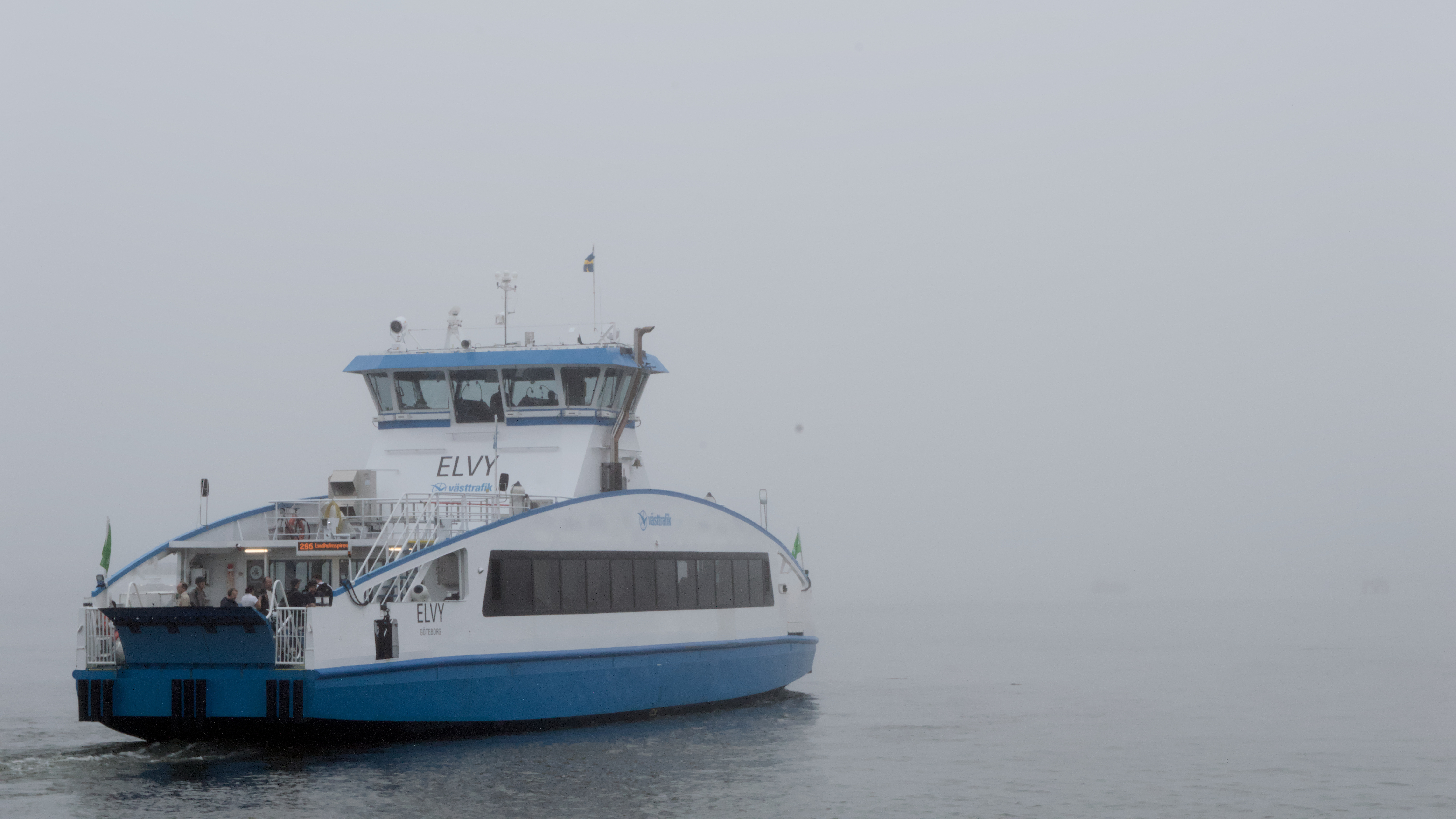
My only complaints are regarding the background. There is a yacht peeking out behind the subject boat and the ferry in the background is not very pretty.
I wanted to be close to the edge so that I would include the water line of the boat in the photo. Otherwise I could have moved further to the left in order to hide the yacht thingy.
I wish my lens would be able to open up wider (if I've understood aperture correctly..?) to create a blurrier background. Lowest I can do with my kit lens is 3.5f and that is if I don't use any zoom at all.
Any other advice?
11
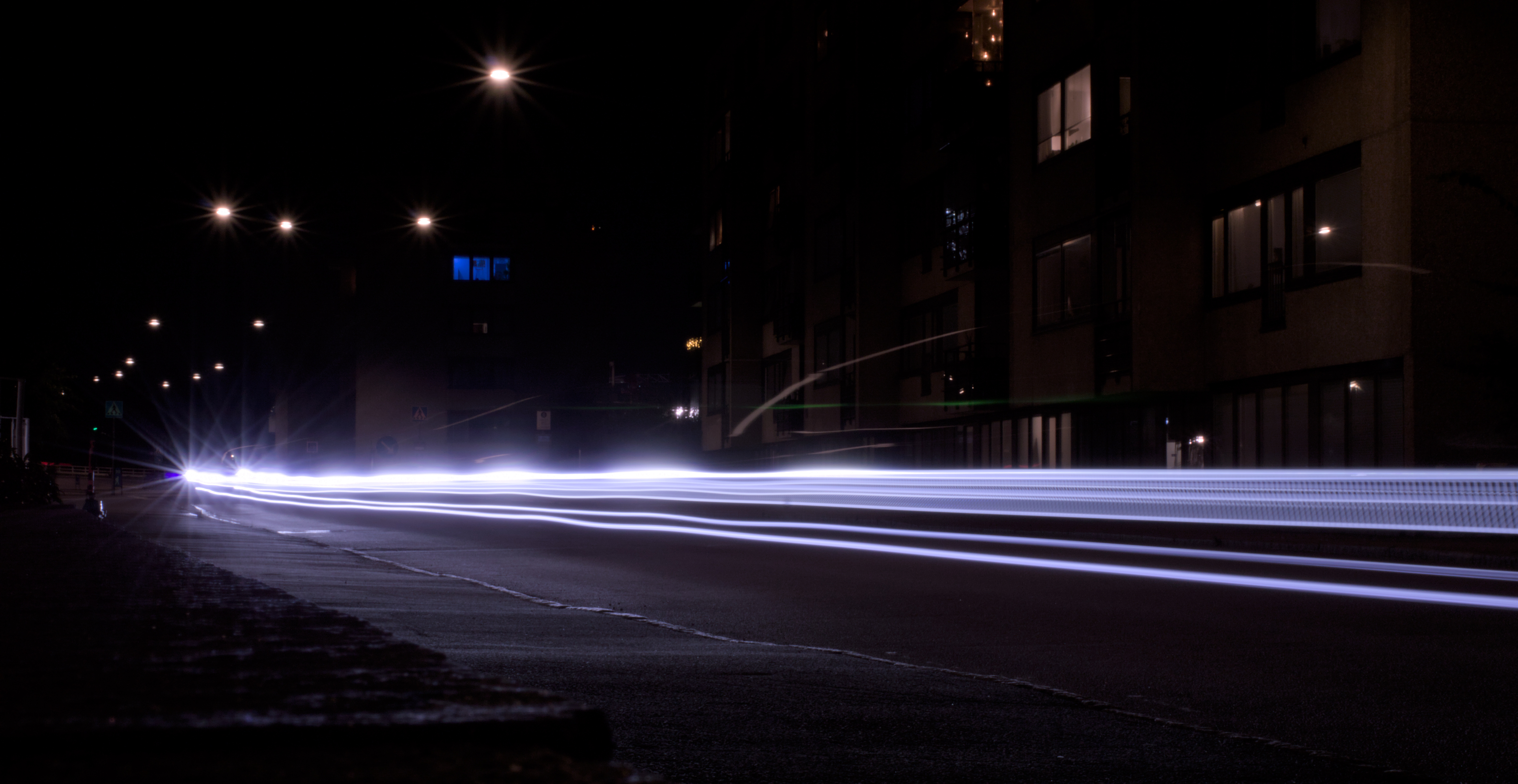
I have just started learning photography and took this yesterday. I am very happy with it.
My own critique would be that I don't like the small light dashes that are over the middle of the "beams" and the "star effect" where the beams start out.
I don't know where they come from. The star effect might come from the car going over a speed bump in the beginning, therefore being slower and emitting more light in one place, but I'm not really sure.
Any critique is welcome! Come with suggestions what to do different or other stuff to try! I appreciate it :)
12
A doorway opens
in the charred remains of home
through which new worlds wait
Canon EOS 5d mark ii Ef l100mm f/2.8L macro ISO 400 f/13 1/100


14
I took this photo of my dog on a beach. It’s always been a favorites, but I feel like it’s audience might be limited because it isn’t a cute photo of a dog. I’d love to hear feedback. Just for kicks, here’s an alternative version of the crop. It tells a really different story:


15
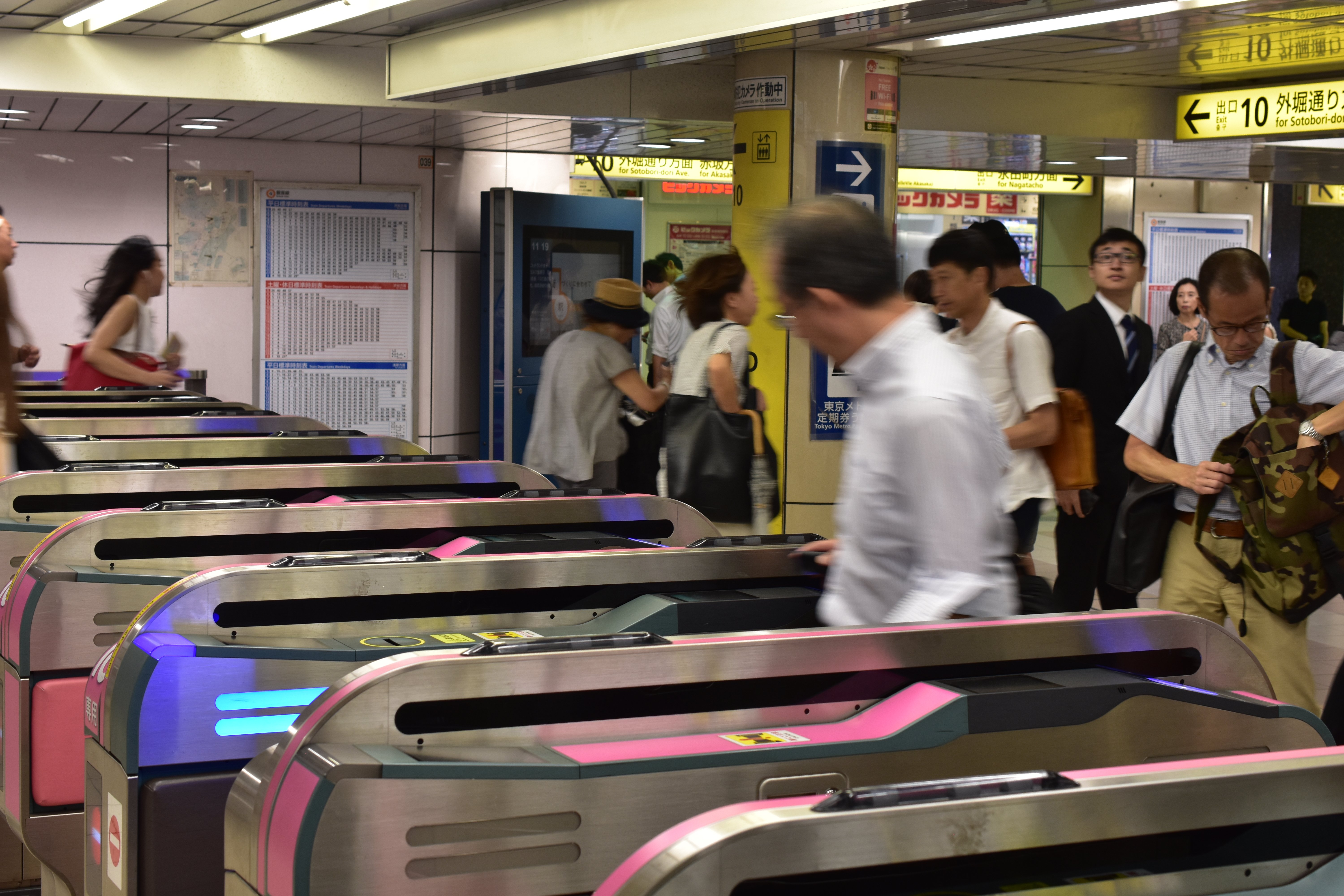
Hey all, found this one digging through some old photos and liked it a lot more than when I initially took it, I think it really does a good job of conveying the frantic energy of the metro. Not sure what direction I want to take it in the edit though, so I thought I'd ask for some advice!
16
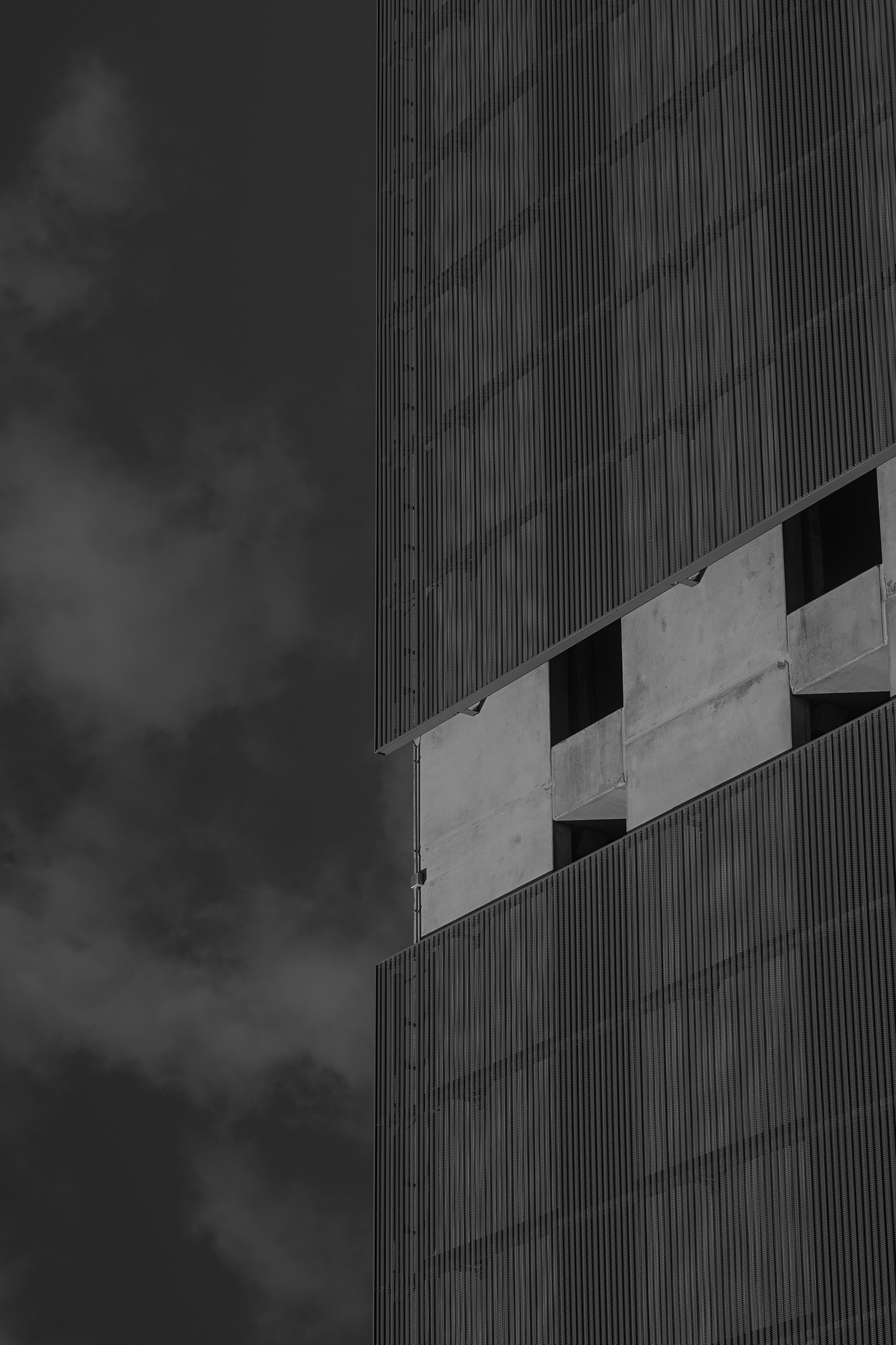
So I've been sitting on this one for a long time - it too comes from the January photos. I was inspired by another photographer who was posting abstract architectural photos on the reddit community and I wanted to try my hand at the style. I really like architectural photography, but it gets boring sometimes because it seems there's only a handful of good angles you can get of a particular building. So this kind of reinvigorated my creativity.
To give some perspective, the roof line of the building is on the left. I've rotated the photo around and to me it looks like a closeup shot of a much taller building with the clouds behind. I really like that. The junction box sitting there is a little distracting to me but it isn't so bad & I'd rather not edit things out of the photo. Not only is it usually obvious to me where my own edit took place but it also goes along with my hang up about being disingenuous in my photography.
I enjoy a lot of the texture here which was my main intrigue when snapping the photo. The wispy, smoke-like clouds remind me of the steam you see coming up from the streets sometimes. The weird metal facade over the concrete is just plain awesome to me - it looks soft and rigid at the same time. The concrete of the building has a nice smooth texture as well.
I'm not sure what to think of the lighting. I think the gray sky behind the white clouds is a little too dark. The building itself looks pretty cool to me and I really like how dark the windows turned out. And the whole photo might adhere too much to the rule of thirds, it kind of gives me that too-clean feeling.
Overall I think I did a pretty good job for a first go at this style!
17
I have no monies for any extra gear or lens adapters, but I have this 40 yr old macro lens (doesn’t mount to any of my film camera bodies) I had been using to magnify images onto the iphone 14 telephoto lens sensor and I finally purchased an actual digital camera (and apparently hands down the worst DSLR camera body Canon has ever dared to manufacture - the t100) which was cheap enough for me to melt a hole into the body cap until I could glue it as a mount to the macro lens so I could get a little more life out of this thing. Now, all things considered, how apparent is the Frankenstein lens and aps-c sensor configuration on a camera that is known to lack the same features that used models that have the exact same image sensor have??? Based on this image of course. I think she did pretty damn good
18
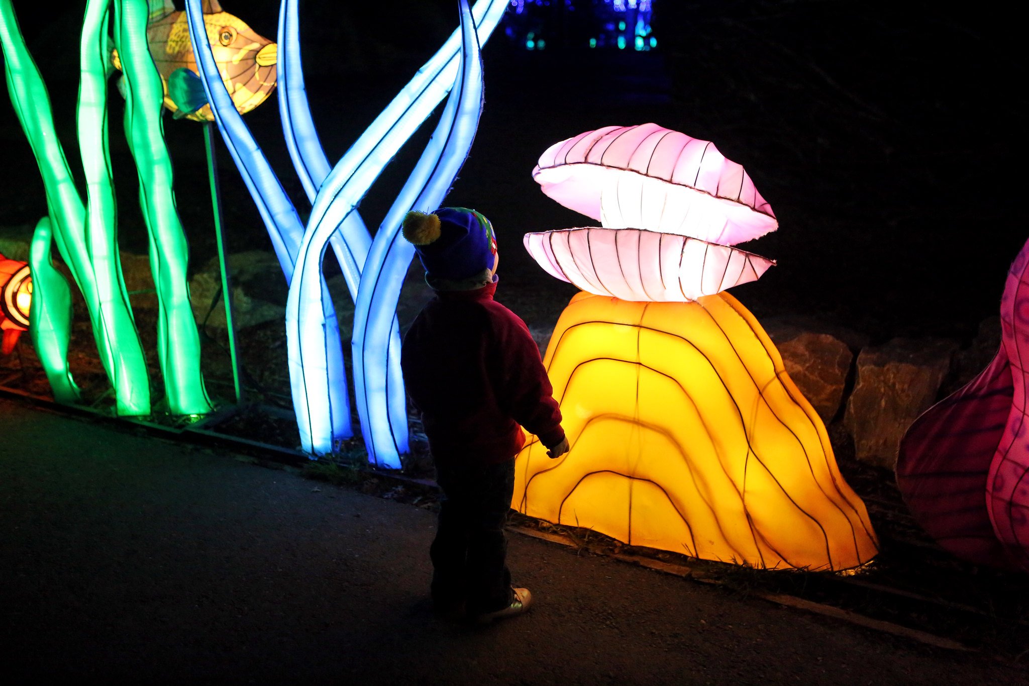
It's hard taking pictures in the dark. We went to see the Glowfari lanterns at the Oakland Zoo and this was my favorite photo. I like the composition with my daughter here looking at the clam shell but I always struggle with how dark is too dark and wonder if I should brighter up the subject a bit.
19
20
I took this photo on a 2008 Fujifilm Z100fd so I don't really have much control over colors because it doesnt output RAW (i dont like how some parts of the shadows just fall into complete blackness) but im looking to see if this picture seems "interesting" to any of you

21
Hey all, I'm going back and forth on this one so I thought I'd ask for some feedback. I really like the moody atmosphere of this pic, but I'm worried that it's just too dark on most viewing devices except for a nice monitor or a good print. I can brighten the image, but there isn't much of visual interest in the darker areas, so I'm worried that it will be too boring of I do so. Thoughts?

22
Canon EOS 7D + EF24-70mm f/2.8L USM f/8.0 1/200s ISO100 24.00mm
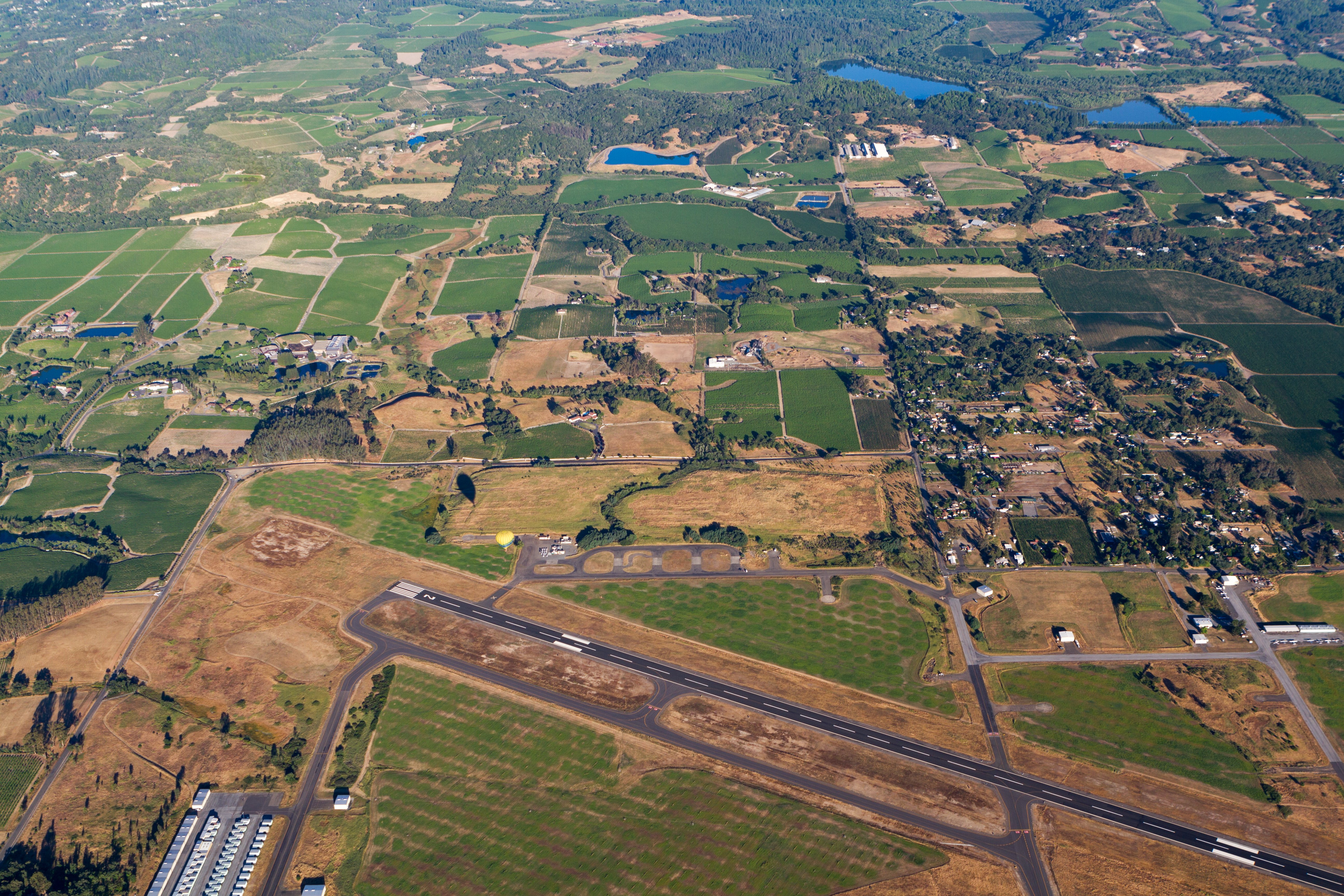
My first time flying in a hot air balloon! How'd I do?
23
Taken four years ago in Melbourne during the White Night Festival on my iPhone.
The photo is cropped just a little at the bottom to keep a few additional buildings out. Then desaturated and cooled a little.

24
I'm not sure what to do with this photo. It's from a series that I did back in January where the goal was to take at least one photo per day all in B&W. It was just something fun to do that would rekindle some inspiration and help me in a time I was feeling very uninspired.
I chose B&W to give myself less to think about when shooting. Too often with color photos I want to edit the colors to make them pop or look more like they did in my mind's eye when taking the photo. But with B&W that isn't so much of an issue for me because now the photo looks nothing like it did when I was shooting and can it kind of be it's own thing. I like that.
It's challenging for me to edit any photo, and this one is no different. I like that without color you can pump the contrast and exposure and really darken the shadows and make it kind of how you want just in messing with the light sliders. I'm pretty happy with how the lighting turned out. I wanted it to be very contrasty much like tri-x but when I did that intentionally it felt kind of wrong so I backed out and went with this. Maybe because the image is too clean and most of the shots I've seen on tri-x are very rough, gritty, etc.
As for the framing and whatnot, this photo is quite cropped. Originally I did not notice the man lying on the bench and was moreso just taking a shot of the tracks to pass the time waiting for the train. When I got back to view the photos I liked the way he was off to the side on the right of the frame but he wasn't the focus. So I cropped in maybe like 25% to get the frame we have here.
I like the emptiness/loneliness of the photo, but I feel like it's a bit too empty and is missing something to tie it all together nicely. I would have liked it better if maybe there was a group of people waiting near the man but no one was paying him any attention, just like I didn't notice him at first.
So, what are your thoughts on the edit? Should I go full crazy and blast the heck out of that contrast slider? Should I have cropped differently? I just feel like this could be a great photo and it's one I look at often. It just needs a little something more in my opinion.
ISO 100 | 50mm | f8 | 1/100s

25
view more: next ›