this post was submitted on 30 Jun 2023
8 points (90.0% liked)

Photo Critique

410 readers
1 users here now

A community to critique photographs and learn from others.


Rules

Trying to create a similar space to /r/photocritique

founded 1 year ago
MODERATORS
 

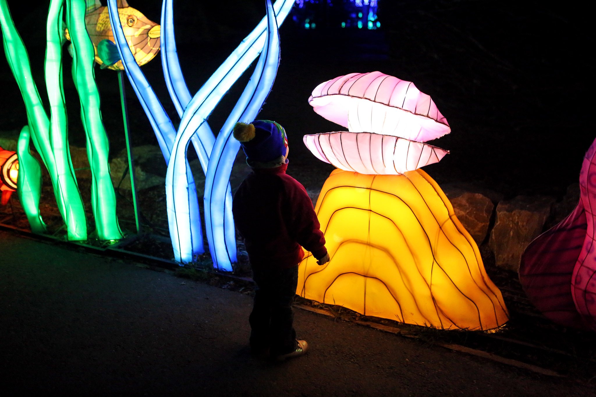
It's hard taking pictures in the dark. We went to see the Glowfari lanterns at the Oakland Zoo and this was my favorite photo. I like the composition with my daughter here looking at the clam shell but I always struggle with how dark is too dark and wonder if I should brighter up the subject a bit.

top 4 comments
sorted by: hot top controversial new old
[–] [email protected] 4 points 1 year ago* (last edited 1 year ago) (1 children)

This is a cool photo!

My main critique is that there is too much light on the left. I think the composition would be stronger if the camera were closer to your daughter to show the light hitting her face, and possibly with more darkness behind her. The squiggly lights in the background are fighting for attention with your daughter, when it really feels like her silhouette (lit by the light in front of her) should be the subject.

I like the colors though, and I don’t think she’s too dark (like you mentioned). Great photo! :)
[–] mrpibb 2 points 1 year ago

Thanks! I think you’re right. This would look better cropped a little tighter.

[–] el_barto 3 points 1 year ago (1 children)

I agree with @clicky there there is too much distraction on the left side. With how the photo is now, I would suggest a vertical crop with your daughter and clam as the main subjects. Cut out what you can on either side. I personally really like the photo cropped in this way.

I think for another photo idea you could kneel directly behind her at her eye level or maybe lower, and capture her whole silhouette as she looks at the light sculpture. Also, with all the amazing colors I also think you could try framing her face at her eye level, up close, with the various colors of light hitting her face at an angle to capture her expression.

[–] Labotomized 1 points 1 year ago

I really like your suggestion for reframing/reorganizing the shot. It would really capture that moment of awe a bit more intimately.

load more comments
view more: next ›