this post was submitted on 07 Feb 2024
145 points (95.6% liked)
196
16968 readers
2037 users here now
Be sure to follow the rule before you head out.
Rule: You must post before you leave.
If you have any questions, feel free to contact us on our matrix channel.
founded 2 years ago
MODERATORS
you are viewing a single comment's thread
view the rest of the comments
view the rest of the comments
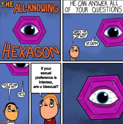
In the original comic, the hexagon is off-panel in panel 3. Also several speech bubbles have been moved around. Who edited these things and why? Also super lame to crop out the comic's title.
They appear to be moved around because the original creator [didn't] put the text boxes in intuitive places. It's instinct to read from top to bottom if both text bubbles are centered at the same spot.
EDIT: missed an important word
Outside of the crop, the edit is a big improvement to readability for me. Trying to read the original was really confusing for a second.
Yeah, that's what I meant. I accidentally wrote the opposite. Added the word.
The hexagon already knew the question so it answered before the question was even asked. It all makes sense.
That all makes sense, although I still find it odd that someone put that much effort into making someone else's comic more readable.