this post was submitted on 02 Feb 2024
556 points (99.1% liked)
196
16821 readers
2865 users here now
Be sure to follow the rule before you head out.
Rule: You must post before you leave.
founded 2 years ago
MODERATORS
you are viewing a single comment's thread
view the rest of the comments
view the rest of the comments
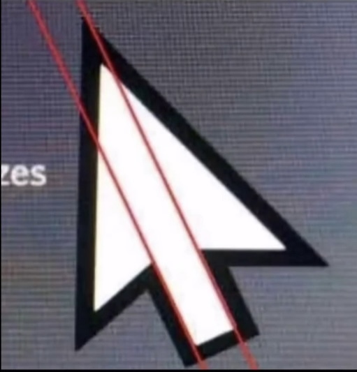
Breeze (KDE) cursor forever!
good choice, but i'm a Bibata enjoyer myself.
I don't really like the breeze cursor, it's just the oxygen one but flattened and it doesn't look as nice.
I'm so confused by the one person replying to you with 5 slight variations of the same comment....
I have to say the "everything flat" was kind of a weird process. I think it looks better than in the old chaotic days. But something in between is best.
I have to say the "everything flat" was kind of a weird process. I think it looks better than in the old chaotic days. But something in between is best. Not sure what that is, at least from screenshots KDE looked worse than Windows XP/7
macOS Catalina is probably my favourite OS design, as a Linux user. No unnecessary padding like Big Sur and onwards, not overly flat like many older versions, everything clickable looks clickable, it's great.
I have to say the "everything flat" was kind of a weird process. I think it looks better than in the old chaotic days. But something in between is best.
I have to say the "everything flat" was kind of a weird process. I think it looks better than in the old chaotic days. But something in between is best.
I have to say the "everything flat" was kind of a weird process. I think it looks better than in the old chaotic days. But something in between is best. Not sure what that is, at least from screenshots KDE looked worse than Windows XP/7. Now Windows 11 looks better than KDE, time for some new icons!
Excellent choice