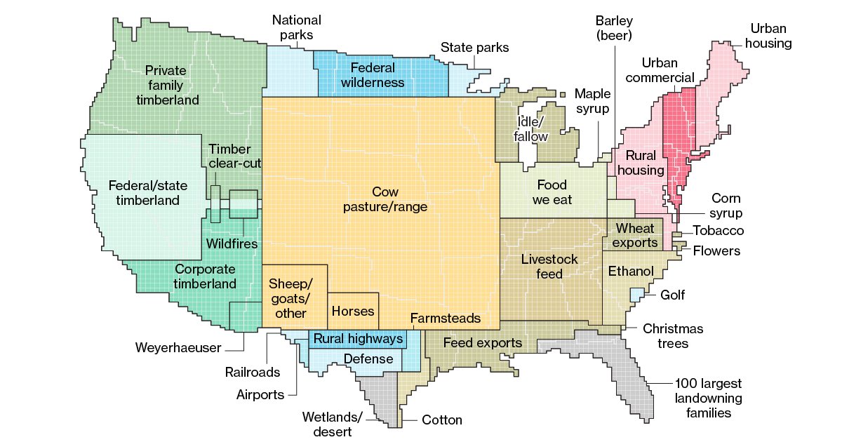
This is a weird ass pie chart using the US map as a base right? If I am correct then this is a terrible way to display this data.
Data Is Beautiful
A place to share and discuss data visualizations. #dataviz
Why? It gives people a relatable size and shape to compare to. Like saying the 100 richest landowners own equivalent to Florida.
I get that but it needs to be labeled some way to clarify this at least. A lot of people look at this and could easily think it is what each area has the most of and that the positions of the types of land have something to do with the states they are near or cover.
Agreed. I definitely thought that at first, thinking some of them seemed very off. Glad I read these comments. It’s especially confusing considering where some things are in the map that it seams almost believable for example that NY/NJ are made up mostly of mostly urban and commercial areas.
But it is a good chart (not map) for what it’s intended to show with some perspective provided in proper labeling.
i really do not understand how anyone can be confused by this, obviously it's not a geographical map because new mexico does not contain the sum total of all american railways..
It's a fine graph that gives an intuitive sense for how much area is used for each thing.
It's really funny to imagine it literally, though.
"We'll I'd heard some bad things about West Texas highways, but this just seems excessive."
I kind of like it tbh
I'm glad this community is following in the tradition of the reddit one, ugly graphics that communicate nothing useful yet somehow get upvoted to the top
I like seeing the area.
Yeah, this is a pretty appalling graphic that maybe seemed good in theory but is hostile to the reader in practice.
Oooooh. I assumed it was supposed to have a geographic relation. Yes, this is extremely unclear.
Has anyone started c/terriblemaps yet?
Seems like I'm getting 3 reactions to this map:
- Neat map
- I don't understand this map
- I will find you and kill your family for this crime against data
cannot believe how many people are confused that the use blocks aren't showing use in that location, just size in relation to the size of the country
I'd say put me under #3, but I'd need you to draw me a map and we all know how that went last time
Because everyone else is shitting on it - I just wanna let you know OP that I actually liked this map
I'd suggest a merger between '100 largest landowning families' and 'Food we eat'.
expected more corn
That entire block that says "ethanol" is corn, plus that entire block that says corn syrup, and a good chunk of that block that says "livestock feed". It's a lot of corn.
It's in there, it's just split up between food we eat, livestock feed, feed exports, ethanol, and corn syrup. Not all those categories are all corn but even then corn will be a lot of it.
Why isn't parking on here?
Streets aren't really mentioned either, besides "Rural highways". I assume other streets and parking spaces are mostly included in "Urban/Rural housing" and/or "Urban commercial" (smaller rural streets might not be counted seperately from the surrounding land).
I have examined this abstraction of a map thoroughly.
I do not see any garbage dumps, recycling facilities, sewage processing, cemeteries, energy production, water production...
I could carry on, but this map means almost nothing with all sorts of factors missing.
Without digging in to the numbers further than just looking at this map, could this be because the relative areas of the factors you listed didn't pass a threshold to make it? @ezmack what data source was used for this?
Urban-commercial
the amount of land for cows is crazy. and the fact that more land goes to livestock feed than food we eat is interesting as well
The conversion losses to feed animals is very high. It takes 76% less land for us to subsist on plants rather than to eat meat. Well, actually, that's the world average, it might be even higher in the US because of its higher meat consumption. I should check the study again.
Thanks for giving me a shitty graph and then a source to a paywalled article.
Here's non-paywall https://web.archive.org/web/20230316140810/https://www.bloomberg.com/graphics/2018-us-land-use/
I'm curious why first nation reservations weren't demarcated. Or maybe they were and I'm just an idiot lol.
This doesn't show where these uses are located on a map, just the area of land relative to the total country.
It's not really the USA without Alaska (and other extracontinental territories, but their landmass probably isn't large enough to change anything).
Or is Alaska included, which would make the presentation of the data even more confusion as it wouldn't even be too scale.
The original article does specify contiguous US.
Funny things if there was regular controlled fire, there would have none wildfire...
I wonder how bad it'll get before we get some kind of prescribed burn policy. Smoky summers suuuuck. Having your house or town burn down in an out of control wildfire sucks even more.
They already exist all over the western US. In AZ the majority of smokey days come from prescription burns or natural fires that the forest service manage like a prescribed burn
California also uses their lands for wildfires, they even have a fire season now. Don't forget to give credit where credit is due!
