this post was submitted on 08 Jun 2024
62 points (98.4% liked)

Pixel Dungeon

1224 readers
122 users here now

This community is a place to talk strategies, tell stories, or discuss anything related to Pixel Dungeon or its many versions.

Rules:

We have a few title tags for standout posts:

Sister Communities:

founded 11 months ago
MODERATORS
 

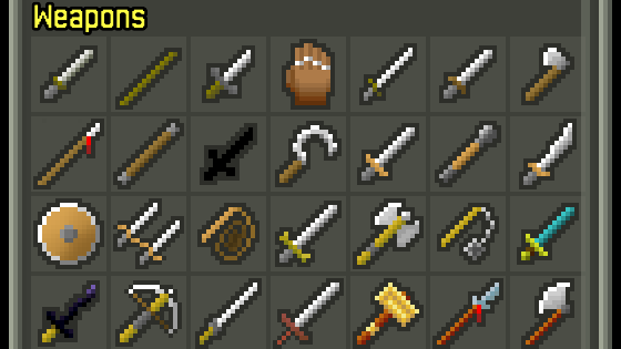
With Shattered Pixel Dungeon v2.4.2 out, I'm properly starting work on the next update, which is going to include a bunch of changes to the journal interface.

Here's one of them, a new UI for the game's item catalog, that uses a grid instead of a long list. This makes the catalogs easier to navigate and gives me loads of room to add new things to them too...

top 9 comments
sorted by: hot top controversial new old
[–] OldFart 15 points 2 weeks ago

This looks like it will be much easier to view the item you want to look at for sure.
Thank you Evan for all the wonderful work you do, Shattered is the best version I have ever played.
Enjoy it immensely.

[–] [email protected] 10 points 2 weeks ago (1 children)

Well well, what's that black mystery sword there...

Aside from that, can I suggest to put all weapons with the same tier in one line? The one thing I like from the current list is that you can easily see what tier each weapon is. I take long breaks between playing these days and so I do forget sometimes if a weapon is tier 3 or 4.

[–] 00_Evan 9 points 2 weeks ago (3 children)

Afraid the black item is just the dirk, I'm just showing what an unseen item looks like there. The tricky bit about separating on tier is that it'll be really, really space intensive on landscape, where there are 12 items per row. The sword weapons still serve as the starting point for each tier though, so you can still tell the difference.

[–] [email protected] 7 points 2 weeks ago (1 children)

How about giving each tier a differently coloured background instead?

[–] CrayonRosary 1 points 2 weeks ago

I like this solution if it's subtle.

[–] Pickyfan 2 points 2 weeks ago

What about adding some kind of dividers? Like making the lines between the tier slightly thicker, or some color coding

Actually I have no eye for design so I won't put any ideas, but some kind of way to tell the tiers apart would help some newer players

[–] chonglibloodsport 1 points 2 weeks ago (1 children)

If you add a new weapon type for the cleric and then another one for a future class down the road, that’ll naturally line things up for one tier per row.

[–] Chorby_Short 1 points 2 weeks ago (1 children)

Currently the tiers have 5/7/6/7/7 weapons, although the 7th tier 2 weapon is the pickaxe which isn't pictured here.

[–] chonglibloodsport 1 points 2 weeks ago

Ahhh okay! Need another Tier 3 then and to show the pick axe in the list then!