this post was submitted on 17 Aug 2024
451 points (97.7% liked)
196
16960 readers
1518 users here now
Be sure to follow the rule before you head out.
Rule: You must post before you leave.
If you have any questions, feel free to contact us on our matrix channel.
founded 2 years ago
MODERATORS
you are viewing a single comment's thread
view the rest of the comments
view the rest of the comments
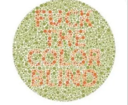
hue-rotate would probably be better?
Depends on the kind of colour blindness you have I guess. I think I have the congenital red-green blindness common among men, and saturate Just Works™ for me. Plus I don't have to fiddle with setting a rotation degree there.
Why?
Colorblindness is usually between particular colors (red-green, blue-green, red-blue), which is why they make those circle dot things in multiple colors. In most cases of colorblindness, if you swap the values of the red, green, and blue pixels correctly then it should technically not be a problem anymore, though it would be for someone with a different type of colorblindness
(am not colorblind though so this is mostly just an educated guess)
Is the hue rotate modifier as easy to add, though? I'd think the high saturation result would make the distinct fields merge enough to distinguish, even if they were also made black and white.