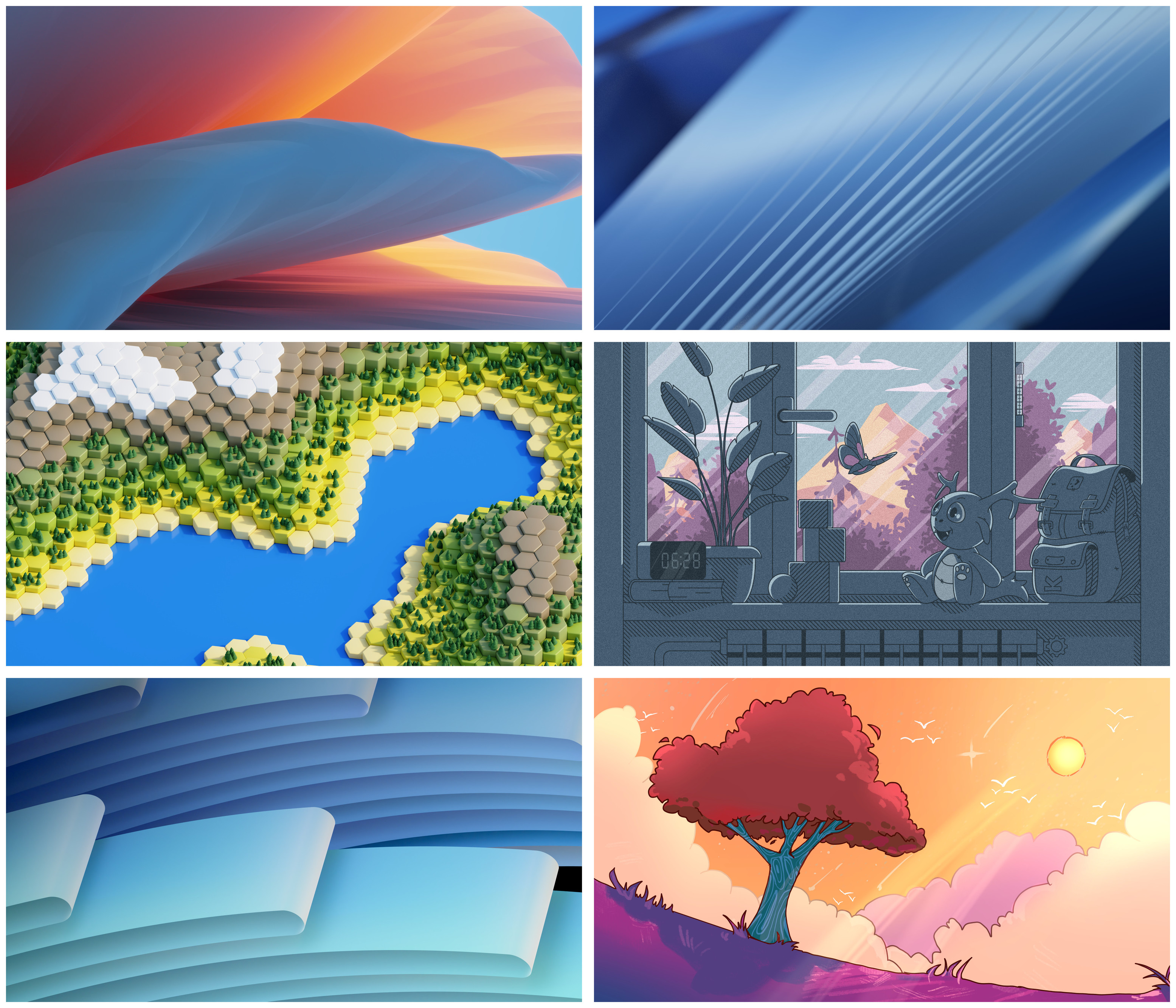
@[email protected] @[email protected] I think it's top left, but I'd love bottom right
KDE
KDE is an international technology team creating user-friendly free and open source software for desktop and portable computing. KDE’s software runs on GNU/Linux, BSD and other operating systems, including Windows.
Plasma 6 Bugs
If you encounter a bug, proceed to https://bugs.kde.org, check whether it has been reported.
If it hasn't, report it yourself.
PLEASE THINK CAREFULLY BEFORE POSTING HERE.
Developers do not look for reports on social media, so they will not see it and all it does is clutter up the feed.
Clearly I have weird taste but I don't find any of these appealing in the least.
Oooh, I love both middle right and bottom right, but I think I prefer middle right.
the bottom left one
@[email protected] @[email protected] Top left and middle right are my favorite, but please ship all of these!!! they're all great!
Top or bottom left
Hmm~ I would say that the bottom right one caught my eye, but I would go with the top left one as the default wallpaper. It looks sophisticated and clean. It depends on the first impression you want to give.
Middle right
Bottom right or middle right.
submissive right
@[email protected] @[email protected] you probably want to give them labels, so people can vote on them.
6
In order of preference, bottom right, middle left, and middle right.
I love the adorable and wholesome cartoons that KDE includes in its background collections.
Middle right, bottom right, and then middle left in that order. Anything else I wouldn't rank in any order because I don't like them at all.
@[email protected] @[email protected] The first (Waves) one is spot on, balanced on colours, closer to previous plasma wallpapers, I would be very happy if that's the default! Flow is also good, the rest, while interesting, are not qualified as good wallpaper. I know I'm probably a rare breed these days, who still uses desktop for actually storing things there and that affects my wallpaper choice a lot.
@[email protected] @[email protected] I really like the one with the tree but I think for the #Megarelease of Plasma 6 one of the abstract ones might be better.
@[email protected] @[email protected]
i *need* the one in the bottom right corner! :3 :blobhaj_hearts:
Ack mine wasn't chosen (well I wasn't counting on it anyway xP) Honestly middle right and bottom right caught my eyes the most.
The first one.
Def bottom right
Nice, top left as favourite for me, but all of them are pretty!
All of these are pretty good
Top left
they're all so good. the artists outdid themselves!
All should be included, but the right bottom is my favorite
@[email protected] @[email protected]
I have a simple solution. Just use multiple desktops. You can use all of them as default. 😃
Then you don't have to decide. 🤓
@kde @[email protected] Awww, all of them look gorgeous!😍
I'd like to have all of them as a wallpaper switching out one for the other every time I log in (I know there is a setting for it).
But if I had to choose: the bottom left one. ✨
@[email protected] @[email protected] The last one. I would really like to see a nice scene instead of the computer generated blocks and gradient
Middle left, middle right, or bottom right
6
Bottom left and top right are really good
@[email protected] @[email protected] Bottom right corner or the one above (with a lovely tiny creature 😄)
I prefer black backgrounds in general. Do these have counterparts for dark theming?
The only wallpaper I really liked after all these years is Haenau. Is it going to be dropped in 6? I really like simply themes, but the subtle constant change is a nice to have. It works with light AND dark themes.
