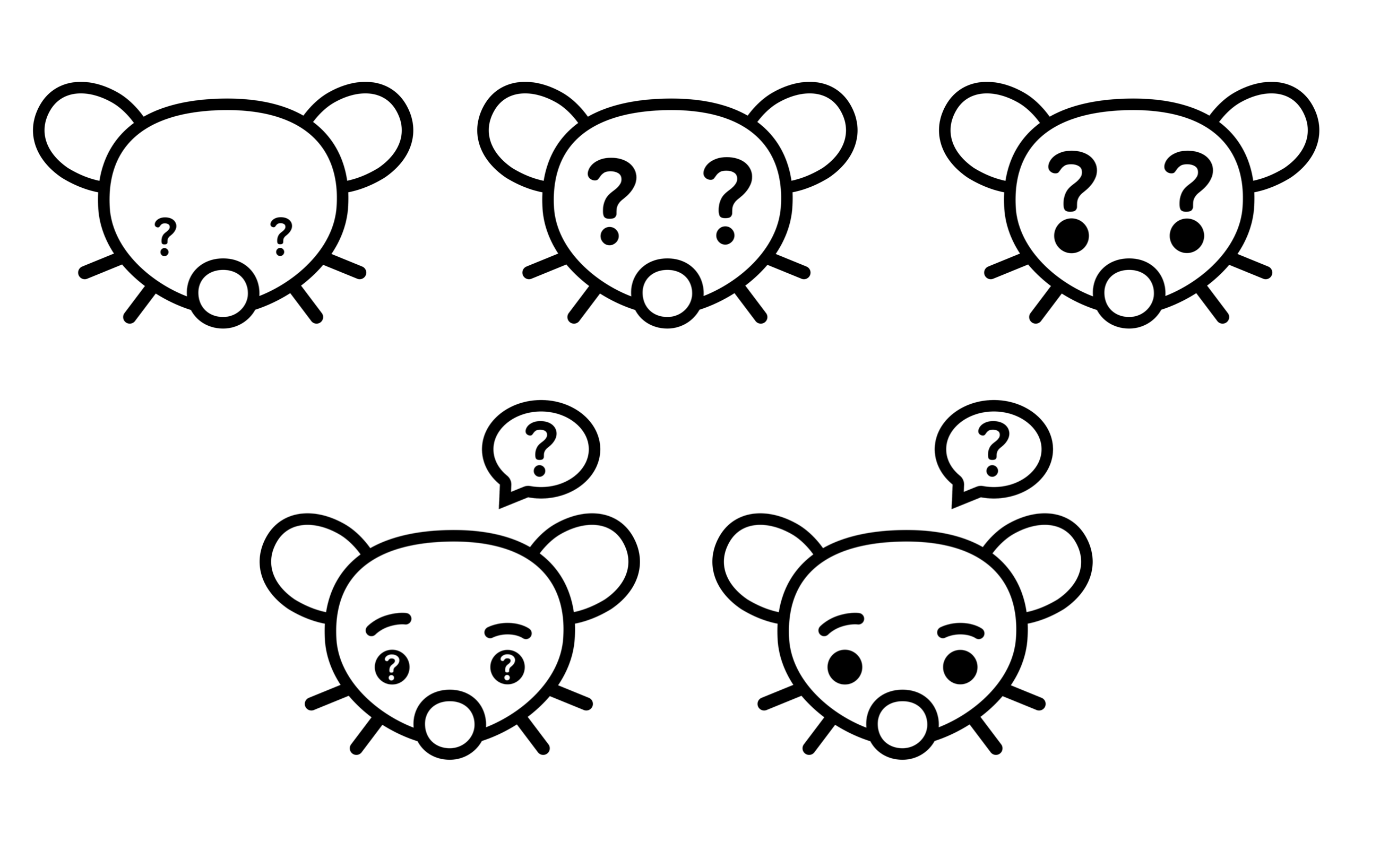
Why not keep it simple? Use the classic Lemmy logo but with question marks for eyes.
Ask Lemmy
A Fediverse community for open-ended, thought provoking questions
Please don't post about US Politics. If you need to do this, try [email protected]
Rules: (interactive)
1) Be nice and; have fun
Doxxing, trolling, sealioning, racism, and toxicity are not welcomed in AskLemmy. Remember what your mother said: if you can't say something nice, don't say anything at all. In addition, the site-wide Lemmy.world terms of service also apply here. Please familiarize yourself with them
2) All posts must end with a '?'
This is sort of like Jeopardy. Please phrase all post titles in the form of a proper question ending with ?
3) No spam
Please do not flood the community with nonsense. Actual suspected spammers will be banned on site. No astroturfing.
4) NSFW is okay, within reason
Just remember to tag posts with either a content warning or a [NSFW] tag. Overtly sexual posts are not allowed, please direct them to either [email protected] or [email protected].
NSFW comments should be restricted to posts tagged [NSFW].
5) This is not a support community.
It is not a place for 'how do I?', type questions.
If you have any questions regarding the site itself or would like to report a community, please direct them to Lemmy.world Support or email [email protected]. For other questions check our partnered communities list, or use the search function.
Reminder: The terms of service apply here too.
Partnered Communities:
Logo design credit goes to: tubbadu
Had some fun making these! I think my favourite is the last one. Thoughts?

My vote is on #5. Although it'd be cool if the rodent had a hand on its chin as if it were questioning itself.
Cute, I tried doing a little lemming paw instead of a hand but it just read as a blob
I like the last one the most (bottom right)
Maybe even no mascot at all and just the ( ? ) speech bubble from the bottom two. Its clean and people know what it means. In my opinion the mouse (or lemming?) is too cluttery and will probably not work well when its scaled to extremely small dimensions
Yeah, I think I agree. Just looking at the communities list the details definitely get lost from the smaller ones, as cute as the mouse/lemming is haha. Could be included in the page header still
I'm partial to #1 & #2 personally. Something about the tiny rodent eyes feels right to me.
definitly bottom right
#5 for sure!
@[email protected] You posted a request for mod applications earlier, then locked the post. Not sure if you realized that.
Yes, I realized that as soon as I did it. It was a mis-click on my part. Thought I fixed it.

