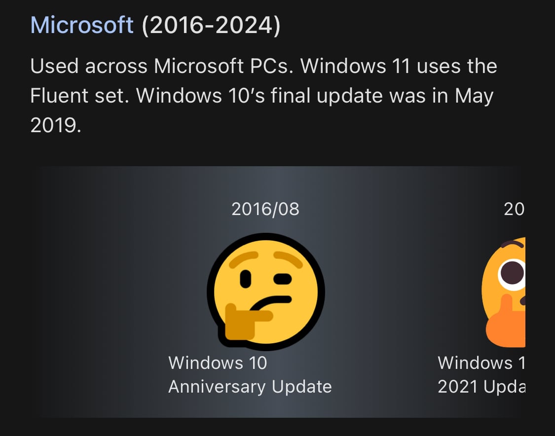
My favorite terrible emoji design is the thinking face Microsoft originally used:
People tweeting stuff. We allow tweets from anyone.
RULES:
My favorite terrible emoji design is the thinking face Microsoft originally used:
Why? 🤔
Because you can use it to show confusion. 😄
you can use this one in Ms teams with windows + dot. I absolutely love it it looks so stupid
Idk if you did this on purpose but the right eye of that thinking emoji lines up perfectly with the front facing camera on my phone and it gave him a monocle as I scrolled away
I miss the blobs so much
>.<
UwU
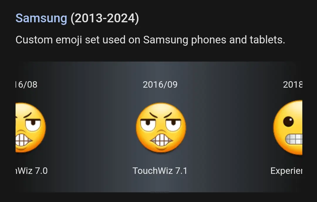
Ha how do I get that Samsung one?
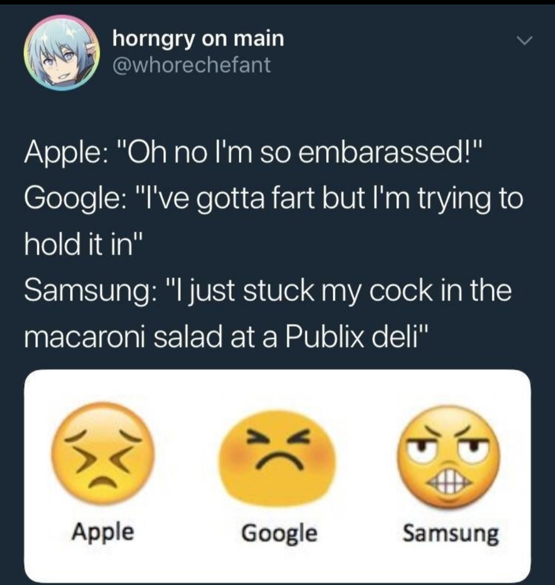
If there’s a Publix nearby, you already know what to do.
It looks like 😬 now.
It is now "I jammed my dick in a cheesegrater:
Fake news.

Google no longer has the blobs either, this abomination was replaced back in 2018
And it was actually the "😬" emoji, not "😣"
That's even worse... 😬 Is a very specific emotion, and one of the few emojis I like using
Yeah I love that emoticon. Still not as good as my fav tho, which can be clearly identified by scrolling through my account history. I use this shit way too much, but idgaf 😅
And why is it "i'm pooping" now instead of a flushed face?
I think it's funny that emoji were created to solve the problem of better conveying emotions, but now we're stuck with vastly different emotions for each emoji set.
The difference between platforms is pretty annoying. I really liked Windows cow face for discord reactions and then noticed it looked totally different on iOS or Mac.

And why is 🤷 not smiley stile? Can't really see what it's doing.
How does one shrug with no hands or shoulders?
Ok, but the hands are too small, can't see it there either.
¯\_(ツ)_/¯