1
Data is Beautiful
5088 readers
1 users here now
A place to share and discuss visual representations of data: Graphs, charts, maps, etc.
DataIsBeautiful is for visualizations that effectively convey information. Aesthetics are an important part of information visualization, but pretty pictures are not the sole aim of this subreddit.
A place to share and discuss visual representations of data: Graphs, charts, maps, etc.
  A post must be (or contain) a qualifying data visualization.

  Directly link to the original source article of the visualization
    Original source article doesn't mean the original source image. Link to the full page of the source article as a link-type submission.
    If you made the visualization yourself, tag it as [OC]

  [OC] posts must state the data source(s) and tool(s) used in the first top-level comment on their submission.

  DO NOT claim "[OC]" for diagrams that are not yours.

  All diagrams must have at least one computer generated element.

  No reposts of popular posts within 1 month.

  Post titles must describe the data plainly without using sensationalized headlines. Clickbait posts will be removed.

  Posts involving American Politics, or contentious topics in American media, are permissible only on Thursdays (ET).

  Posts involving Personal Data are permissible only on Mondays (ET).
Please read through our FAQ if you are new to posting on DataIsBeautiful. Commenting Rules
Don't be intentionally rude, ever.

Comments should be constructive and related to the visual presented. Special attention is given to root-level comments.

Short comments and low effort replies are automatically removed.

Hate Speech and dogwhistling are not tolerated and will result in an immediate ban.

Personal attacks and rabble-rousing will be removed.

Moderators reserve discretion when issuing bans for inappropriate comments. Bans are also subject to you forfeiting all of your comments in this community.
Originally r/DataisBeautiful
founded 2 years ago
MODERATORS
2
cross-posted from: https://lemmit.online/post/4821847
This is an automated archive made by the Lemmit Bot.
The original was posted on /r/dataisbeautiful by /u/ptrdo on 2025-01-03 03:39:05+00:00.


4
In the UN General Assembly, do some countries consistently vote the same way?
This plot lays out patterns of similarity in voting behaviour in the decade starting in January 2015. Countries that are close together in space on the plot tend to be similar in their voting.
Clearly the countries are divided and united by certain political themes, but the analysis is blind to these: all it sees is the votes themselves, not the topics voted upon.
Nevertheless, it has picked out a cluster of European nations in the top centre, joined by Ukraine and, more loosely, by Japan, the United Kingdom, New Zealand and Australia. The United States and Israel are a pair of outliers, voting almost identically to one another and often very differently from the rest of the world.
The technique used is logistic PCA, a decomposition method for use with binary data. Data is from the UN digital library. Visualisation done in R.

5
111
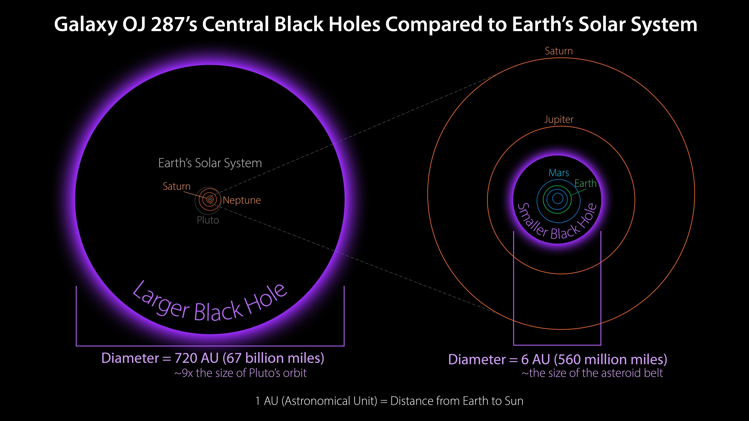
The size of two supermassive black holes at the center of a distant galaxy relative to our solar system
(lemmy.world)
Two supermassive black holes are locked in an orbital dance at the core of the distant galaxy OJ 287. This diagram shows their sizes relative to the solar system. The larger one, with about 18 billion times the mass of our sun (right), would encompass all the planets in the solar system with room to spare. The smaller one is about 150 million times the mass of our sun (left), which would be large enough to swallow up everything out to the asteroid belt, just inside the orbit of Jupiter.
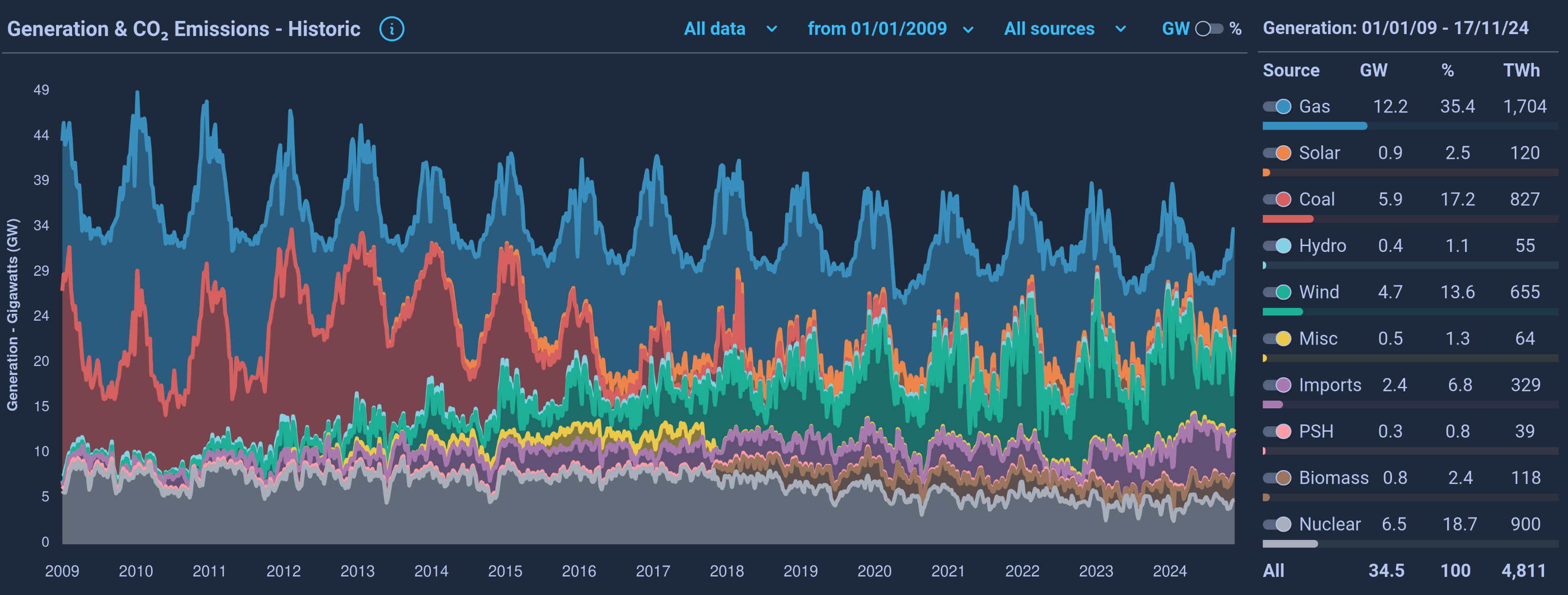
6
cross-posted from: https://lemmit.online/post/4604659
This is an automated archive made by the Lemmit Bot.
The original was posted on /r/dataisbeautiful by /u/Lionheart9207 on 2024-12-07 08:40:16+00:00.

7
143
9
10
cross-posted from: https://lemmy.ml/post/22680392
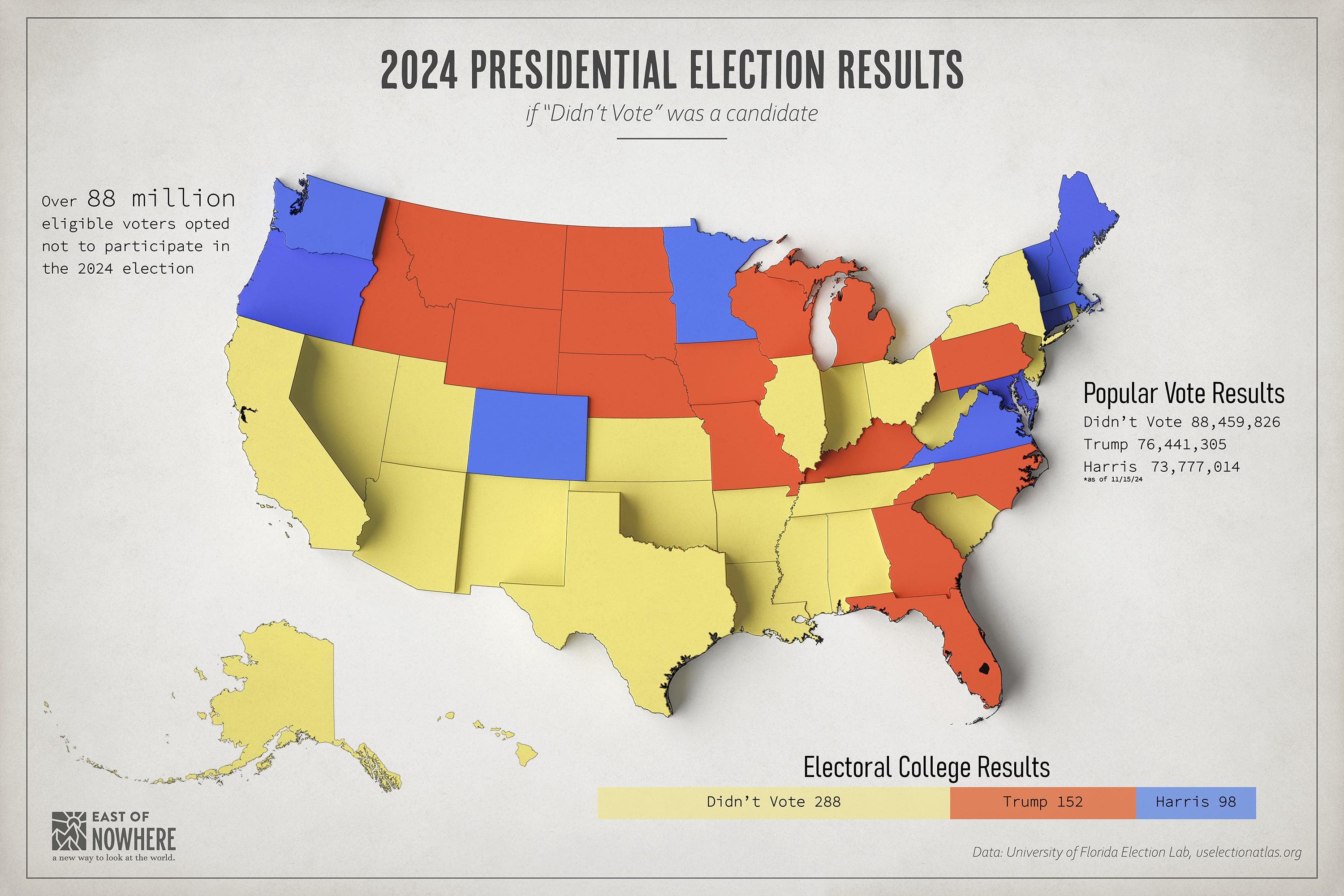
Thinking of red states vs blue states is busted. Plenty of good visualizations of this over the years, but this election in particular feels really important to point out "We" did not chose this.
When I say we I mean registered US voters, but even less so citizens, and even less so again residents.
Even of the voters who did vote for the GOP candidate, who can say how many really wanted him or his policies vs they just didn't want more of the status quo Dems.
The popular vote tallies in this graphic are out of date too, He definitely didn't win in a landslide the way it can appear with red and blue maps. His win in the popular vote was also pretty small now that more votes have been counted. https://www.thenation.com/.../donald-trump-vote-margin.../
So, what if Biden used broad immunity SCOTUS granted to declare a crisis of democracy - That between massive disinformation campaigns by enemies both foreign and domestic, voter suppression, as well as many other factors, the will of the people can't be discerned from our recent presidential election. That it would be a dereliction of duty both to the people and to his oath to defend the constitution to hand over power to someone whose clear and declared intent is abuse the power of the office to fundamentally reshape or demolish our republic based on this highly suspect and incomplete result (remember, most people didn't even vote)
Here is my off the cuff proposal for what to do after that
A new election, everyone must vote. Trump and Harris on the ballot, but each major party must offer 2 candidates, and we're using Ranked Choice Voting. 1st place gets presidency, 2nd place gets VP.
Biden almost certainly won't do anything like this. He is clearly a coward with a stupid sense of optimism - a "things will be just fine, no need for any drastic measures" ever, mentality, and despite some rhetoric has shown no signs that he thinks there is anything to actually be concerned about from the party which has veered hard towards fascism. But, hey, a guy can dream.
11
12
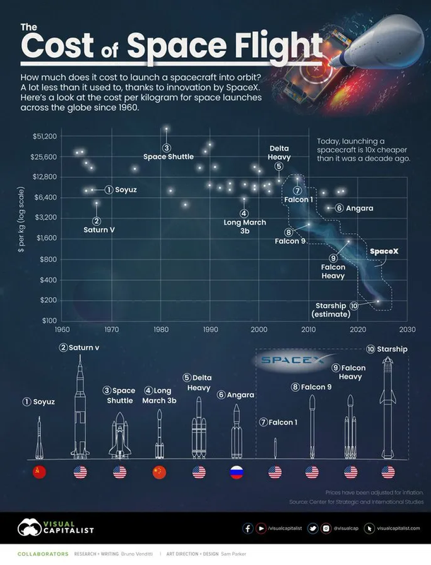
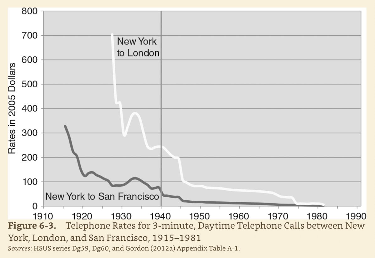
28
10x cheaper than in 2010, and 40x-100x cheaper than in the 90s. It'll probably continue to decrease.
(i.postimg.cc)
13
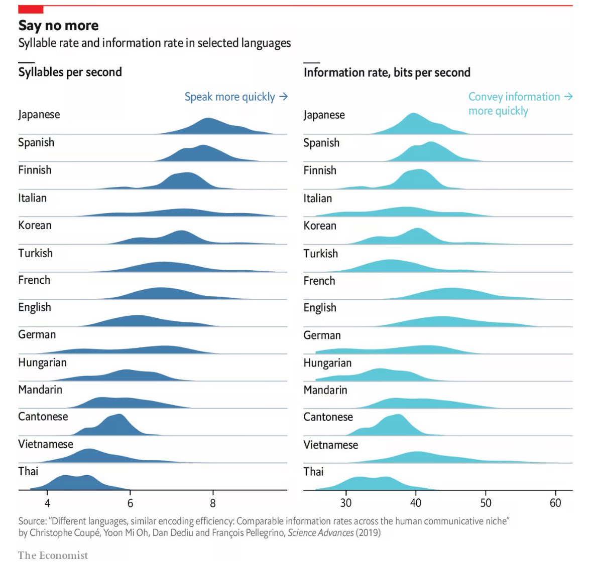
15
16
17
518
It's fascinating that while languages vary wildly by speaking speed, information transfer is fairly similar.
(lemmy.world)
19
304
Number of False claims of "rigged election" or "election interference" by Trump before the last three presidential elections
(lemmy.blahaj.zone)
More like Data is Scary than Data is Beautiful.

20
It's been trending this way for years, but seeing it graphed out like this is shocking.
What do you think are the effects of this drastic change?
22
23
37
Link to website: https://whatif.sonycsl.it/15mincity/index.php
cross-posted from: https://slrpnk.net/post/13859498
I'll note that in the US, their urban area definition includes a lot of outlying and substantially unpopulated areas which fall within county boundaries; these areas tend to show up as having long travel times to services.

24
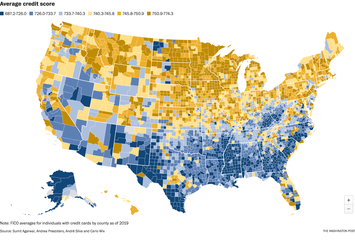
The image is from a Washington Post article which took the data from an interesting research paper titled Who Pays For Your Rewards? Redistribution in the Credit Card Market.
The research paper is a good read. (A free PDF of the whole paper is available at the link.) It examines how the use of rewards credit cards results in a massive wealth transfer from low-credit-score customers to high-credit-score customers:
We estimate an aggregate annual redistribution of $15 billion from less to more educated, poorer to richer, and high to low minority areas, widening existing disparities.
The Washington Post article attempts to frame the clear north-south split as a result of healthcare issues in the south. That explanation seems too narrow to me. This map looks too similar to maps of poverty and education, and we know health correlates strongly with both of those issues.
Edit to fix a sentence fragment. Sorry; it was late and I was tired.
view more: next ›