
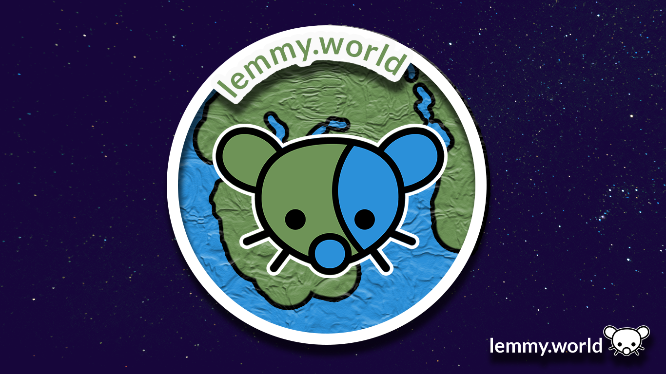
Here are some proposed graphics.


EDIT: I've now made a repository on GitHub, so that you can download the graphics and use them for your communities and projects. There's even an Etsy store selling stickers now.

Welcome to the official Lemmy.world Support community! Post your issues or questions about Lemmy.world here.
This community is for issues related to the Lemmy World instance only. For Lemmy software requests or bug reports, please go to the Lemmy github page.
This community is subject to the rules defined here for lemmy.world.
To open a support ticket
You can also DM https://lemmy.world/u/lwreport or email [email protected] (PGP Supported) if you need to reach our directly to the admin team.

Here are some proposed graphics.
EDIT: I've now made a repository on GitHub, so that you can download the graphics and use them for your communities and projects. There's even an Etsy store selling stickers now.
I like the last two, although the "world" part is less obvious.
Trying to get a picture with smoother anti-aliasing for the site logo. The jagged edges really bug me.

SVG file: https://pastebin.com/6ywmisZK
Good edit. Thing is, I think there's some compression going on in the backend, so even with an .SVG file, it might be somewhat complicated.
I'm going to probably make a quick GitHub page for the editing files with an .SVG, so the mod team, admin team and community managers can access all the files and edit them to spec.
But you're right: the pixelation on the edges is causing my artist OCD to flare up. Good suggestion, Margot!
No problem!
Adorable, I love the ones with the earth in the background.
Am I the idiot or is it really a penis next to its right cheek on the images with the globe? Maybe both.
Oh dear. Now that you mention it, I kinda see it too. Thanks for the flag: I'm... going to give it a think about how to shift it so that... isn't there. Maybe in the second version.
Everyone should start setting this to their profile picture on Reddit before we bail out forever. :)
I like the bottom one I think. And number 3.
Why a mouse? Seems a few Lemmy instances have a mouse as a logo / mascot.
Ah! It's an inherited piece of artwork, based on the mother instance, err, or the original instance of Lemmy.ml and the open source project itself. It's a bit of a nod to the musician, the Mario character, an old video game, and, of course, the adorable critter.
Excellent to know. Thank you!
The Mario character is named after the musician, so I found that point odd when I first read it.
It won't help anyone to make a choice, but I love them all !
I personally like the little lemming logo, but there could be a benefit of a more universally liked aesthetic that isn’t a rodent.
Does lemmy have polls? It could be useful to see which one people like the most
looks clean and nice. good work.
Love it!
#2 looks a bit forced imo. #1 is better.
love them! much better than the current one id say, its got too much going on.
Ohh.. I really like these! If you want to do a banner for [email protected], that would be awesome! We need one...
I'm digging the 2nd one. I like the 3D effect, though fear that it would be lost on smaller versions of the logo.
I miss the old logo. It looked very old internet. The kind of thing I'd see on the cover of a vaporwave album.
congrats but did you at least get a shoutout?
Oh! I got a shoutout on Mastodon.
With all of the bits and bobs in flux, it's all good. I'm already noted on the Mastodon instance and on the blog, and for other projects, so it's all good.
We're probably due for a monthly update in late July, when things quiet down and things get sorted. So, I think a shoutout makes the most sense then (or maybe later).
Here’s the logo with a brighter palette. In fact it was created using Mastodon Purple (#563ACC) as the root color for the new blue, and green colors so that "Ruud Worlds" harmonize.
Blue: 0/131/246
Green: 0/158/85

Very cool!
I've now made a repository on GitHub, so that you can download the graphics and use them for your communities and projects. There's even an Etsy store selling stickers now.
I like the first one!