this post was submitted on 03 Aug 2023
95 points (75.1% liked)

AssholeDesign

7566 readers
5 users here now

This is a community for designs specifically crafted to make the experience worse for the user. This can be due to greed, apathy, laziness or just downright scumbaggery.

founded 1 year ago
MODERATORS
 

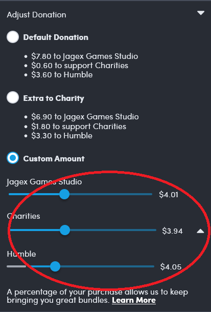
The amount going to Humble is the most, even the the Humble slider is the lowest.

all 38 comments
sorted by: hot top controversial new old
[–] CustodialTeapot 69 points 1 year ago (2 children)

Asshole design being incorrect again and even misplaced. Classic.

Humble is still the best place to buy games to support Devs and charities.

5% to charity is still higher than 0% like all other market places. They still have to make profit and support the staff that work there... They themselves aren't a charity.... Come guys.....

Also, they have the lowest cut take compared to all other market places. Steam, epic, Microsoft, they beat them all.... AND you can get steam keys from them.

If you ever have to buy a game on steam. Buy it from humble to better support the dev. Stop crying that everything isn't perfect, is still better than the rest. What's more annoying then shitty captilism is misplaced anger and uneducated consumers.
[–] [email protected] 34 points 1 year ago (1 children)

The slider for Humble is furthest to the left, while also being the highest cut of the pie.

That's pretty fucking asshole design. You don't get to claim you're doing something "for charity" and then use psychological tricks to convince people to give more money to you. That's not doing something for charity, that's claiming charity as a marketing gimmick.

[–] Red_October 13 points 1 year ago (2 children)

Exactly, the Humble slider should mean the lowest but instead they get a whole 11 cents more than the Charity option, and 4 cents more than the developers. It's preposterous. When the sliders are that close, yet there's a whole 3% difference, it's Asshole Design. Obviously the best answer is to use some other service that doesn't even bother giving anything to charity at all. The good can get fucked, Perfect or Nothing.

[–] [email protected] 3 points 1 year ago

I vouch for a bit more nuanced.

These sliders are either a software bug or asshole design. That doesn’t mean the entire site is crap.

Other sites can have asshole pricing or asshole customer support humble clearly is a net plus even with this flaw.

[–] [email protected] 44 points 1 year ago (1 children)

Regardless of if this is intentionally designed to be misleading, a stack of sliders is the wrong way to show portions of a whole. I wonder what a better way would be for the web? A single slider with multiple knobs? Or like a single stacked bar with draggable boundaries between sections? I bet you could accomplish that with multiple sliders and some CSS to make them look like a single thing

[–] [email protected] 21 points 1 year ago* (last edited 1 year ago) (2 children)

Just checked the website. Your interpretation (and nine) was incorrect.

The publishers and charities sliders and connected, so they split up a total between the two. The Humble slider is independent (or connected to a referral in a similar way).

There should be some kind of separation here. I’d go so far as to say there should be a text explanation.

The other issue is that they’re absolutely no indication that spiders can affect each other, when using a screen reader. There’s no feedback for a slider you’re not adjusting.

[–] [email protected] 4 points 1 year ago (1 children)

All 3 are connected. If you have Humble at minimum and lower one of the other 2, the humble slider increases along with the one you didn't slide. Keeping humble at minimum while fine tuning the other 2 is really fiddly.

I set up a monthly donation to charity:water when IGN first added the sliders, before they lowered the humble minimum. It used to be 50%. So now a charity gets a bit more than I was donating through humble, and I spend roughly the same amount buying games elsewhere. I get a bit fewer games, but I play all the ones I buy. /shrug

[–] [email protected] 2 points 1 year ago

Sorry, kind missed this. Yeah, there’s some weird stuff going on.

It’s more than fair to focus your perspective on Humble on how they deal with charity and move your resources elsewhere.

[–] betterdeadthanreddit 3 points 1 year ago (1 children)

Now you've got me wondering whether a client-side change would work to unlink the sliders and set them all independently. Could just be sending one value (the Humble slider's position with the other two determined by splitting the remaining percentage) but if all three values are submitted and pass whatever validation takes place on the server, this could be fixable. No argument that it's a shitty design though.

[–] [email protected] 3 points 1 year ago

You could check your browser’s dev tools network tab and inspect the request. There isn’t much “hacking” you can do here though. If you send a low enough total amount, you just won’t get the games. If you send a higher total amount, you’ll get charged for it. This interface comes before the checkout proper.

It would still be interesting to get some insight on how this works though.

[–] leekleak 15 points 1 year ago (1 children)

More so bad implementation of a feature. Would be surprised if they actually cared about the sliders being slightly incorrect when most people slide the humble and game studio to the minimum and charity to the maximum...

[–] zkfcfbzr 3 points 1 year ago (1 children)

It took me a bit of staring to realize what OP was complaining about - I think it's that 0 is at the right for the slider, not the left. So they're not slightly incorrect, they're reversed, with the implication being that someone absentmindedly trying to donate nothing will donate everything

[–] Selmafudd 13 points 1 year ago* (last edited 1 year ago)

Narh I just checked, $0 is on the left. This issue is the dev and charity slides start at $0 but the humble slider has a minimum (for me it's $2.67 but I assume it's different for each currency) so when the slider is moved by adjusting one of the other sliders it's just calculated as if the slider is 0-100% instead of something like 5-100%... Pretty easy mistake to make

[–] PierrAlex 8 points 1 year ago

In first glance I missed the point, humble is far on the left compare to other but stay the most paid service.

[–] [email protected] 6 points 1 year ago (1 children)

Deleted my account years ago when they capped donations to charities but not themselves.

[–] psycho_driver 0 points 1 year ago

Just IGN doing IGN things.

[–] [email protected] 3 points 1 year ago

As long as all 3 can slide down to 0, I really wouldn't care. Otherwise I'd back out of that site and never return.

[–] [email protected] 1 points 1 year ago

This is the sort of thing the law can’t keep up with. Markets do this better. I bet someone could make a “no ui bullshit” certification and then websites could display a little badge. Like LEED, but for websites and with regard to protecting the user’s sanity and trust.