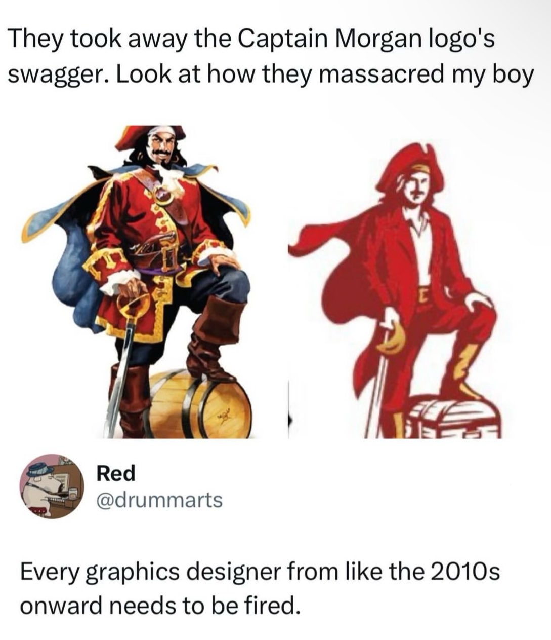
Why did they replace the barrel with a chest? Come on guys, this isn't hard. The barrel is rum, the rum is the treasure. Smh
People tweeting stuff. We allow tweets from anyone.
RULES:
Why did they replace the barrel with a chest? Come on guys, this isn't hard. The barrel is rum, the rum is the treasure. Smh
And why the fuck is he wearing a suit?
I think it clearly pictures the company CEO's values. The suits and their chest full of profit money they want to keep all to themselves.
For people who aren't aware, Henry Morgan was a legendary pirate who used his pirate booty to purchase sugar plantations in Jamaica to produce rum. Eventually he became so wealthy and famous that he was appointed the Colonial Governor of Jamaica.
He wasn't a 20-something guy in a nightclub with a popped collar.
To be fair, he's now basically a cartoon character who is used to promote the sale of cheap flavored rum. So...
And I'm sure there was nothing going on there but well paying jobs for the local inhabitants. What a cool guy.
Oh yeah no, the dude was a slave owner and a piece of shit. Let's also not forget what a pirate literally is. He was not a good dude. But he was famous and was subjectively kinda a badass in a historically contextualized perspective.
Everyone else has done the in-depth design analysis already, so I'm gonna say what's really on my mind:
They made him less fuckable. I would never put the new Captain Morgan logo on my "hall pass" list.
Best analysis in the thread.
Ok I'm in a waiting room super bored so forgive my ridiculous takes, but the second one is probably a better logo even if the design is worse in a bunch of ways.
So, first lets look at Morgan as a brand. It's a known brand, but not exactly top shelf stuff. From what I can find, they seem to be trying to change that, moving into the ready-to-drink and doing a bunch of social media stuff. they've moved from using artificial vanilla flavor to real *Madagascar vanilla* which is definitely more marketable no matter if it actually tastes better or not.
So as part of that they've redesigned basically all their labels and that means they need vibe with the modern upmarket design trends which right now are to use more type and negative space, and to ape design from the era around the 50s and maybe 60s. It goes with the current retro packaging design trend but doesn't alienate older people like the 70s based stuff, which is usually aimed at a younger market segment. It's old enough to feel "classy" even if the customer is old.
As part of that, the large illustration doesn't fit. Printing full color like that in the era it's aping was expensive so it feels out of place, and you just don't have space for it if you want a clean look. So it's got to be way smaller. The old label has the illustration as basically the main focal point - it's huge. The new one has it as a small design point. The illustration just doesn't work at that size. On a little 50ml bottle it's going to be like 4mm high. Here's a photo I found.
The new one actually reads pretty similar even though it's like half as tall and only uses 2 colors. When it's on a bottle that small and sitting next to Admiral Nelson and Lady Bligh which still use big full color illustratons on their labels can you tell which one is which?
But here's the thing, the captain isn't even actually the logo. The logo is the name, it's the same logotype. They didn't change that. They changed the mascot. It's pretty important to note that there's a big difference. A logo basically is your branding. It needs to work at any size, in any medium, and be instantly recognizable. That generally means it needs to be pretty simple. The Morgan logotype works great as a logo, but the mascot until now really didn't. You can tell because if you look around there are about 50 different versions because the big full color illustration doesn't work more often than it does. The new one will.
With all that defense I will say there are a few kind of dumb moves. The treasure chest is clearly a terrible idea. Like, if they were swapping it in on the non-alcoholic lines it would be kind of great but on everything it's dumb. And I definitely would have fought for a puffy shirt instead of the collared one, if nothing else than for historical accuracy - I don't think you can even wear shirts if the era unbuttoned with a collar like that. Edit- honestly they might be going intentionally anachronistic so that you can "cosplay" as the captain easily. Do the pose, hard cut to the captain logo, it writes itself. Which would be kind of clever but if that were the case I might have pushed the whole thing to be slightly more androgynous.
Anyway, I keep seeing this take over and over again, that everything is moving to minimalist blobs for logos, and while sometimes there's definitely a point (the cross branding for Google's apps on Android come to mind) a lot of the time there done just like this - with two large copies next to each other. And when you frame it like that of course the detailed one will look better. But when your logo has to shrink to 32x32px on a crappy Android phone or be printed like 5mm wide in black and white the simpler one is going to look way better.
Anyway thanks for coming to my Ted talk I guess.
Tldr: the guy isn't the logo he's the mascot and the new one can be printed small.
This is all true. But he still looks like David Arquette instead of Dustin Hoffman's Hook. They could have retained his swagger even with a simplified look.
It's really just that he looks depressed now. Shoulders back, hips forward, and it's 100% better.
I really dislike the collar shirt. I, too, suspect cosplay encouragement, but it really ruins the scallywag vibe
It's only better as a logo because it's a vector image and can be printed on everything. It's worse in every other way, and they could have vectorized the original Captain without making him a narrow shouldered dweeb.
This guy either rums or markets. Maybe both. Possible pirate and/or parrot and sabre enthusiast.
We found one lads, quick grab him before he slips back into the art cave
Old boy is about to pop open that keg and have a great time with the guys.
New dude is pondering investment plans to maximise return on investment from that treasure chest.
This is the definitive proof that money doesn't bring happiness.
Went from a pirate to a port town customs agent
From Captain Morgan to some guy named Mike
He's a web designer and just threw this together for Halloween because he got a surprise invite to a party.
He looks like a business major
I'm a business/accounting grad and I can verify business majors look like this.
It's the shitty contagion of Flat design. Back around 10 years ago or so, the Flat craze began and everything that had details or depth was pounded down into simple flat design. Now everything has to look basic and boring, and it sucks.
This doesn't have anything to do with flat design. It's the fact that people take hammers and look at everything as a nail and go pounding things. Everything like this is a "contagion", people just latch onto hot button ideas and go crazy. Flat design in itself is fine, and extremely beneficial for what it was designed for, it's just overused because people chase trends.
Before flat it was skeumorphism and that was even worse. You had everything in tech trying to look like real things which made things way too busy and hard to read. And then people tried to make it work on tiny phones with low res displays and it was difficult to use.
Hence, flat design was born as a solution. It made icons easy to read on tiny devices. And it did a good job at that. It solved a problem and did it well and everything was well and good.
The problem was the next step where people decided they needed "consistent branding" so they did it on their website too. And then their marketing materials. And then their products. Then you had a problem.
Flat design works well for what it was made for: iconography. And for legibility of small UI. But it's not for everything. But people can't think for themselves and solve different problems in different ways. And Google made it easily available everywhere. And people picked that up and use it everywhere. And THAT is the problem.
The new one looks like he'd schedule a meeting to all agree on a timeline for the plundering of the next shore to "move forward"
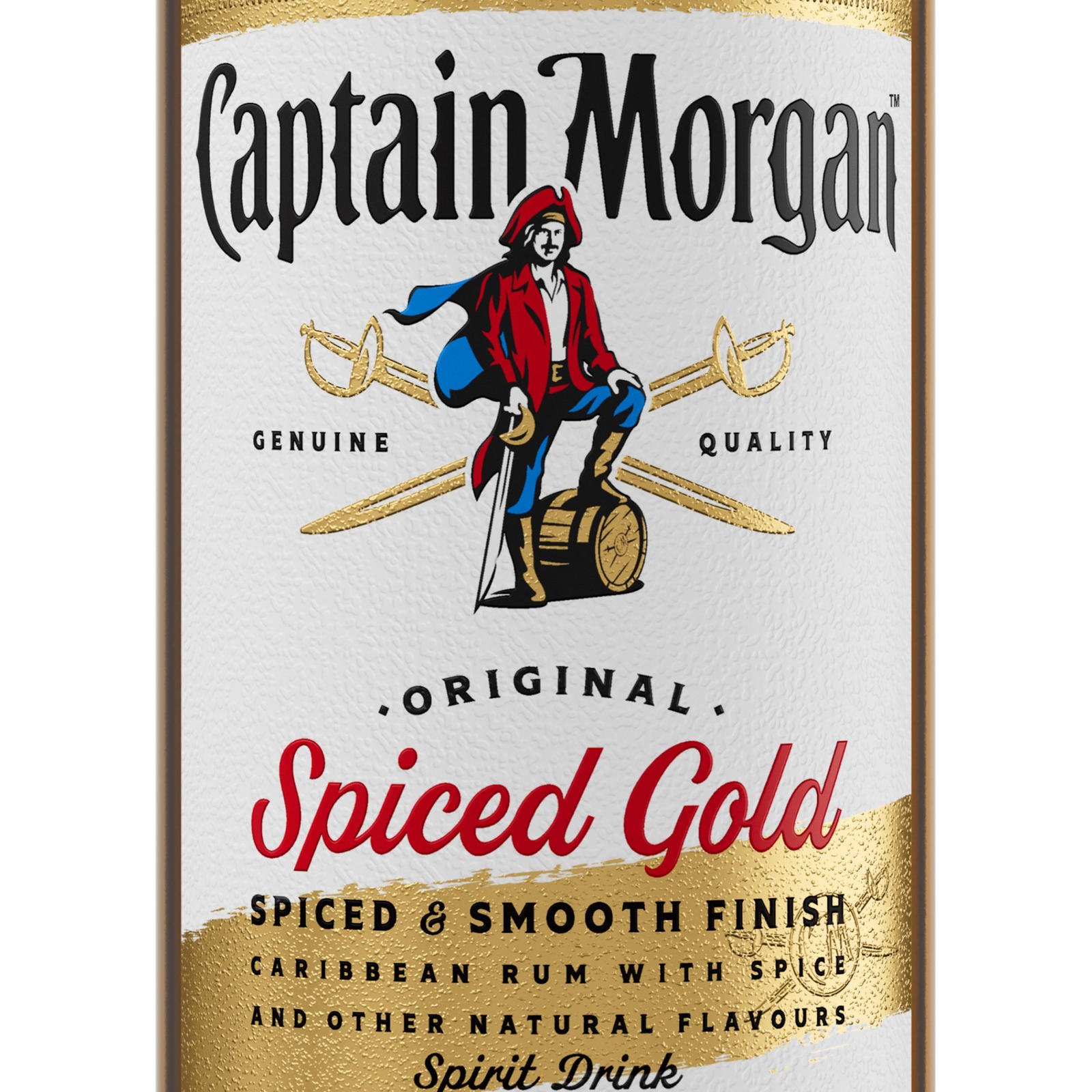
This is the new Spiced Gold label. They did keep the barrel instead of changing it to a chest, but overall it's not exactly what I'd call an improvement. They had the equivalent of Dustin Hoffman's Captain Hook as their logo and they replaced him with David Arquette
Edit: also, he's holding his sword like it's a cane. Wtf lol
It looks like he's holding the guard instead of the handle. I don't get it.
The logo kinda makes sense for the alcohol free version:
https://media.captainmorgan.com/media/ix0gstkf/captain-morgan-gb-0-0.png?mode=crop

A graphic designer in this case is really following orders from a long command chain, I assure you
My guess is this saved somebody money.
Simpler design = fewer colors = lower printing cost.
Sometimes this can just be ink cost. Sometimes it can make discrepancies between printers less noticable.
Could still be the other things too
I heard somewhere before that often these simplistic logo changes are due to how they look on thumbnails, mobile devices etc. Unsure of the evidence there but it made sense to me. I still hate it though.
Generally it's not much savings if any to do more than 1 spot color instead of full process cmyk. It might even be more expensive since it's a new setup for the printer. Given the volumes they're printing at it's probably basically a wash.
Left: I just sacked Panama Right: We had already been at peace with Spain for 2 weeks
Why is the new one Ryan Gosling playing a near-mute emotionally troubled man who dresses as a pirate?
less ink colors when printing. they are pinching pennies everywhere to deliver more profits.
Is that a cape, or a piece of cloth stuck to his back? It looks so weird.
It's a "kick me" sign.
From Tim Curry to Orlando Bloom. A disgrace all round.
That is not an improvement.
Of all places, rum bottles ain’t the place for flat design. One reason why flat design is often used is that it does well small as big, especially on a computer monitor.
Captain Morgan is a character that takes up the entire rum bottle. There’s never an instance where the Captain Morgan character is going to be as small as a fingernail.
And for some reason this designer felt the need to make the colors mute.
At least they really nail the cheap rum feeling.
Version on the right has poor posture and almost certainly plays bass.
I hate this oversimplification trend with logo
He does not 'got a little Captain in him.'
How will I know this is saucy sauce if the cap isn't looking saucy? Frankly dangerous.
