Photo Critique

406 readers
1 users here now

A community to critique photographs and learn from others.


Rules

Trying to create a similar space to /r/photocritique

founded 1 year ago
MODERATORS
26


It’s been several decades since I’ve opened my photography up for critique. I was a photography major back in the day and gave it up as a professional track so i could feed and house myself. I now really only share my photos with three friends. But there isn’t much in the way of actionable feedback - I’d love to hear your thoughts.

This photo was taken on a piece of white paper under a skylight on a cloudy day with my iPhone. I made a few small edits to bring the reds out (such a hard color to get right in digital photography).

27


Hey all, looking for feedback on the edit here. Obviously lots of noise, not too much can do about that, but is the farm visible enough? Is there anything can do to make it pop more? Any and all feedback is appreciated!

28


Hey all, I'm a hobby photographer, took this one a couple days ago and can't seem to structure my own opinion about this snap.

I'm trying to convey the feeling of experiencing a sunset, but I don't think sunset is very well expressed in this picture. I tried to boost the colors a little bit to help, would love some feedback on best practice for that.

Also not sure if I've chosen the best crop, but that's somewhat secondary for me. Any and all feedback is welcome, I'm new to this whole Lemmy thing, here's hoping it goes well!

29


South India, viewpoint in the mountains near Yercaud.

Used the auto-focus which adjusted on the bushes behind the monkey, leaving the monkey unfortunately out of focus. I like the atmosphere of this photo, although it took some exposure adjustments in the editor to get it this way.

spoilerThe Macaque is facing towards the camera.

.

Fujifilm X-T100, XC15-45mmF3.5-5.6 kit lens

ISO 200, 1/150s,f/5.6

30
10
Taipei - Taiwan (lemmy.world)
submitted 1 year ago* (last edited 1 year ago) by Krob to c/photocritique


This is a photo I took recently enough. What I like about is how your eyes get drawn to the yellow taxi. Despite being quite a busy with all the lines and leaves there is a certain kind of calmness in the shot. What could make this shot better for me is if there was just a little bit more going on around the taxi maybe someone getting in or out. I'd be curious to here your thoughts.

Camera: Minolta CLE

Lens: M-Rokkor 40mm F2

Film: Fujifilm 400H

31
3
[META] Logo? (self.photocritique)
submitted 1 year ago by Labotomized to c/photocritique


We need a logo for our community! I have 0 skill when it comes to logo design or anything like that pretty much. I asked ChatGPT to make one and it came up with a pretty good sounding design with some pretty thoughtful elements

The logo features a camera lens as the central element. The lens is depicted >in a simplified and geometric style, with clean lines and rounded edges. It >symbolizes photography and serves as a visual representation of the >community's focus on critiquing photos.

Surrounding the lens, there are three speech bubbles, each representing >conversation, feedback, and critique. The speech bubbles indicate the >interactive and collaborative nature of the community, emphasizing the >importance of communication and discussions around photography.

The color scheme of the logo is a combination of vibrant blue and crisp white. >Blue represents trust, reliability, and professionalism, while white adds a >sense of purity and clarity. The contrast between the two colors enhances the >visual appeal and legibility of the logo.

I think that's a pretty good starting point but I'm down for whatever! I think it just looks weird with no logo! Any other ideas are TOTALLY welcome!

32
4
Speed boat (lemmy.world)
submitted 1 year ago by yenahmik to c/photocritique


Part of me absolutely loves this picture, but part of me thinks maybe I should've done something differently. I'm interested to hear others thoughts.

Things I like:

  • I really like the contrast between the dark water and the brightness of the cliffside.
  • I also like the way the wake behind the boat appears

Things that could be improved:

  • Would it be better if the boat was on the right side of the frame? I feel like where it is right now cuts off some of the wake and detracts from the photo.

  • Also, while I like the division between light and dark, should it be framed higher so there is less of the water and more cliff? It just feels like a lot of the water is dead space to me.

33


Shot at 55mm, f/10, 1/160th, ISO 100.

Last summer, I went over to Lighthouse Park with the intent of getting some shots of the ferry underway. I decided to include the pier, as it and the fishermen add a bit more life to the shot.

34
 
 
35


This one here is one of my all-time favorite interior photos. I absolutely love the gigantic windows and hate to think how expensive something like this would be.

As for the photo, I like everything about it. The staging was fantastic and the colors and design of the space works so well. I feel like these interior type photos are hard to critique because I really didn't do much work to get this photo. Just tripod positioning and the thought process to decide this was a good angle to capture.

I do think i should have raised the tripod. There may have been something preventing me from doing so. I know there was a catwalk style walkway overhead and maybe that ceiling line was butting into the frame when the tripod was higher...who knows! This photo was taken at least a year ago, but I think it's a great one to share!

36
3
Rainy Night 1 (lemmy.world)
submitted 1 year ago by Labotomized to c/photocritique


This one right here is one of my most recent favorites. A couple weeks ago on Memorial Day weekend it rained the entire few days. So what better way to make the most of the rain than taking photos! I went to a local college that has a few very old, historic buildings ( a favorite subject of mine) that I'd been considering photographing for quite a while. And it was finally the time.

I set out with my rain jacket on, boots laced tight, and a grocery bag wrapped around my camera and lens to hopefully protect everything. I used a 1/8 promist filter stacked on top of a 1/4PM because I'm on a budget and can't afford a more dense mist filter just yet. These are also 72mm filters on a 48mm lens which just looked hilarious, but as you can see the results are pretty good!

Things I like: everything? but more seriously, my favorite part of the image has to be the red streak of brake lights directly over the bench on the right side of the frame. I wanted to show the bench in the photo but not bring too much attention to it and I think the red streak guides the eye over there and makes you wonder just a bit.

The glow and color of the lights inside the building are also just wonderful to me. I love some good lights! And the color of them was perfect for the atmosphere I was going after.

Things I don't like: I think the area in the middle of the frame is kind of uninteresting and needs a subject like someone strolling through with an umbrella and maybe walking a dog...that sort of thing. In order to mitigate this I tried using a wide ratio for the crop and I really think it works. The crop kind of makes two photos that are tied together by an uninteresting middle part that your eyes walk back and forth between to get to the more interesting parts of the image.

Anyways give me some feedback! What do you like? What do you not like? Do you hate it? All thoughts are welcome! :)

37
7
Burrito (lemmy.world)
submitted 1 year ago by Labotomized to c/photocritique


This one is a bit of a weird one for me. I don't usually photograph vehicles but this one really stood out to me mainly because of the license plate but it's also just a beautiful bike!

Anyways I really like how the light is shining off of different parts on the motorcycle especially the bright highlight on the gas tank and the tops of the engine. I also like the gradient on the rear tire. And I think the depth of field blur of the background is also sufficient and not too much bokeh and not too sharp - I think it looks very natural.

Things I don't like:

I think the background is too busy with the SUV and the work truck back there. If I were to take the shot again, I'd wait for the traffic to clear for sure. The owner of the motorcycle had seen me out there taking photos by this point and was talking my ear off about different aspects of it which did distract me from the photo and might have led to this mistake. I love meeting new people when doing street photography though!

38
5
Bassist (lemmy.world)
submitted 1 year ago by Labotomized to c/photocritique


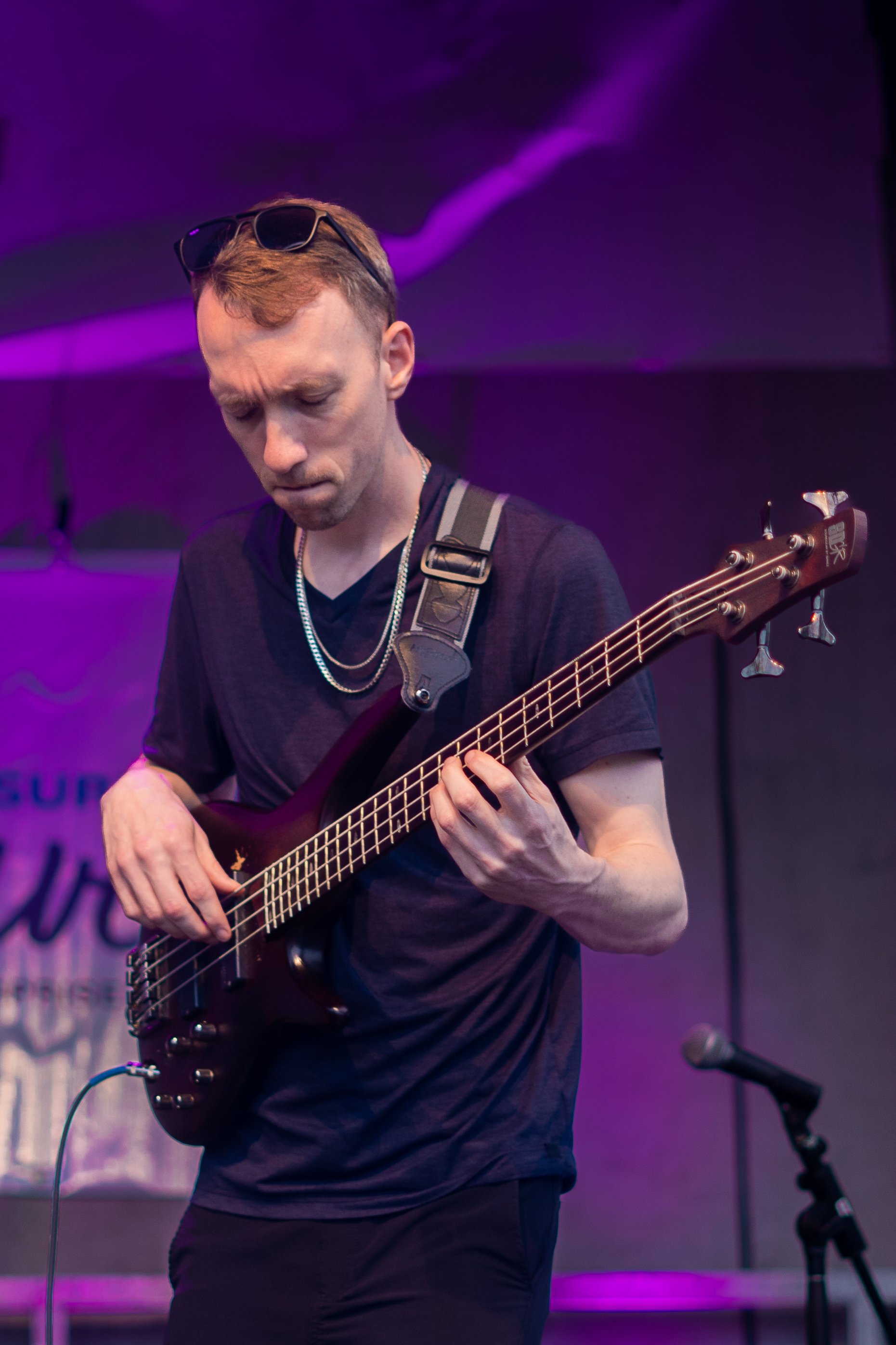
This was my first time photographing live music! I took a ton of photos that evening and this is, by far, one of my favorites.

I really enjoy the purple tones of the lighting on the backdrop. I feel like purple is a pretty uncommon color overall and I think it really makes this image pop. I like the concentrated look on the player's face like he is really focusing on nailing all the notes. I believe they were playing Gold on the Ceiling.

Another aspect of this photo that I like is the angle of the bass itself because it accentuates the depth with the leading lines of the strings and the neck of the bass. It feels like it's coming out towards the viewer.

Some things I don't like:

I feel like the background is too busy. I tried to fix a few things in Lightroom and even removed the text on the big banner behind the player, but I still feel like it's too busy.

I feel like the microphone could be removed from the image. And I would do that, but I don't like spending hours on making the removal look as perfect as possible and instead will just try to mitigate those distraction in the future when shooting other performers.

There is a pole directly behind the cord to the bass that jumps out to me and looks like crappy masking or some sort of retouching, like the cord is glowing a bit because of that. Personally, this is really distracting to me and may warrant a crop to remove that altogether.

Looking forward to your thoughts!