this post was submitted on 15 Jun 2023
10 points (100.0% liked)

Photo Critique

406 readers
1 users here now

A community to critique photographs and learn from others.


Rules

Trying to create a similar space to /r/photocritique

founded 1 year ago
MODERATORS
10
Taipei - Taiwan (lemmy.world)
submitted 1 year ago* (last edited 1 year ago) by Krob to c/photocritique
 

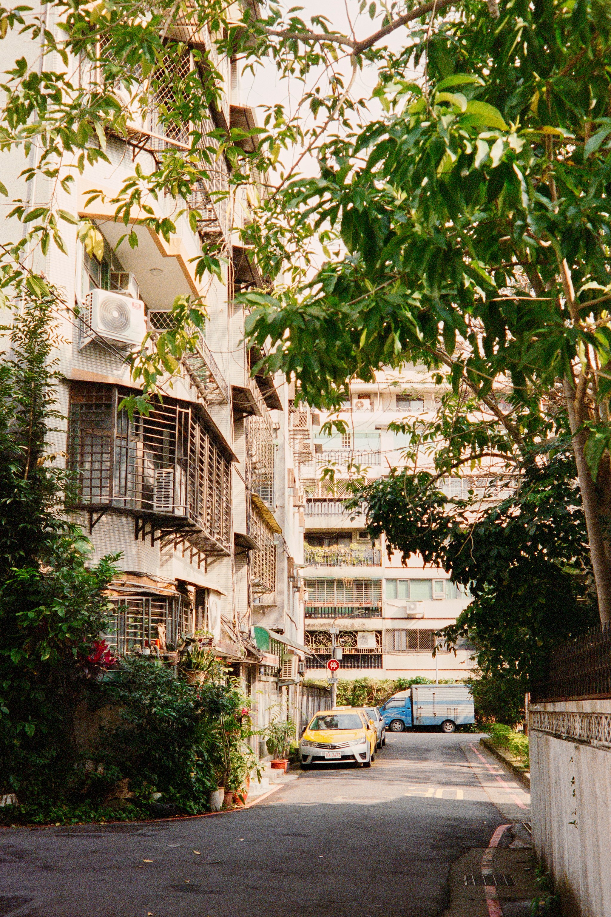
This is a photo I took recently enough. What I like about is how your eyes get drawn to the yellow taxi. Despite being quite a busy with all the lines and leaves there is a certain kind of calmness in the shot. What could make this shot better for me is if there was just a little bit more going on around the taxi maybe someone getting in or out. I'd be curious to here your thoughts.

Camera: Minolta CLE

Lens: M-Rokkor 40mm F2

Film: Fujifilm 400H

top 5 comments
sorted by: hot top controversial new old
[–] Krob 4 points 1 year ago (1 children)

Let me know if this is a digital only community and I'll remove the post if so

[–] Labotomized 2 points 1 year ago* (last edited 1 year ago)

Heck no - I love film! Thank you for contributing to this awesome little community!

[–] Melon 3 points 1 year ago (1 children)

I actually wish there was less going on around the taxi - a lot of the texture and busy-ness comes from the buildings and trees above ground-level in the scene and I think it would be more effective at communicating the calmness you want from the shot.

Other than that, I think the taxi's unfortunately too bright. I'd try bringing down the luminance of yellows in post, increasing saturation, and shifting ever so slightly toward orange to see if it'll jump out more. As-is right now the blue truck behind it is more eye-catching to me because it's a nice midtone in a sea of near-blown-out highlights on the buildings and near-black leaves on the trees.

[–] dsigned 3 points 1 year ago (1 children)

I agree. I feel like there isn’t anything for my eye to anchor on and draw me into the photo. It’s got some interesting stuff going on - but maybe a new crop would help.

Also agree on the saturation and contrast being too high. It’s blowing out the details of the building texture.

[–] Krob 3 points 1 year ago

Appreciate this, I tried a different crop and it's a bit better indeed, might rescan in the weekend if I have time to see if I can get a bit more out of it.