
more, for those who use 88x31 buttons


more, for those who use 88x31 buttons
alright. i'd say it's hard to guess what you were arguing, as you just said the name of an logical fallacy without any other context though.
but as a response to that, i'd say it's not - in order to not be a slippery slope, there needs to be an obvious line where we ban legal content, and were we don't. where is that line? piss? humiliation? normal bdsm? none of these are things i want to see; but all i know is if they come for the scat fetishists, and i don't speak out, because i am not a scat fetishist...
wait what? i've always used arpg to mean "rpg or rpg-adjacent game with realtime combat rather than turn-based". dark souls, witcher, deus ex etc. i'd all call arpgs
I mean, look at the steam tags for arpg (not that steam tags are a great metric)
meh, i'd say they're obviously buttons from context (why would a calculator app just have a bunch of random unclickable symbols?). but assuming they don't immediately read to you as buttons; md3 calc app only has 8 buttons: AC, (), %, ÷, ×, -, +, & =. ~~the rest is just exactly the same mess of text randomly laid out~~ edit 2023-08-03: i have now looked at this image on a better calibrated monitor. the numbers actually do have background circles (why did no-one pick me up on this). however, this does prove my point about the complete lack of any contrast on anything
having areas is good as it allows the eye to do a sort of binary search: if i want a scientific function i'll look in the white on blue, operators in blue on white, numbers in black on white; then search for the exact button i want. without that, everything's an unorganised mess (for instance why are brackets in the same section as operators?), with some functions hidden in the v button at the top right
also i've just noticed - how do the brackets work in md3? do you have to tap the button once to bring up a menu and then tap the bracket you want? or does it automatically insert one based on whether you're inside a set? if it's the latter, how does one do nested brackets?
tinfoil hat time, but i'm pretty sure that's why they were trying to introduce web bundles a few years ago. thankfully they seem to have flopped, but if they hadn't and chromium introduced a closed source interpreter i think that would have been the end of anything non-chromium
i wouldn't even mind the colours if they didn't tint the background. tinting solely the main text colour and the main buttons might look quite nice. to be honest though, i just loathe pastel colours in general, so it's possible that's influencing my opinion
it would be nice if it were expanded/mirrored to here - i try to avoid discord for obvious reasons
personal opinion, i think padding is worse for delineating objects than a bit of colour; or just, like, a line. look at this example - there are four distinct segments on the left, whereas on the right they all merge into one and a half
padding is really useful, yes, but if you put padding on everything then what's there to be separated?
yeah, i hated material ew as soon as it was announced. so much padding everywhere, and so little contrast - to paraphrase the incredibles: if everything's orange^[1]^, nothing is. your eyes will adjust to it. i want actionable items to stand out, not be a slightly lighter shade of the same colour. it also looks rather like a fischer-price my first phone interface
i must say, if an app (for example, jerboa) uses material 3, i usually try to look for an alternative
[1] other colours are available, i just like orange
edit: some examples:
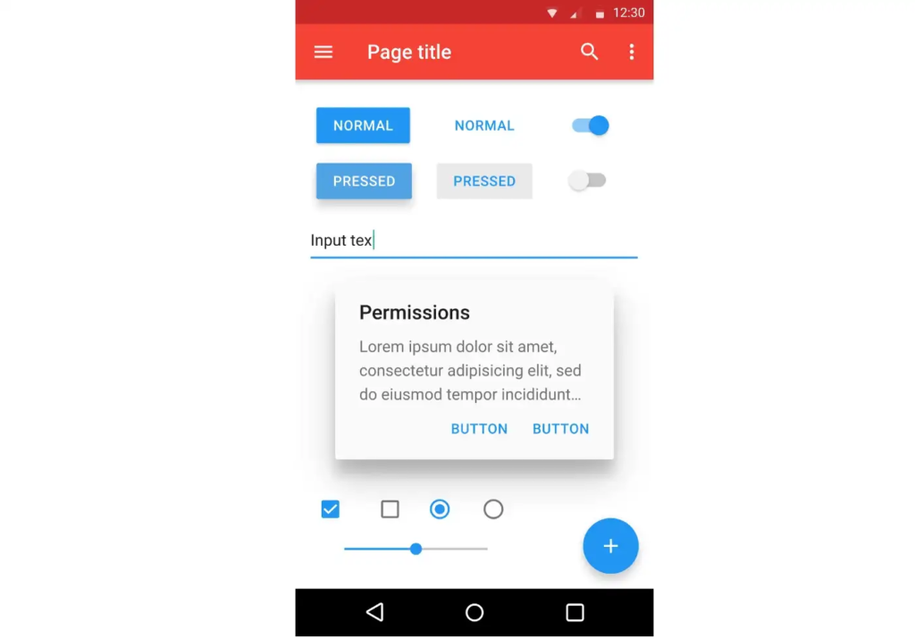
with material design, it's clear what's a header, what's a footer,^[2]^ and what each button's state is.
with all the padding, there's also less space; leading to less functionality
with material ew, it's much harder to tell at a glance what each app is, one has to scrutinise the icon rather than just tell at a glance by colour
i also really dislike monet; the way it pulls this horrible washed out sickly pastel colour from a wallpaper and washes it over the entire app. if i just pulled one accent colour, and applied that to, say, the header and main action button, i'd like it a lot more
[2] look at the lack of contrast on that "new post" button
machine translation of linked telegram message:
original text: