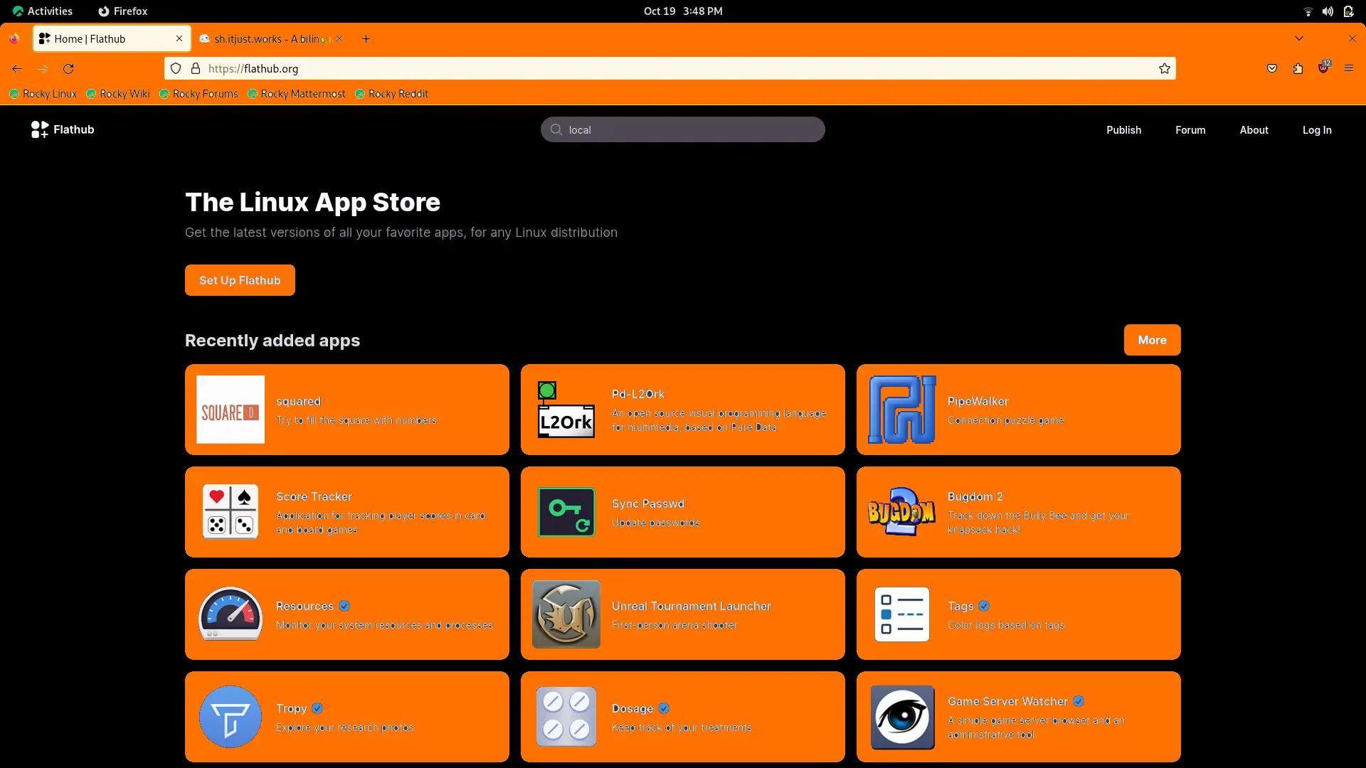
Why is everything so sickly orange?
linuxmemes
Hint: :q!
Sister communities:
Community rules (click to expand)
1. Follow the site-wide rules
- Instance-wide TOS: https://legal.lemmy.world/tos/
- Lemmy code of conduct: https://join-lemmy.org/docs/code_of_conduct.html
2. Be civil
- Understand the difference between a joke and an insult.
- Do not harrass or attack users for any reason. This includes using blanket terms, like "every user of thing".
- Don't get baited into back-and-forth insults. We are not animals.
- Leave remarks of "peasantry" to the PCMR community. If you dislike an OS/service/application, attack the thing you dislike, not the individuals who use it. Some people may not have a choice.
- Bigotry will not be tolerated.
- These rules are somewhat loosened when the subject is a public figure. Still, do not attack their person or incite harrassment.
3. Post Linux-related content
- Including Unix and BSD.
- Non-Linux content is acceptable as long as it makes a reference to Linux. For example, the poorly made mockery of
sudoin Windows. - No porn. Even if you watch it on a Linux machine.
4. No recent reposts
- Everybody uses Arch btw, can't quit Vim, <loves/tolerates/hates> systemd, and wants to interject for a moment. You can stop now.
5. 🇬🇧 Language/язык/Sprache
- This is primarily an English-speaking community. 🇬🇧🇦🇺🇺🇸
- Comments written in other languages are allowed.
- The substance of a post should be comprehensible for people who only speak English.
- Titles and post bodies written in other languages will be allowed, but only as long as the above rule is observed.
Please report posts and comments that break these rules!
Important: never execute code or follow advice that you don't understand or can't verify, especially here. The word of the day is credibility. This is a meme community -- even the most helpful comments might just be shitposts that can damage your system. Be aware, be smart, don't remove France.
Because he used mspaint to change it to PH colors
CSS was invented in 1996
Web devs before 1996:
Things were centered easily
Ah yes, good old top:50% left:50% margin-left:-50% margin-top:-50%
Before that was worse, straight up center tags everywhere and assuming the user's screen was 1024x768 lol. Things today are sooooo much nicer with flexbox and especially CSS grid 😍
Simpler tools, for a more civilized age
Ah yes good old times. by the way, yes it exists
cue GitHub READMEs flashbacks
This would be so good nowdays. Why did they remove it?
For semantic reasons.
Each element in HTML should correspond to a proper semantic element. For example, navigation elements should go within <nav>. Elements like <center> are remanants of the good ol days when css wasn't mature enough and you'd add color to an element via attributes. Obviously, center has no semantic meaning and pretty much useless in web dev now. It hasn't been removed but deprecated.
These are "should"s and not "must"s. This is why divs exist because many times it's hard to decide what semantic meaning a piece of content has, so divs are just generic components when you can't think of an better semantic tag.
p align=center
MS paint ewww. Gimp tho
It's soooo pleasent to look at
If the text on the yellow buttons wouldnt be gray perhaps.
Jeah, why are people loving this? It is broken. Stop reducing contrast.
It hurds my eyes
whoosh. "Its the hub" the black and orange website.
guys my parents caught me browsing flathub and now they insist i only install packages from the repo what do i do?
Phlat Hub
This post was empty for me. Upvoted.
Unreal Tournament, oh the classic!
