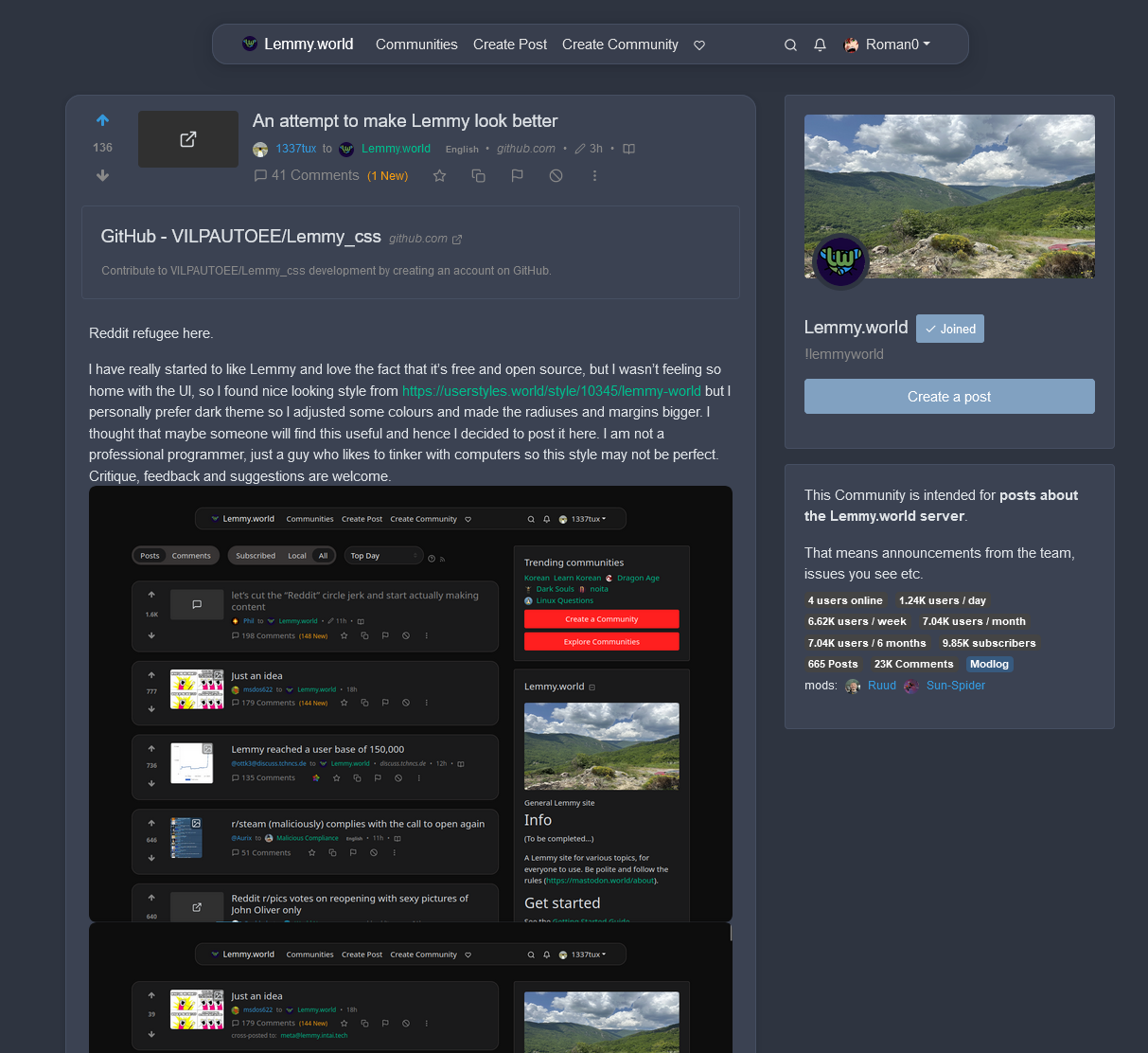
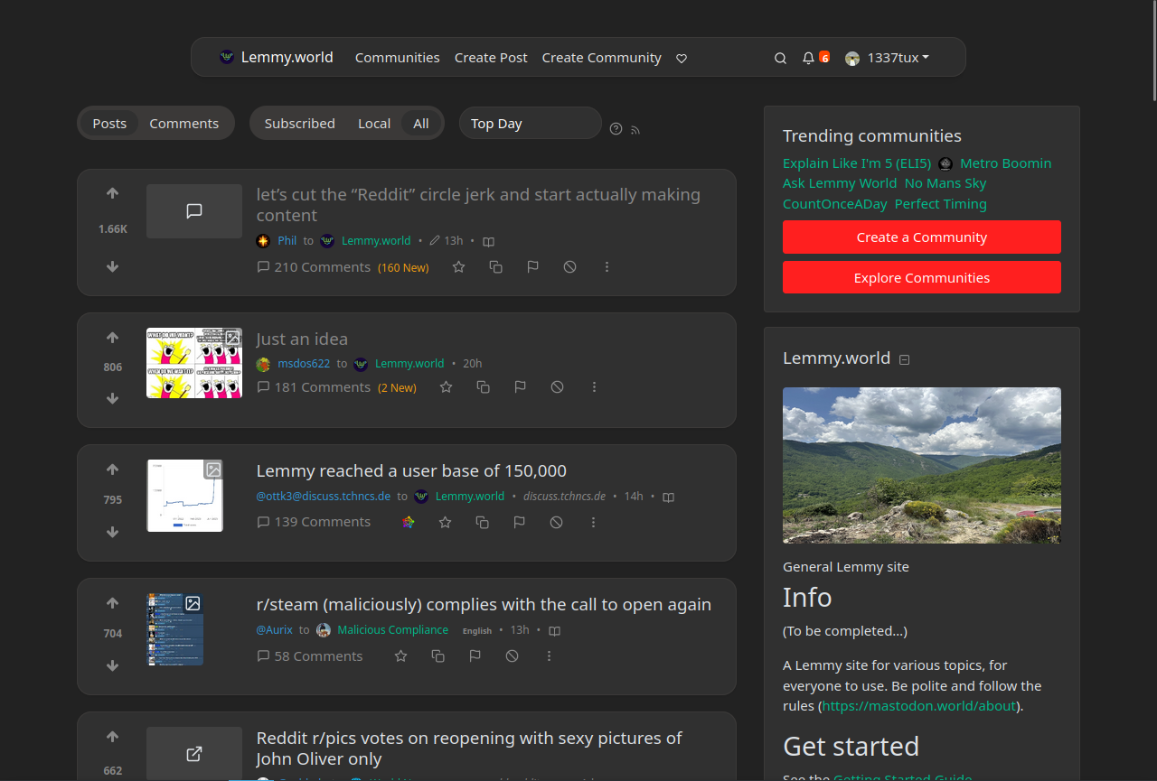
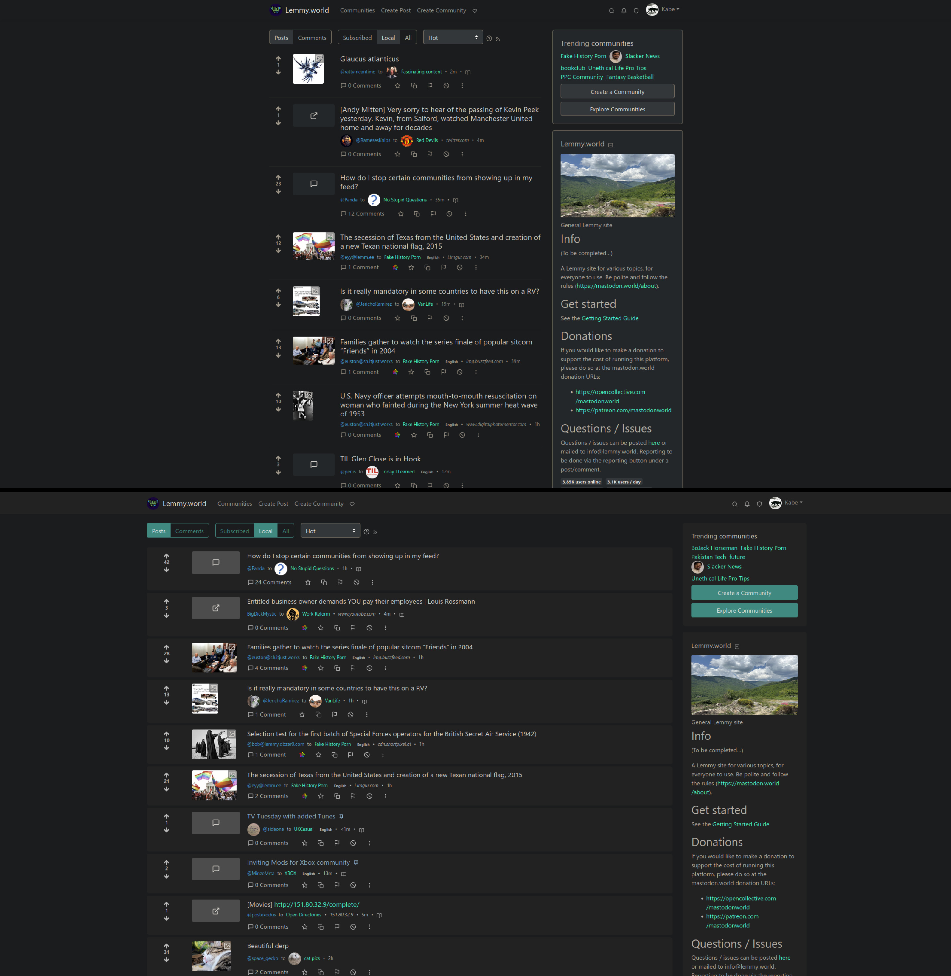
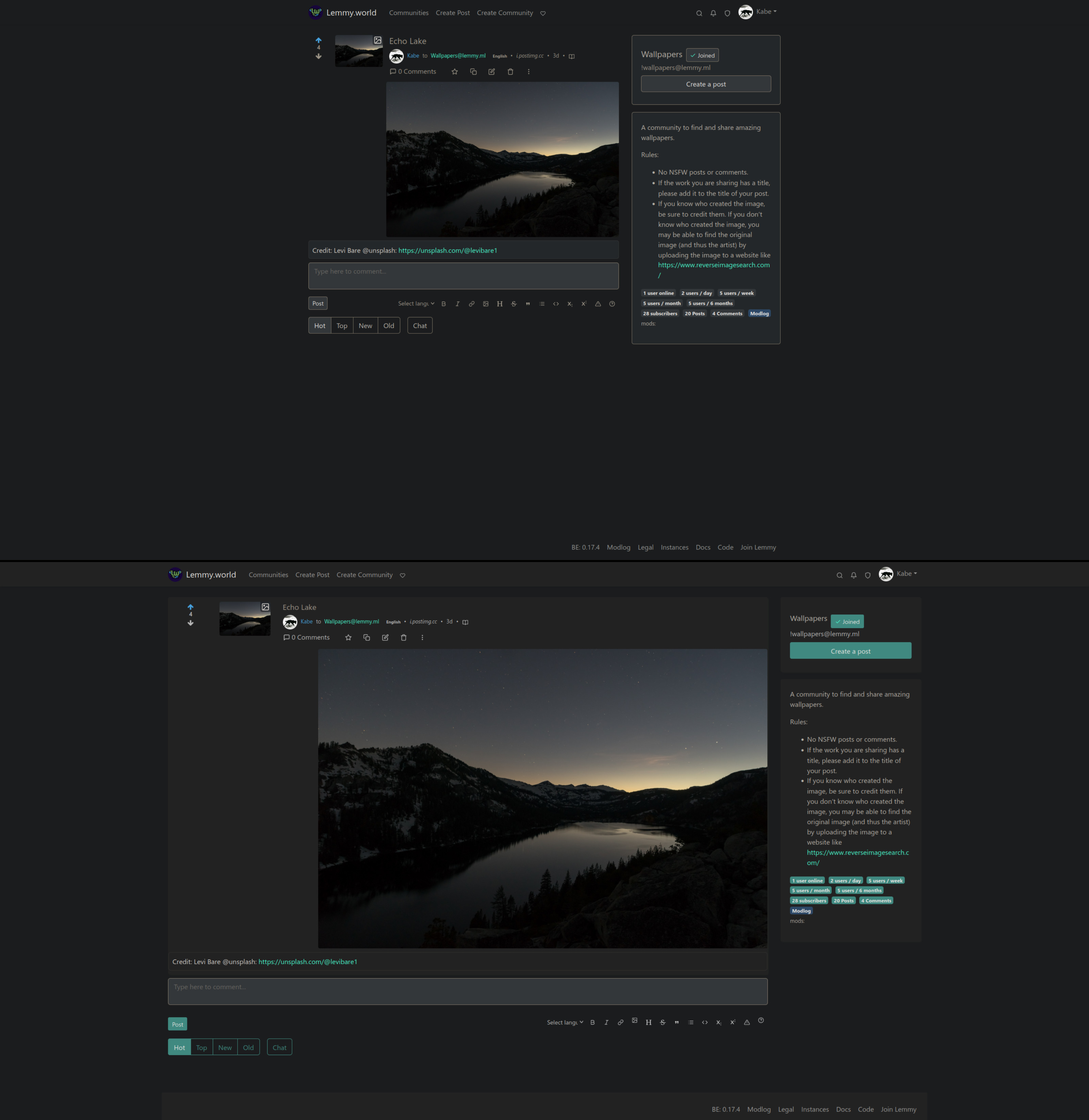
Lemmy Enhance Suite when?
Lemmy.World Announcements
This Community is intended for posts about the Lemmy.world server by the admins.
Follow us for server news π
Outages π₯
https://status.lemmy.world
For support with issues at Lemmy.world, go to the Lemmy.world Support community.
Support e-mail
Any support requests are best sent to [email protected] e-mail.
Report contact
- DM https://lemmy.world/u/lwreport
- Email [email protected] (PGP Supported)
Donations π
If you would like to make a donation to support the cost of running this platform, please do so at the following donation URLs.
If you can, please use / switch to Ko-Fi, it has the lowest fees for us
Join the team
I really like it. But I also think that it's not a great idea to use colors similar to Reddit, it's best if Lemmy (or each instance) finds its original design for those
Yeah I think so too, and that's why I created two styles with different color schemes. I just think that some reddit refugees might have gotten used to the reddit colors and find them more familiar
Thank you. I took your theme and "nordified" it a bit:
spoiler
Now it's in line with the rest of my web apps :)
Looks really great. My first tought was steam
This is whatβs beautiful in open source. I wonder if any one has had any luck making the old.Reddit nesting style yet
Hey! This looks awesome. Im a programmer working on a UI. I would really really really like to use this and work with you on completing my project.
You can use this freely and I'm open to improvements and changes to the code. You can for example make pull request to the github repo :)
And what is it with the narrow aspects? I totally get the need for mobile support, but the default desktop view looks like it's trying to play nice with old 4:3 aspects. If that's the root design goal, I sure hope we can let that design goal die. In a 16:9 maximized window there is so much wasted real estate it pains me.
I tweaked margin and padding. Is just a lot of wasted space if you ask me. .post-listing + hr.my-3 { margin-block: 0.2ch !important; } .post-listing { padding: 0.4rem 1rem; } :root { --radius-1: 1px; --radius-2: 2px; --radius-3: 4px; --radius-4: 8px; }
^___^
I dont like the wasted vertical space at the top. Regardless, I think it does indeed look better overall, specially the visibility of the cards. Have you thought of doing a PR for this in lemmy-ui?
I haven't yet thought so far, because this was just a personal little project, but I will think about it. I will probably just keep tinkering with this and try to make it better and maybe try to document this little bit
I would honestly look into creating a new PR. Check to see if they would rather this as a new theme or just the default thing.. Please do it! Defaults are important, not many people are going to be adding a new CSS..
What's the best way to add this to my instance? I guess it's just additional css to the default css? Can I use the default css and add the userstyles css?
I like the way threaded comments are colored in the default scheme. Makes it very easy to see which subcomment belongs to which parent.
With a bunch of vertical lines, I quickly lose track.
But I very much appreciate all the crafting and tinkering going on! It's nice to see things grow.
Tracing those lines was almost a wasted effort for some more complex threads lol. Start going cross eyed. I like the colors much more.
This is just me but I missed the day when the site provided us to customize our profile page. Like friendster for example we can change the look of the buttons, we can change the size of the fonts and etc.
It shows us a little bit of our personality. But I know that it's no longer a thing. The closes experience I could think of is how we design our linux desktop. In windows it would be using rainmeter.
Noob here. How can I use this?
There should be instructions on my github
If you come across some problems you can dm me
It requires tampermonkey, greasemonkey or any equivalent but this also works wonder to get a more compact look while fully utilizing the entire screen.
Nice, thanks. I don't feel like installing Stylish but I do have a script manager so I prefer this solution. Had to comment a few lines because I didn't like how it was messing with font sizes, however.
Yes! I hate the default look that doesn't separate in "zones"
I've only interacted with Lemmy a few times from a PC, but I can definitely say it looks better your way. I found the webUI frustrating - but it's still in its infantile stage so I can't fault the devs.
Looks great, thanks for sharing! However userstyles collect too much data off users given that the extension should only inject a css rule into a tab. https://userstyles.org/privacy-policy
Hi, thanks for the feedback. The extension that userstyles.world redirects you to is Stylus not Stylish. It's a fork of Stylish and they even state on their web site that "Any and all analytics, telemetry, and data-collection have been removed completely. We'd rather not know what you're up to." https://add0n.com/stylus.html
I hope this clear things ;)
The main problem with the Lemmy UI on desktop, IMO, is the cramped and narrow page width. There's so much wasted space on either side of the content.
I'm currently using a customized version of this one: https://github.com/HrBingR/Lemmy_CSS
Very nice, can this be pushed mainstream so it is the default for everybody?
Just wanted to ask your opinion. Which is better color scheme. The reddit colors or the lemmy's?
Reddit:
Lemmy:
I love it! Any possibility to change the ugly teal/green link color to something else? Orange maybe?
A quick fix to that is, if you change the theme from your lemmy settings to darkly-red. I will look into that ;)
This is fantastic, love it!
wow, this is light years ahead of my attempt
That's kinda how kbin looks like.
Is it supposed to look like this? Some of the text is hard to read and I can't switch to the dark theme, it's always bright.
I love it, thanks a lot. :) You could add feddit.de, it's the same but for German communities.