

Reddit refugee here.
I have really started to like Lemmy and love the fact that it's free and open source, but I wasn't feeling so home with the UI, so I found nice looking style from https://userstyles.world/style/10345/lemmy-world but I personally prefer dark theme so I adjusted some colours and made the radiuses and margins bigger. I thought that maybe someone will find this useful and hence I decided to post it here. I am not a professional programmer, just a guy who likes to tinker with computers so this style may not be perfect. Critique, feedback and suggestions are welcome.
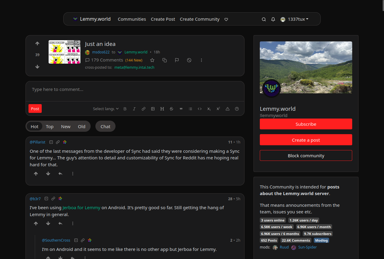
Edit: The colors are from reddit and if you want the colors to look more like the original lemmy, change the bg primary and default to hex #303030 and #222222. I really like this color scheme too
--bg-primary: #303030;
--bg-default: #222222;
Edit2: I have now made some small adjustments using the feedback and suggestion I got from you. I'm really grateful for the feedback :)
I also have now two styles, which have slightly different color scheme https://userstyles.world/user/VILPAUTOEE
Keep the feedback coming ;D Thx
And what is it with the narrow aspects? I totally get the need for mobile support, but the default desktop view looks like it's trying to play nice with old 4:3 aspects. If that's the root design goal, I sure hope we can let that design goal die. In a 16:9 maximized window there is so much wasted real estate it pains me.
Lemmy doesn't run very well on mobile either. It crashes and burns on my iPad (probably because it doesn't fully support whatever fancy JavaScript it relies on), and Kbin is the only way to connect with Lemmy communities, since their site does work.
I think that’s the websocket connection that they are working on removing in the next version. Should make the loading issues on mobile go away.
That's weird. For me it is kbin that crashes all the time. Lemmy works fine. I like kbin's vibe and concept, I just figured it was still really buggy. Now I'm thinking maybe the problem is on my end.
Kbin does crash, but in my experience, that's more of an issue of server load than anything else. Whereas my issue with Lemmy seems to be a problem with the client/Web UI (since my iPad is a bit too old for any of the apps).
Avoiding Kbin during the times where the US is most active (since it seems like they're busiest around then) seems to help with the crashing issues.
A funny "accident" I had with this is, that the first version of this style (which is in the screenshots) I created with a monitor that has an 4:5 aspect ratio. I then got some feedback and tested the style on my laptop that has 16:9 ratio and fixed some things. You can change the max-width in the line 222.
I would have liked that the max-width could have been in percents but that caused a weird bug on the nav-bar and it looked like this: Anyone know what could have caused this?