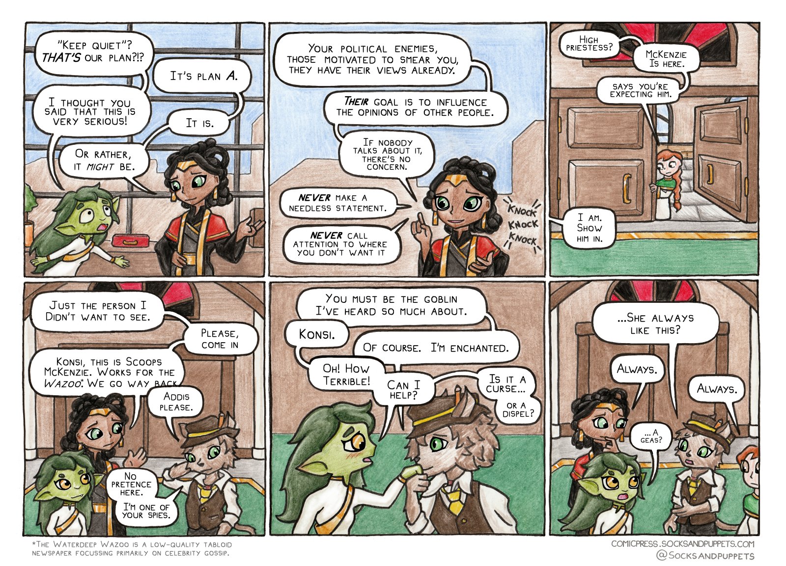
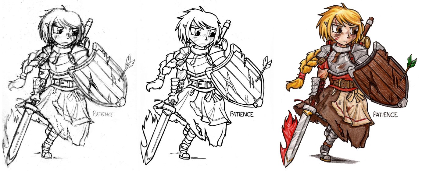
This comic follows on from the Previous comic which will almost certainly provide context.
Just enthralled. Completely spellbound. Beguiled, charmed, under your spell.
Humor, jokes, memes about TTRPGs
This comic follows on from the Previous comic which will almost certainly provide context.
Just enthralled. Completely spellbound. Beguiled, charmed, under your spell.
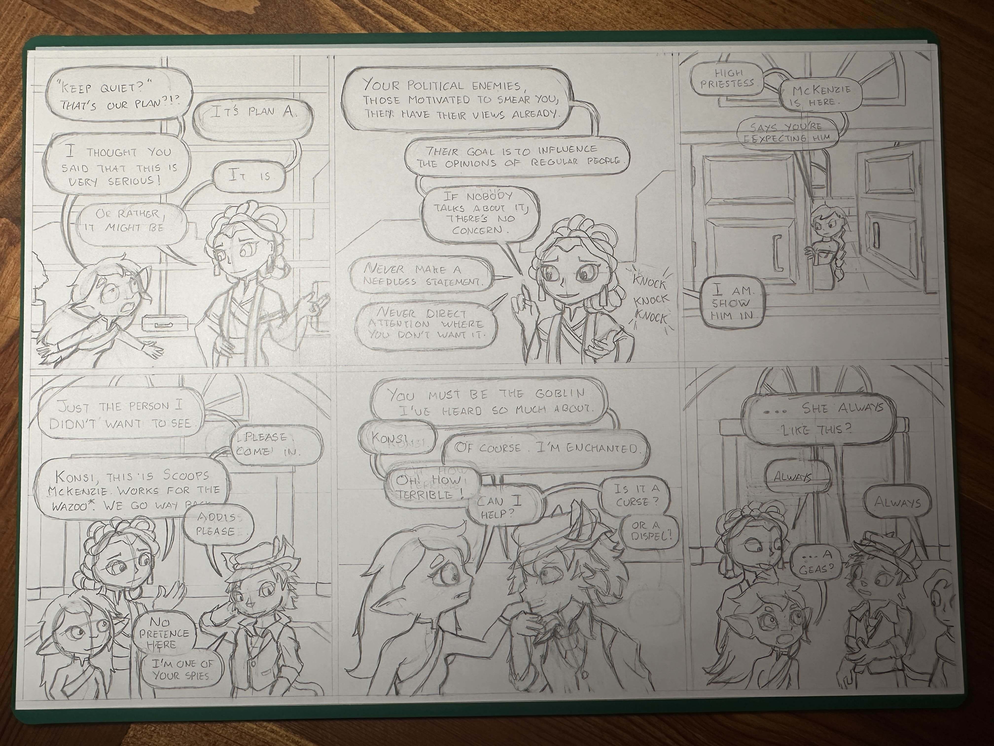
Oh, Scoops has a token, in case your campaign needs a Tabaxi journalist for some reason.
Why would a campaign not need a tabaxi journalist?
Ironclaw, but yes I could use a journalist token, thanks!
I always get excited when I see a new Konsi comic :)
Probably. An author once wrote this piece of conversation:
"Wait? You can transform matter. Thats magic." "Your people can use metal to fly over buildings." "Of course they can. It makes perfect sense."
Having a world, where "magic" actually exist raises a lot of questions about some conventional expressions and cultural aspects.
Does the symbol above the door intentionally look like a roulette wheel?
Yep.
As best I can find, rooting through old Forgotten Realms lore, the colours of the Tymoran church are normally blue and silver.
For my comics, I made the Tower of Luck use green as it's main colour for stuff, to mimic the green baize of gambling tables. Gold accents to symbolize wealth - since the Tower of Luck is much more focused on luck and gambling than the good fortune and karma focus that the rest of the faith normally has. It's my general intention to slip gambling references and symbology into the church whenever the characters are there.
Oh damn you're the author of these?
I am!
That is sick! Thanks for all the work you do.
You hand draw them and then add the text digitally?
Yes. One of the benefits of this is that it makes my visual style rather unique - I often get asked what digital brushes I'm using to get these pencil textures, and the answer is "pencils." One of the downsides is it means it's quite slow to make new pictures.
I used to hand-letter, but lettering is a surprisingly slow and taxing job, and I found myself spending a lot of time touching it up digitally, so now I use a font I made from my own handwriting.
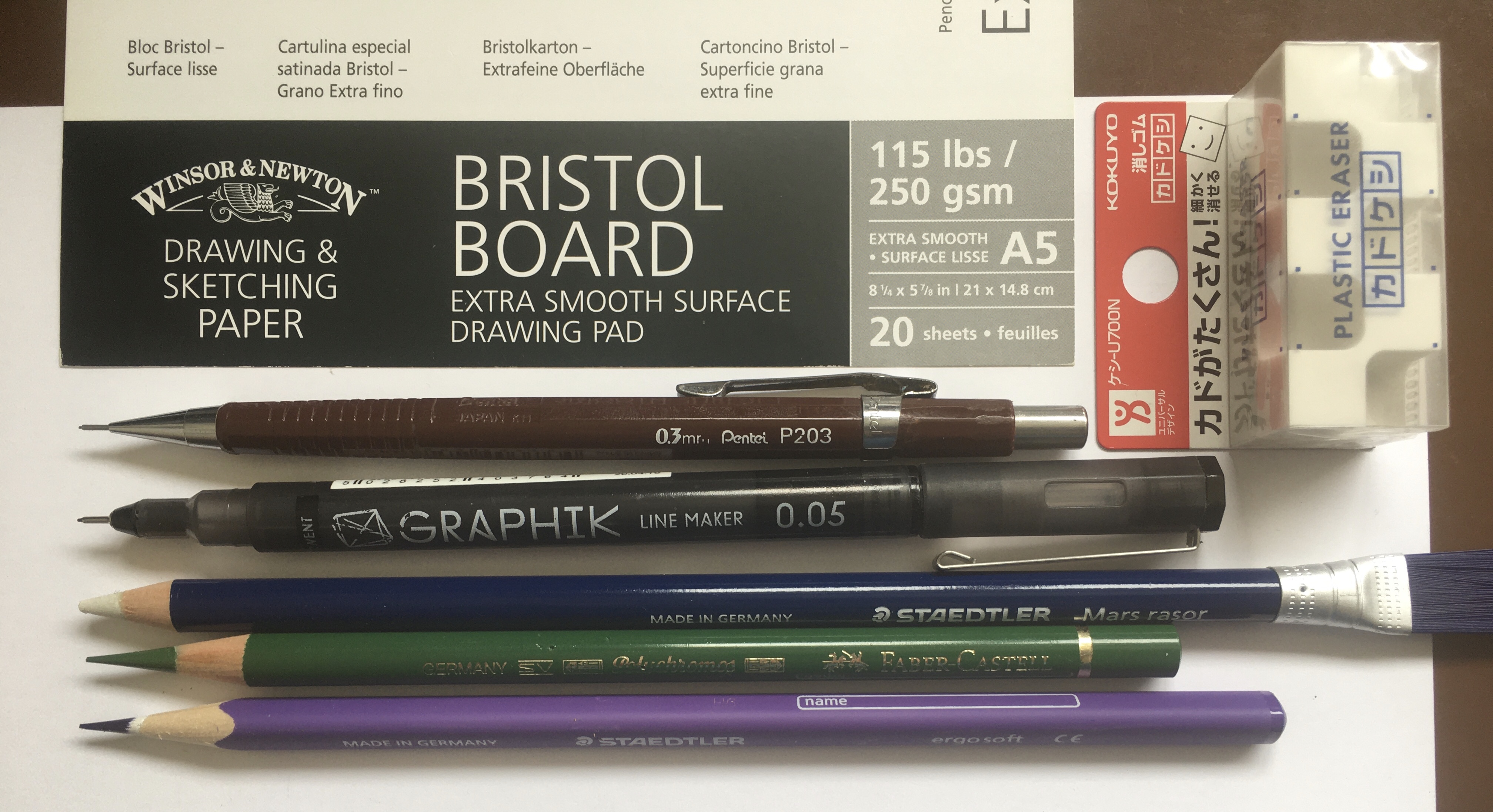
Here's an image showing many of the physical media brands and tools I use. Notes:
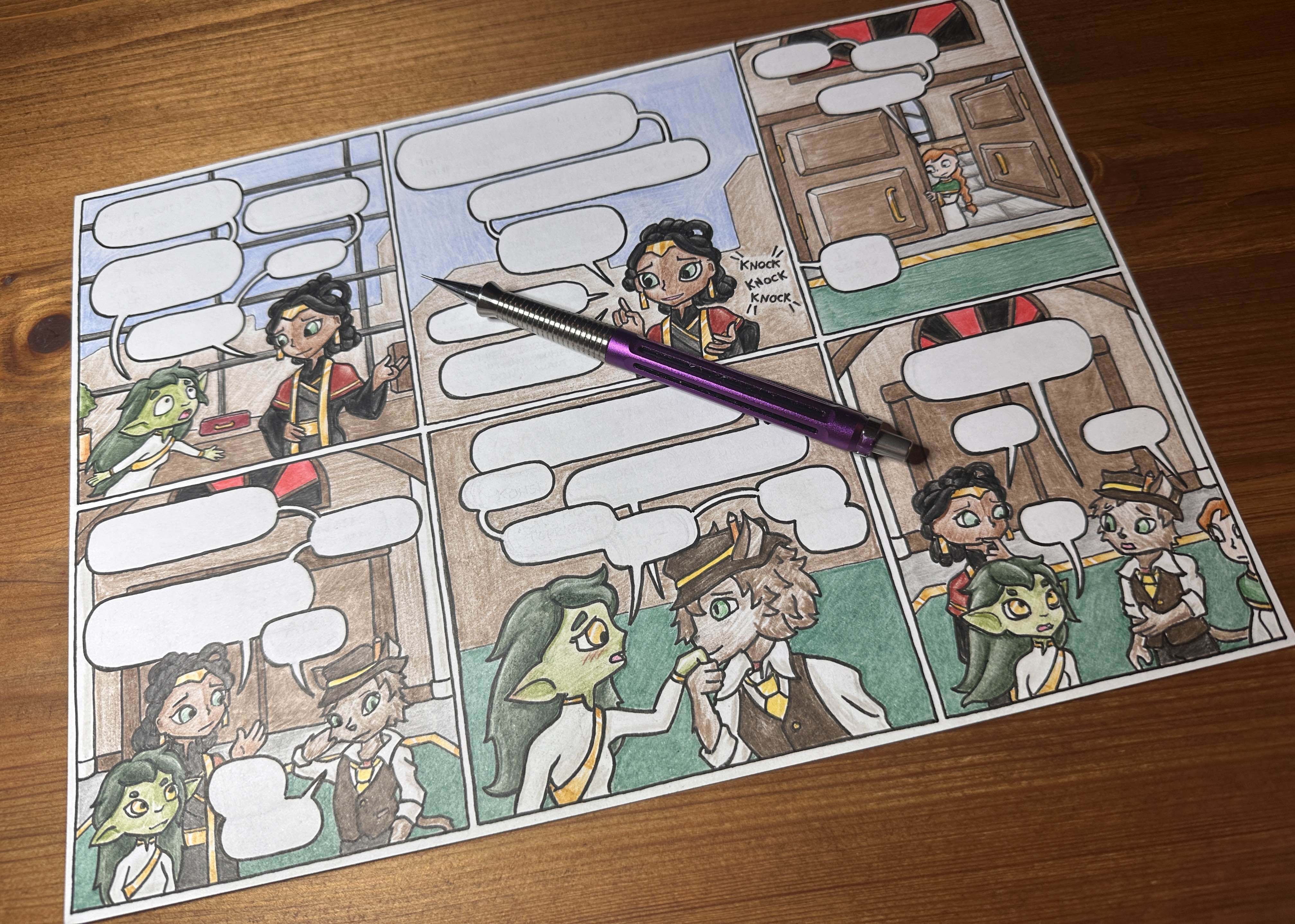
Here's a step-by-step showing how it looks as I go
And, here's a photo of the pencilwork for this specific comic :D
🤯 that is really cool
I didn't notice until now that your characters sometimes slightly cover the text boxes! Very cool.
Yeah. I also sometimes break the panel borders this way too, to avoid tangenting. Addis' fingers in the first panel actually break out of it very slightly here.
In Making Comics Scott McCloud talks about these techniques as "fourth wall breaks" - if your characters significantly overlap the framework scaffolding of the comic itself (speech bubbles, panel borders, gutters, other panels etc) it can serve to build up dramatic intensity, especially when combined with other techniques like oversized letters, or dramatic panel shapes, or intense forshortening.
Here, the purpose is much less grandiose... I have a limited size for the panel on the page, and speech bubbles take up a LOT of real estate (especially with this much dialogue.) This forces me to squish my art into the remaining space, but I can get a little more of it out if I disrespect the panel apparatus.
TL;DR it's the temple of the Goddess of Luck, so yeah it is
So how do you pronounce Geas? I'm inclined to /ɡiːɑs/
lol.
maybe dominated/j
Like this?
Ayoo not what I was expecting!
I'm happy for Razira, though.
😍
😳
So that's what she does on weekends
Gods I love your comics. So cute. So clever.
