
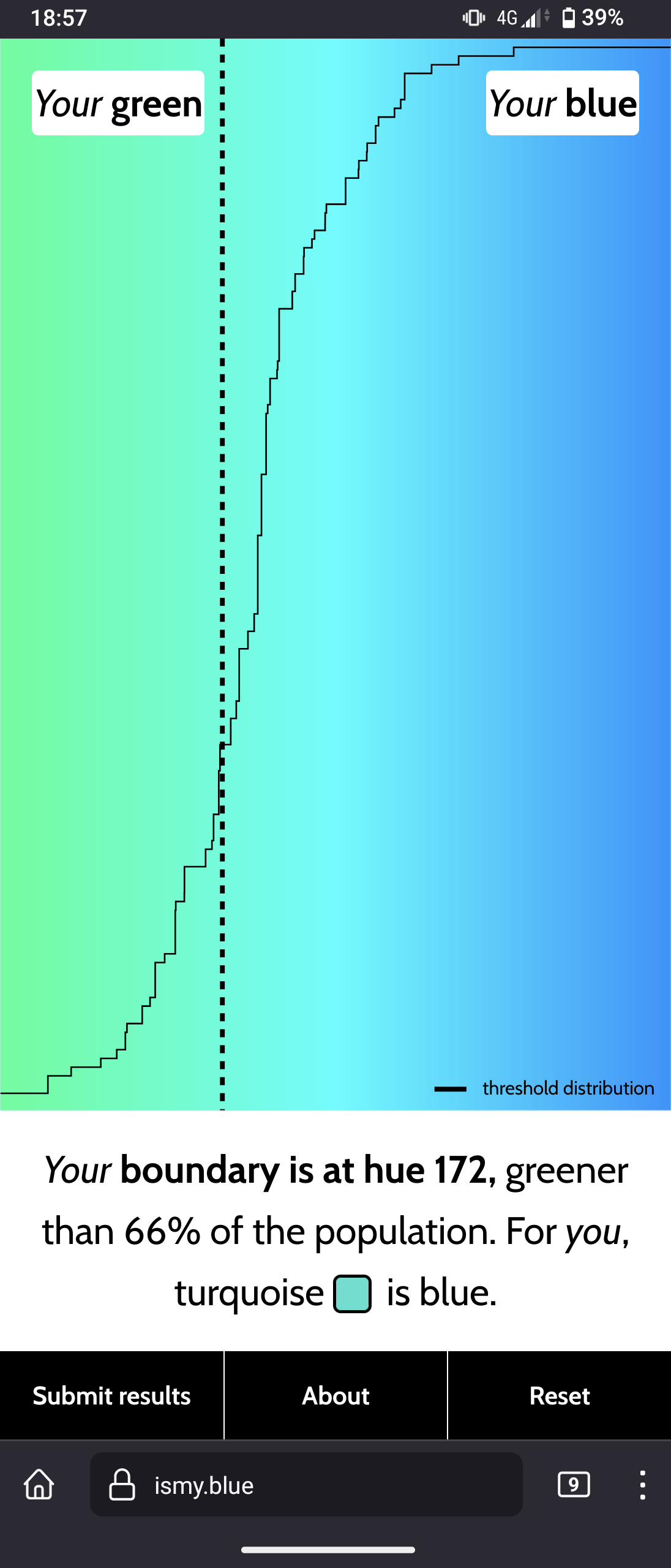
Interesting website to see what you personally perceive as "blue"
Total subscribers:
🇬🇧 Let's discuss art and design!
Join us and
This community is about art in all its form, as well as its influence on culture and its application at the service of society: architecture, music, literature, performances, video games, graphic design...
Check the pinned posts for a (wip) list of art related communities 🔗
You're on a francophone instance, don't be scared if you see some posts in french!
🇫🇷 Discutons d'art et de design !
Vous pouvez ici :
Le sujet de la communauté concerne toutes les formes d'art, ainsi que leur influence sur la culture et leur application au service de la société : architecture, musique, littérature, performances, jeux vidéos, design graphique...
Pour toute question, suggestion, réclamation, etc. N'hésitez pas à utiliser le sujet épinglé.
✅ Les règles de l'instance s'appliquent bien évidemment.
Interesting website to see what you personally perceive as "blue"
This is great! I’ve always felt my color recognition is different from my wife’s so now we can compare.
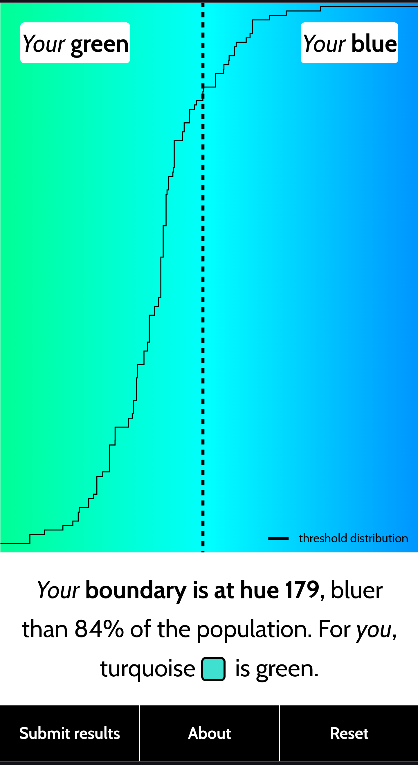
I've got 174. As I remember correctly categorizing colors in your mind depends on your native language (or just language used), and some may even categorize the hues on this gradient to more basic colors in their language (like in Russian: зелёный [zʲɪˈlʲɵnɨj], голубой [ɡəɫʊˈboj] and синий [ˈsʲinʲɪj]).
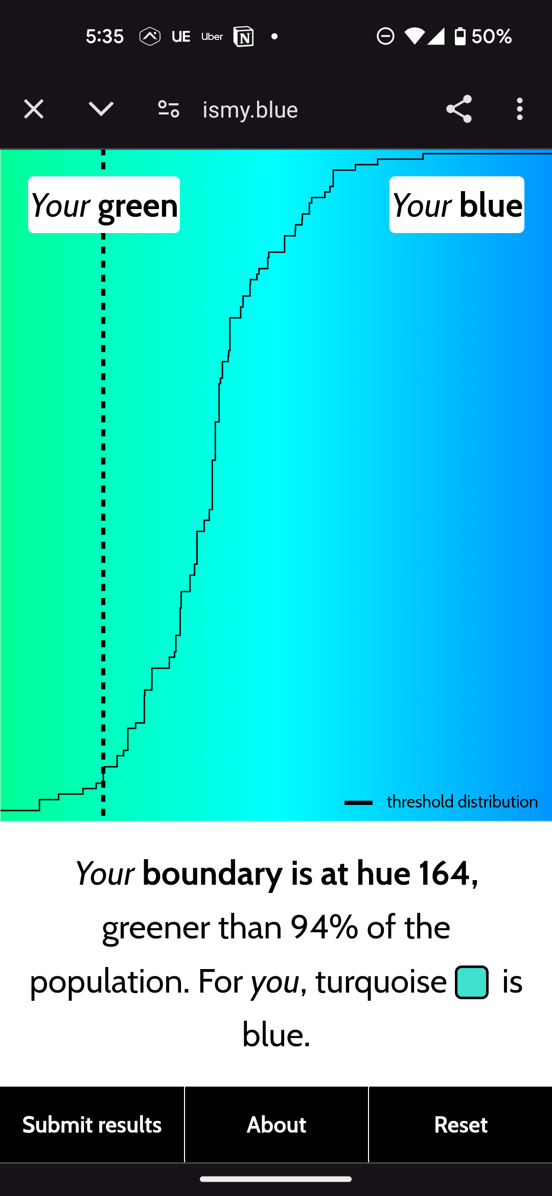
I think the boundary between the basic color equivalents for green, and blue (zielony /ʑɛˈlɔ.nɨ/ and niebieski /ɲɛˈbjɛs.ki/) in Polish are more moved more to the right, and that's why I got 174. But I wonder if I have repeated that test in my native Polish if the results would differ (so they are even more to the right).
Edit: I have manually changed strings on the website from English to Polish, making my mind to "think in Polish". The result is 179 so I think that theory checks out.
I'm red green colorblind but ended up at 177, which is fairly close to the (as I see at least) middle while line dividing green and blue.
Which is surprising because I bought blue chopsticks in Japan, and my mother say they are mainly green, much to my frustration.
~~I got 84 too, looks like we see colors different from the normal people~~
I forgot I have night mode enabled on my phone, after turning it off I got closer to average, oops
I get different results with each eye 🤔
This is silly, instantly it's not blue or green
I got exactly the same result
i feel like this needs like 5x as many data points before giving a result, also at some point to me the only correct answer would be "neither" because the middle point is just Cyan to me, which isn't blue and definitely isn't green, just like how orange isn't yellow but definitely isn't red.
I think that the difficulty in deciding which to pick when the truth feels to be "neither" is an intended effect of the test. It would be interesting to see the results of a test that allowed for "neither" though
i don't think that's the case, the point of the website seems to quite clearly be seeing what shades people consider either colour, and if a shade is "neither" then that's the answer you want to track rather than polluting your data with forced false answers.
182 for me. Interesting, I have a little bit of synesthesia. When I see turquoise, a very specific taste comes in my mouth.
these questions are really hard to answer
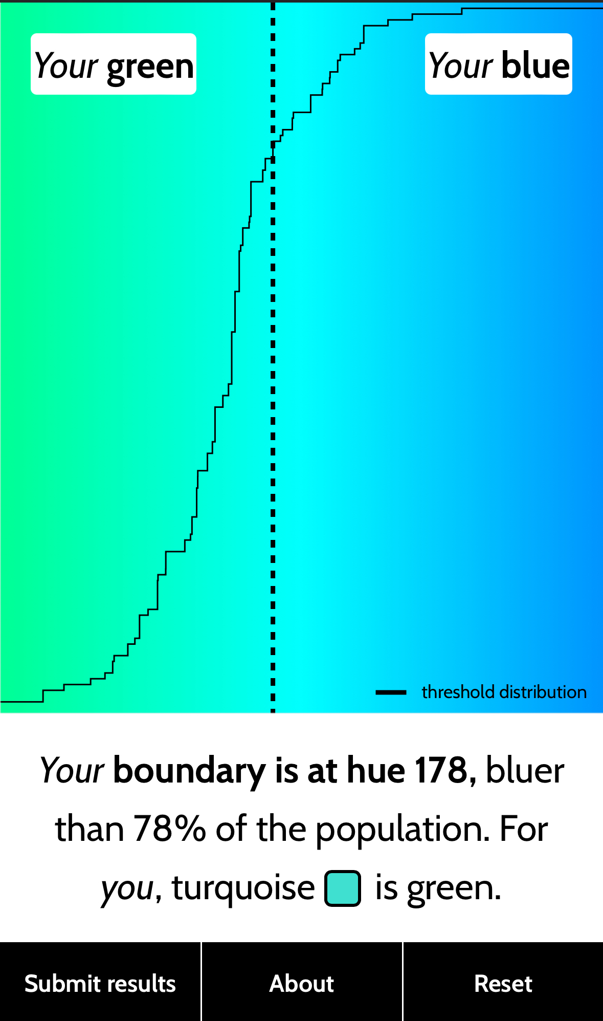
I got exactly the population median (174 iirc?)
I got 187? I have been playing I love hue a lot tho which may be skewing my perception

The most interesting thing is my wife is 172, and I am 173. So I guess our blues are the same
I got 161 then 169 for my blue boundary. looking at the chart, I definitely agree more with the latter