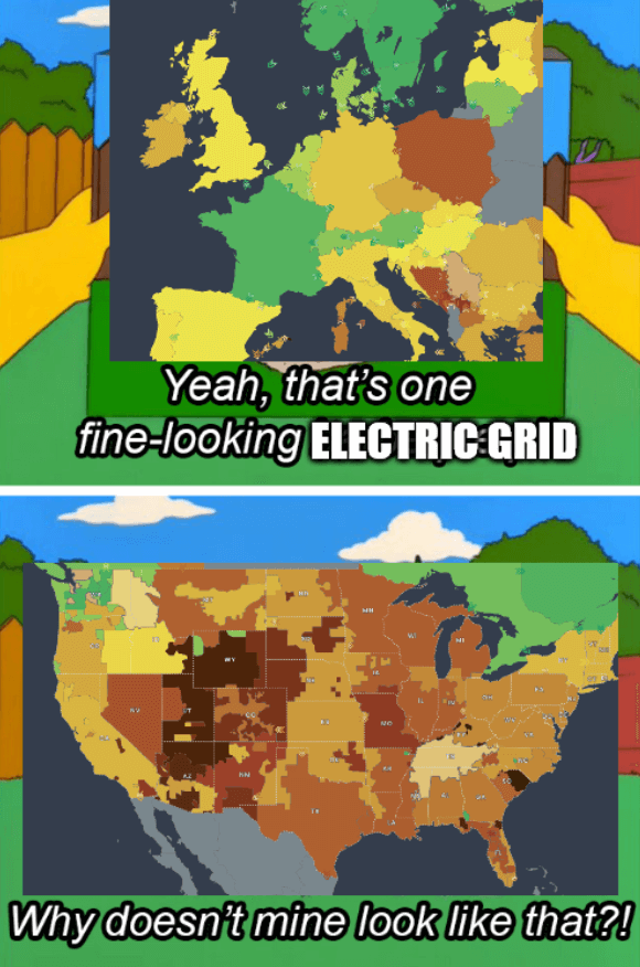
Did they merge Belarus and Ukraine on this map? Also Poland’s out here trying to be American.
Memes
Rules:
- Be civil and nice.
- Try not to excessively repost, as a rule of thumb, wait at least 2 months to do it if you have to.
Belarus was actually always Ukrainian territory, historically...
I mean, if that excuse works for russia, why not us?
Im still partial to the 1957 borders agreed upon in the board game RISK.
You can see a faint border - they’re just both gray, I assume for no data like Kaliningrad and Albania.
Poland is actually trying to be Amerikkkam, they are obsessed. They even tried going for the extreme racism.
So sad that they don't have data for most of africa btw
Asia is more interesting with all the growth happening there
In terms of area, aren't the size of the various American grids roughly the same size as the ones that comprise the individual countries in Europe?
Hahaha GOTTEM!!!
NOW DO A MAP OF UNEXPLODED WARTIME ORDINANCE/LANDMINE COVERAGE!
Don't be too shy to expand it a bit east 🤣
