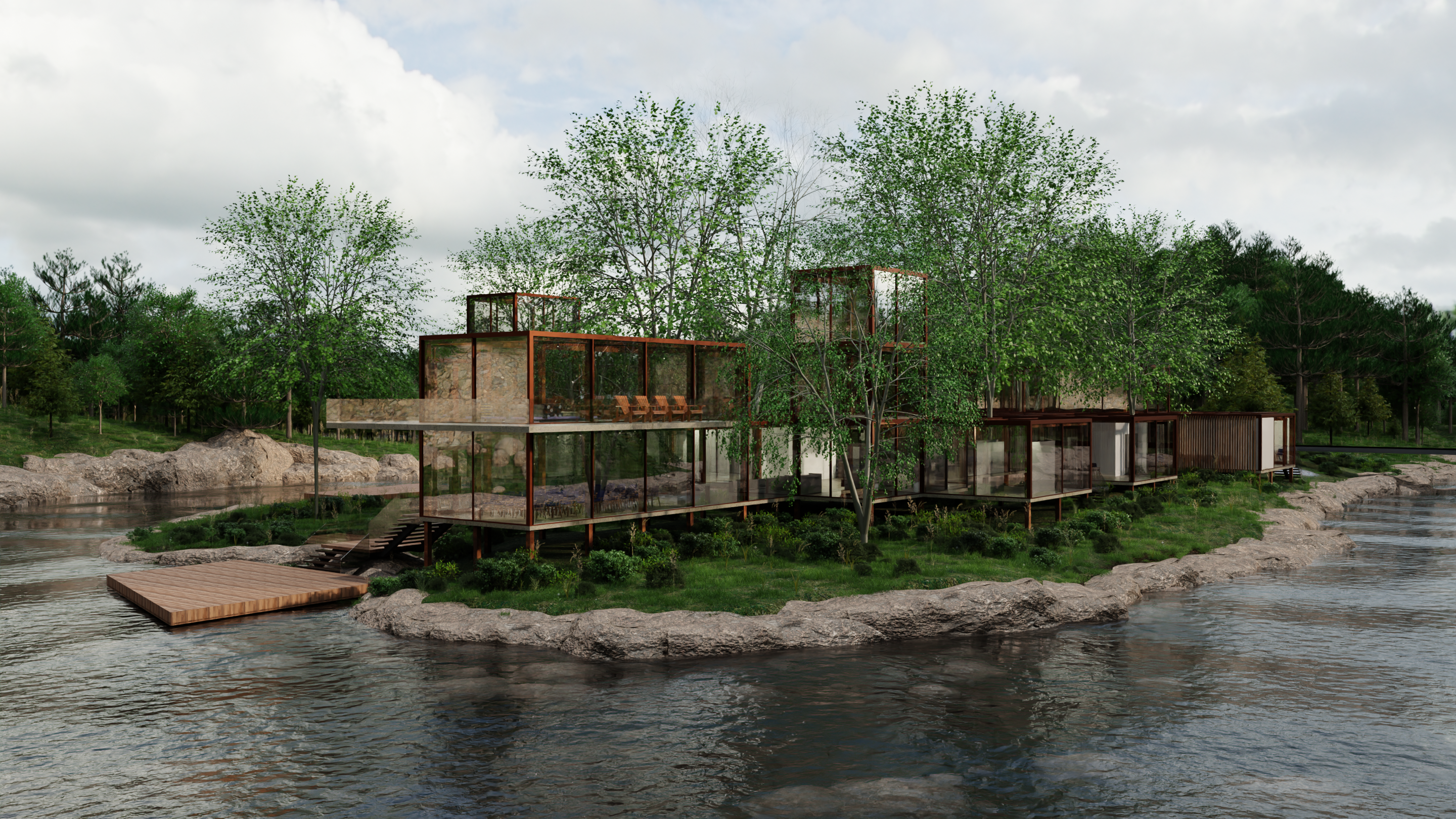
Popping in from my all feed and to my untrained eye I thought this was a real estate shot
Blender
A community for users of the awesome, open source, free, animation, modeling, procedural generating, sculpting, texturing, compositing, and rendering software; Blender.
Rules:
- Be nice
- Constructive Criticism only
- If a render is photo realistic, please provide a wireframe or clay render
Me too!
Thanks for sharing! Good progress, right now it kinda looks like if high quality raytracing shaders were put on something like Half-Life or Sims 2.
It looks great but the biggest issue is your ground vegetation.
-
The ground vegetation is far too homogenous and too green. If you look at reference images of landscape designs (I can't help myself -I'm a landscape architect using blender for archviz) you'll see what I mean. Just 5-6 different species are enough to create the illusion of realism. You want ta layer the plants on to add the chaos. Also, even the most modern clean designs have old nature around (scattered leaves, branches, rocks, twigs, weeds, etc). Also, only artificial turf will look this green consistently throughout the site. Real vegetation varies. In blender you can trick this by adding a random node to a saturation node and mixing with the diffuse or texture.
-
The water could benefit from foam/bubbles etc where it crashes with the rocks.
-
Lighting. Experiment with different light angles. Using a cloudy hdri works well for portraits but it neutralizes all the shadows. In landscape renderings, shadows add depth and scale.
Hey thanks for the advice I'll look into those points. Really appreciate the tips!
Your scene looks really good!
Can you share how you populated the grass plane with foliage?
Sure! I found some grass clump models somewhere, they are basically just little tufts of grass of various different orientations and arrangements, very low poly but from a distance they work.
Then I selected the ground plane I wanted to apply the grass to, and in edit mode selected only the areas to apply it to (you can do this using weight painting or vertex groups, I will encourage you to look both those up if you're not familiar).
Then using particles I made the ground plane an emitter for hair particles, but switched them out for a collection which contained all of my grass tufts. It took some time to orient each grass tuft object so they were position with z upward, but in the end I figured it out.
Theres a number of great tutorials on youtube about this technique that would probably do a better job explaining. This video seems really good.
This looks fantastic! Nice job!
