this post was submitted on 06 Feb 2024
91 points (100.0% liked)
Blender
2797 readers
104 users here now
A community for users of the awesome, open source, free, animation, modeling, procedural generating, sculpting, texturing, compositing, and rendering software; Blender.
Rules:
- Be nice
- Constructive Criticism only
- If a render is photo realistic, please provide a wireframe or clay render
founded 2 years ago
MODERATORS
you are viewing a single comment's thread
view the rest of the comments
view the rest of the comments

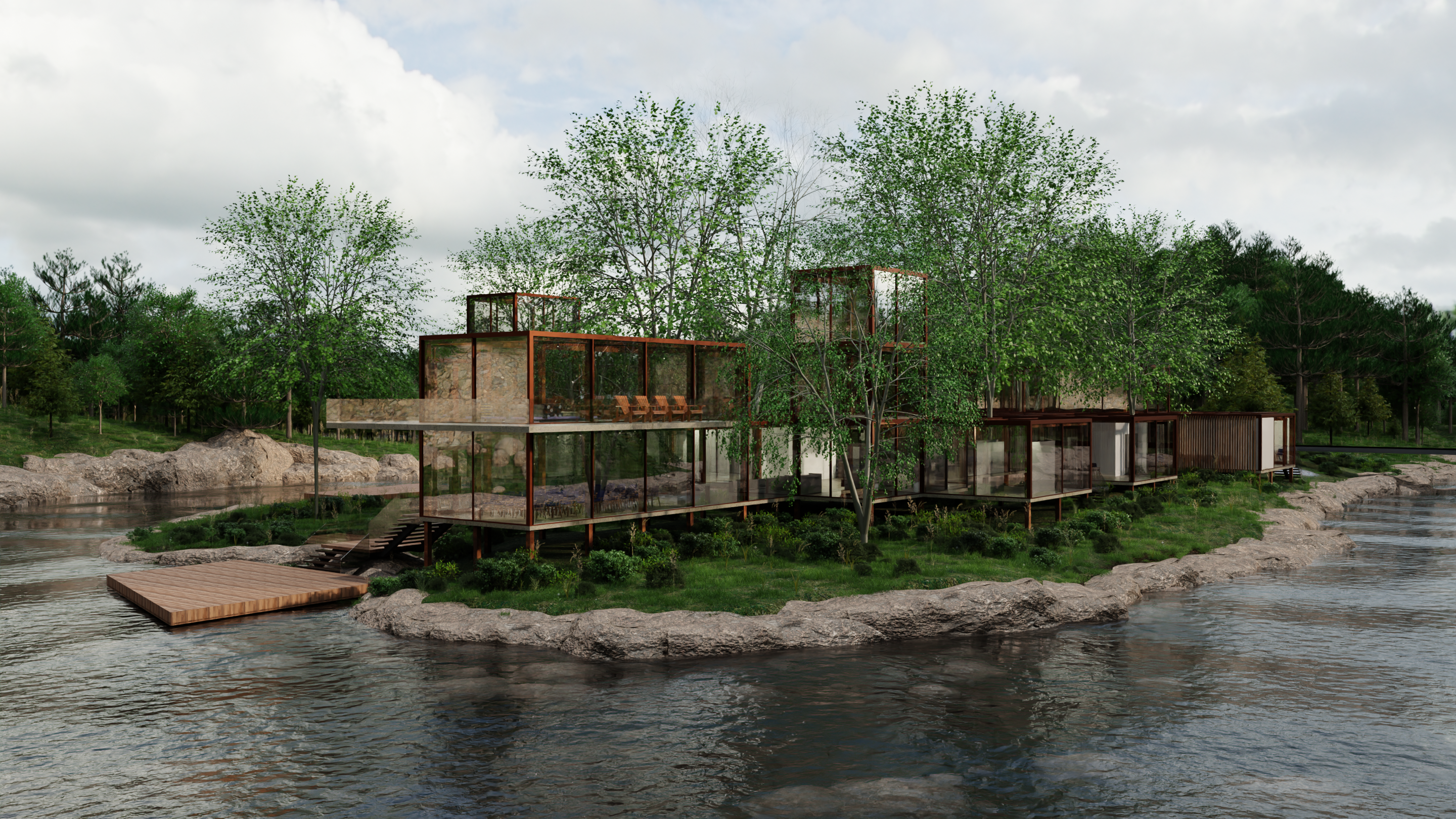
It looks great but the biggest issue is your ground vegetation.
The ground vegetation is far too homogenous and too green. If you look at reference images of landscape designs (I can't help myself -I'm a landscape architect using blender for archviz) you'll see what I mean. Just 5-6 different species are enough to create the illusion of realism. You want ta layer the plants on to add the chaos. Also, even the most modern clean designs have old nature around (scattered leaves, branches, rocks, twigs, weeds, etc). Also, only artificial turf will look this green consistently throughout the site. Real vegetation varies. In blender you can trick this by adding a random node to a saturation node and mixing with the diffuse or texture.
The water could benefit from foam/bubbles etc where it crashes with the rocks.
Lighting. Experiment with different light angles. Using a cloudy hdri works well for portraits but it neutralizes all the shadows. In landscape renderings, shadows add depth and scale.
Hey thanks for the advice I'll look into those points. Really appreciate the tips!