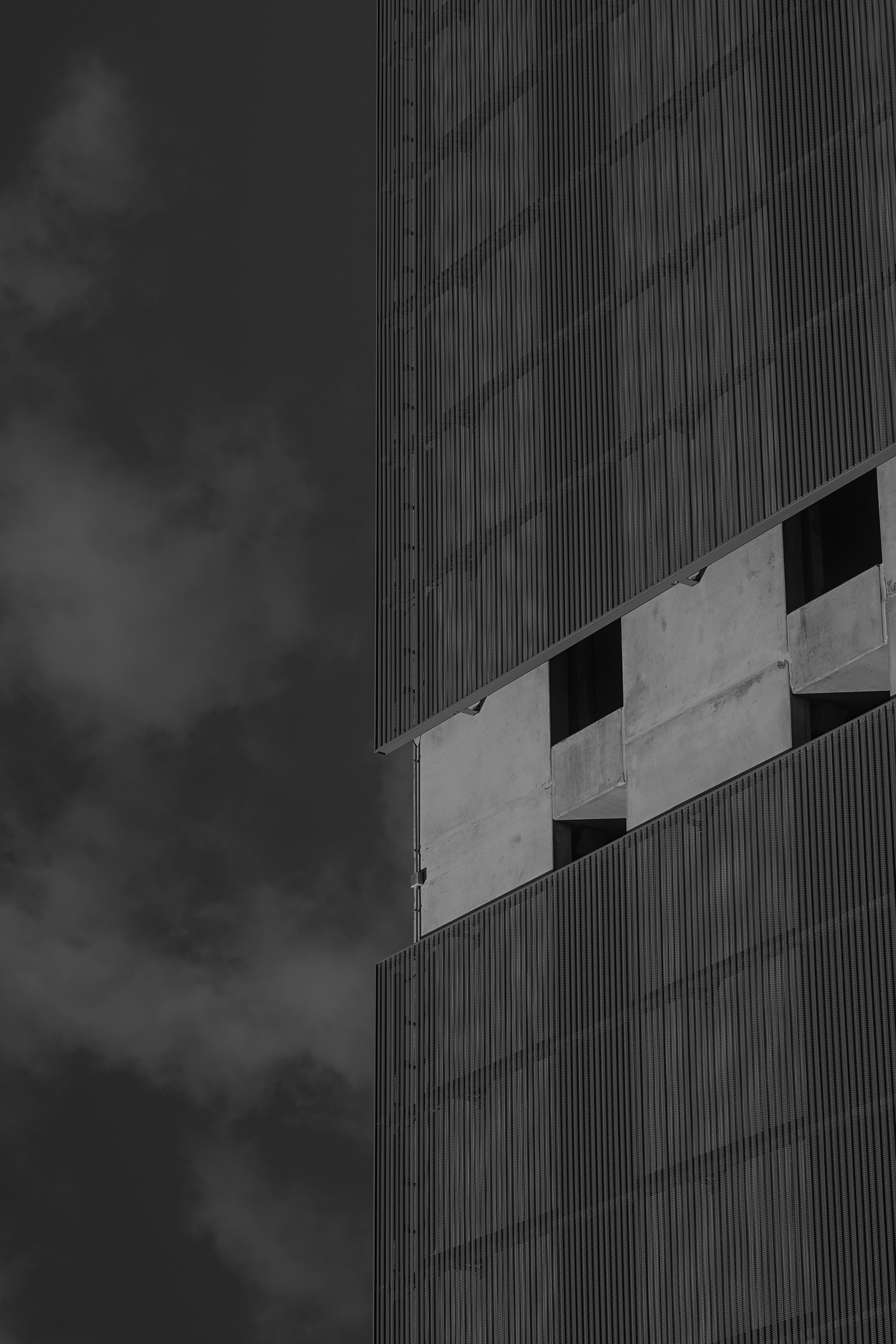
So I've been sitting on this one for a long time - it too comes from the January photos. I was inspired by another photographer who was posting abstract architectural photos on the reddit community and I wanted to try my hand at the style. I really like architectural photography, but it gets boring sometimes because it seems there's only a handful of good angles you can get of a particular building. So this kind of reinvigorated my creativity.
To give some perspective, the roof line of the building is on the left. I've rotated the photo around and to me it looks like a closeup shot of a much taller building with the clouds behind. I really like that. The junction box sitting there is a little distracting to me but it isn't so bad & I'd rather not edit things out of the photo. Not only is it usually obvious to me where my own edit took place but it also goes along with my hang up about being disingenuous in my photography.
I enjoy a lot of the texture here which was my main intrigue when snapping the photo. The wispy, smoke-like clouds remind me of the steam you see coming up from the streets sometimes. The weird metal facade over the concrete is just plain awesome to me - it looks soft and rigid at the same time. The concrete of the building has a nice smooth texture as well.
I'm not sure what to think of the lighting. I think the gray sky behind the white clouds is a little too dark. The building itself looks pretty cool to me and I really like how dark the windows turned out. And the whole photo might adhere too much to the rule of thirds, it kind of gives me that too-clean feeling.
Overall I think I did a pretty good job for a first go at this style!

I'm so bad at getting exposure right! lol playing with the exposure slider in Lightroom makes it look a lot better especially the sky that I was thinking felt too dark. It may have made the building a bit too bright but that's easy to tone down. Maybe I need to start paying more attention to the histogram.
I'll take a look at how a red filter would change it. It kinda hurts my brain trying to think of how it would affect the image since it's limited to black and white. I know some of the people I watch on YouTube use them sometimes - I'm sure I can find a how-to video.
Thanks so much for your input! I really appreciate it.
Hopefully you took it in a RAW format, so you should have considerable freedom to mess with exposure levels and whatever histogram/levels tools or shadows/highlights sliders you have access to, without introducing artifacts in the result.