this post was submitted on 12 Feb 2024
653 points (97.8% liked)
RetroGaming
19995 readers
160 users here now
Vintage gaming community.
Rules:
- Be kind.
- No spam or soliciting for money.
- No racism or other bigotry allowed.
- Obviously nothing illegal.
If you see these please report them.
founded 2 years ago
MODERATORS
you are viewing a single comment's thread
view the rest of the comments
view the rest of the comments

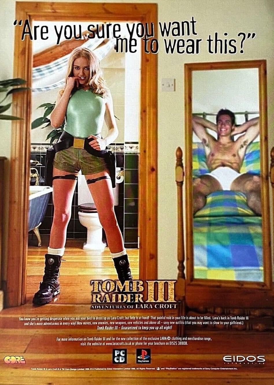
Is there a reason they used the "You wouldn't download a car" font?
Gen X edgy font?
The entire design is just janky somehow.
Also, do y'all remember the time Arby's of all people used this concept for an ad? It was a TV commercial, we see a guy waiting on a bed and hear a woman's voice from the bathroom "This is really what you want? Well I'm only doing it once." and she comes out dressed as an Arby's cashier with a tray of meat sandwiches.
Hmm, 1998. Is that Gen. X or Millenials? Makers are Gen. X, target group probably Millenials.
Default late-90s design intern font.
Tomb Raider 3 came out in 1998. Well before the anti-piracy campaigns.