this post was submitted on 14 Jan 2024
1437 points (97.4% liked)
Greentext
5208 readers
799 users here now
This is a place to share greentexts and witness the confounding life of Anon. If you're new to the Greentext community, think of it as a sort of zoo with Anon as the main attraction.
Be warned:
- Anon is often crazy.
- Anon is often depressed.
- Anon frequently shares thoughts that are immature, offensive, or incomprehensible.
If you find yourself getting angry (or god forbid, agreeing) with something Anon has said, you might be doing it wrong.
founded 1 year ago
MODERATORS
you are viewing a single comment's thread
view the rest of the comments
view the rest of the comments

You don't need a navbar if you switch to gesture controls
That's another thing they ruined! Oneplus had amazing gestures, but then Google enforced using their gestures only, and they're so much worse! I especially hate that back is swiping in from an edge, which is in conflict with every side drawer and cropping tool in every app ever!
Yeah, I have the most problems with it in Thunder. I avoided using gestures for so long but they've grown on me.
With Oneplus gestures back was swiping up from the bottom left or right. So much better. And the screen-off-gestures with drawing the pause symbol for play/pause or < or > for jump back/forward in a podcast or song. I miss them.
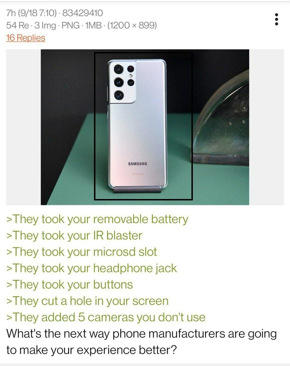
Fuck gestures, gice me back my buttons
If you're talking about physical buttons, please no. Gesture navigation is an incredibly useful feature for those with short fingers like myself, who have problems with reaching the "Recents" button without weirdly tilting the phone and then stretching their thumb to the point that it gets painful over time. And while it's technically possible to use gesture navigation on phones with physical buttons, it would definitely be weird. Not to mention that it's also wasted space, because physical buttons obviously can't just disappear when needed like on-screen buttons do, so you can have a bigger and more efficiently used screen. There are a lot of things that are dumb to remove from phones, pyhsical navigation buttons, in my opinion at least, are not one of them. I can't even think of an advantage physical buttons would have over on-screen buttons.
If you meant that you want to keep the option for on-screen button navigation, I'm all for it. Can't hurt to have more options :)
Well i meant physical buttons but i also think phone displays should be 5 inches, 5.5 at absolute most. Also, by the by, the main advantage of physical buttons is a) useabilty while gloved or with wet/dirty hands and b) being able to know precisely what button you're on by touch
I don't think this is a common use case for most people, but I can see how that might come in handy for some, so you've got some good points.
Thx. It's more about versatility in my eyes. A smartphone should be, above all else, practical. So a perfect phone for me would be something like Fairphone but with a 3,5mm jack, physical front buttons, and 2 cameras on the back (wide and normal/narrow lens). Mby additional sensors like a barometer, assuming that can be scaled down or done digitally/electronically.