this post was submitted on 04 Nov 2023
75 points (96.3% liked)
RetroGaming
20292 readers
722 users here now
Vintage gaming community.
Rules:
- Be kind.
- No spam or soliciting for money.
- No racism or other bigotry allowed.
- Obviously nothing illegal.
If you see these please report them.
founded 2 years ago
MODERATORS
you are viewing a single comment's thread
view the rest of the comments
view the rest of the comments

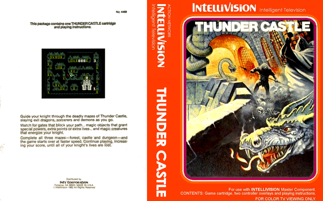
Shit site on mobile. The column of social media buttons floating on the right covers the most important parts of the art.
I was thinking the same thing, how annoying
There was room for a row at the bottom too that wouldn't block the middle area view, I don't know css extremely well but I figured they could put that row horizontal down there without much hassle and give a better view. Of course then you don't get reminded to click on a social link, ugh.