this post was submitted on 07 Sep 2023
4 points (100.0% liked)
Photo Critique
414 readers
1 users here now
A community to critique photographs and learn from others.
Rules
- OC only for critique
- Film & Digital are both welcome!
- General photography questions are also welcome
- Critique requestor should critique their own work (it really helps!)
- Above all, be kind :)
Trying to create a similar space to /r/photocritique
founded 2 years ago
MODERATORS
you are viewing a single comment's thread
view the rest of the comments
view the rest of the comments

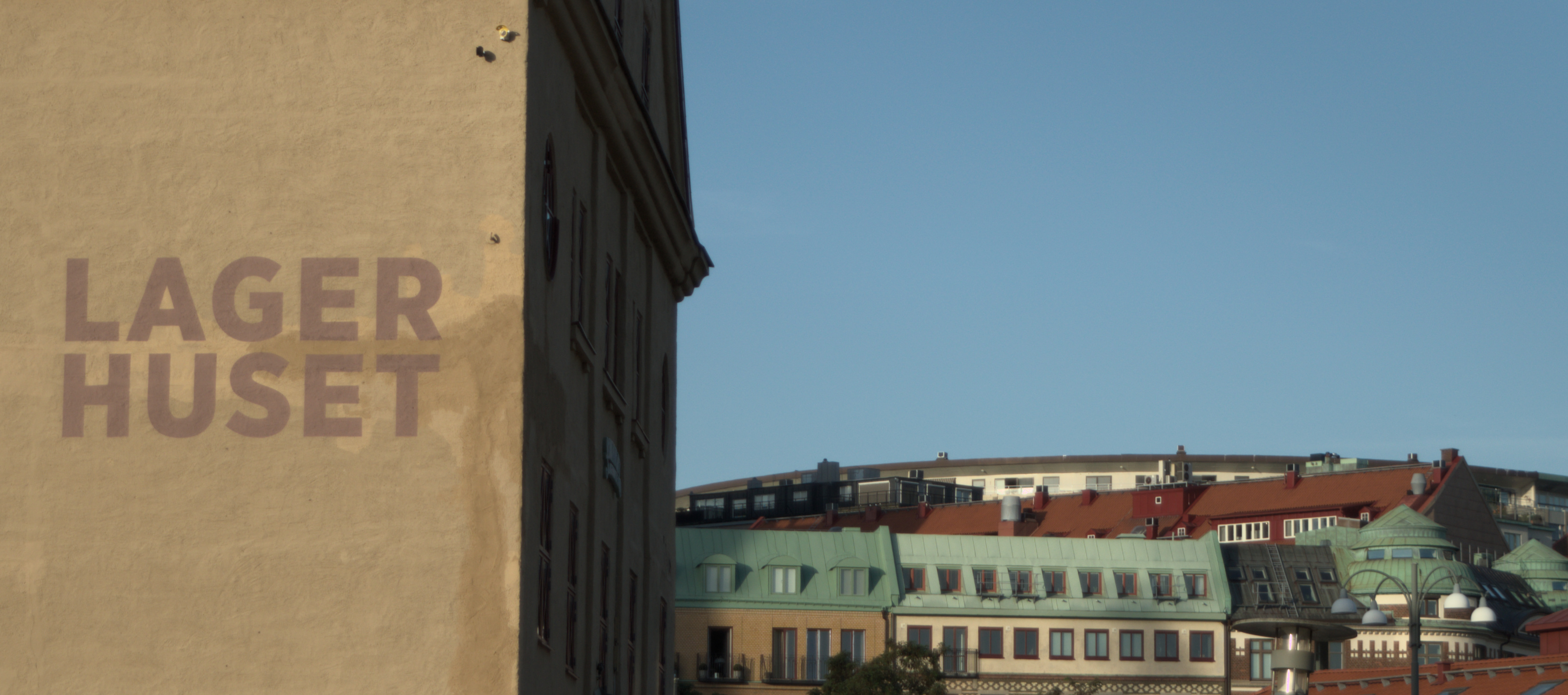
Here is an alternative crop: