this post was submitted on 15 Jun 2023
4 points (100.0% liked)
Photo Critique
414 readers
1 users here now
A community to critique photographs and learn from others.
Rules
- OC only for critique
- Film & Digital are both welcome!
- General photography questions are also welcome
- Critique requestor should critique their own work (it really helps!)
- Above all, be kind :)
Trying to create a similar space to /r/photocritique
founded 2 years ago
MODERATORS
you are viewing a single comment's thread
view the rest of the comments
view the rest of the comments

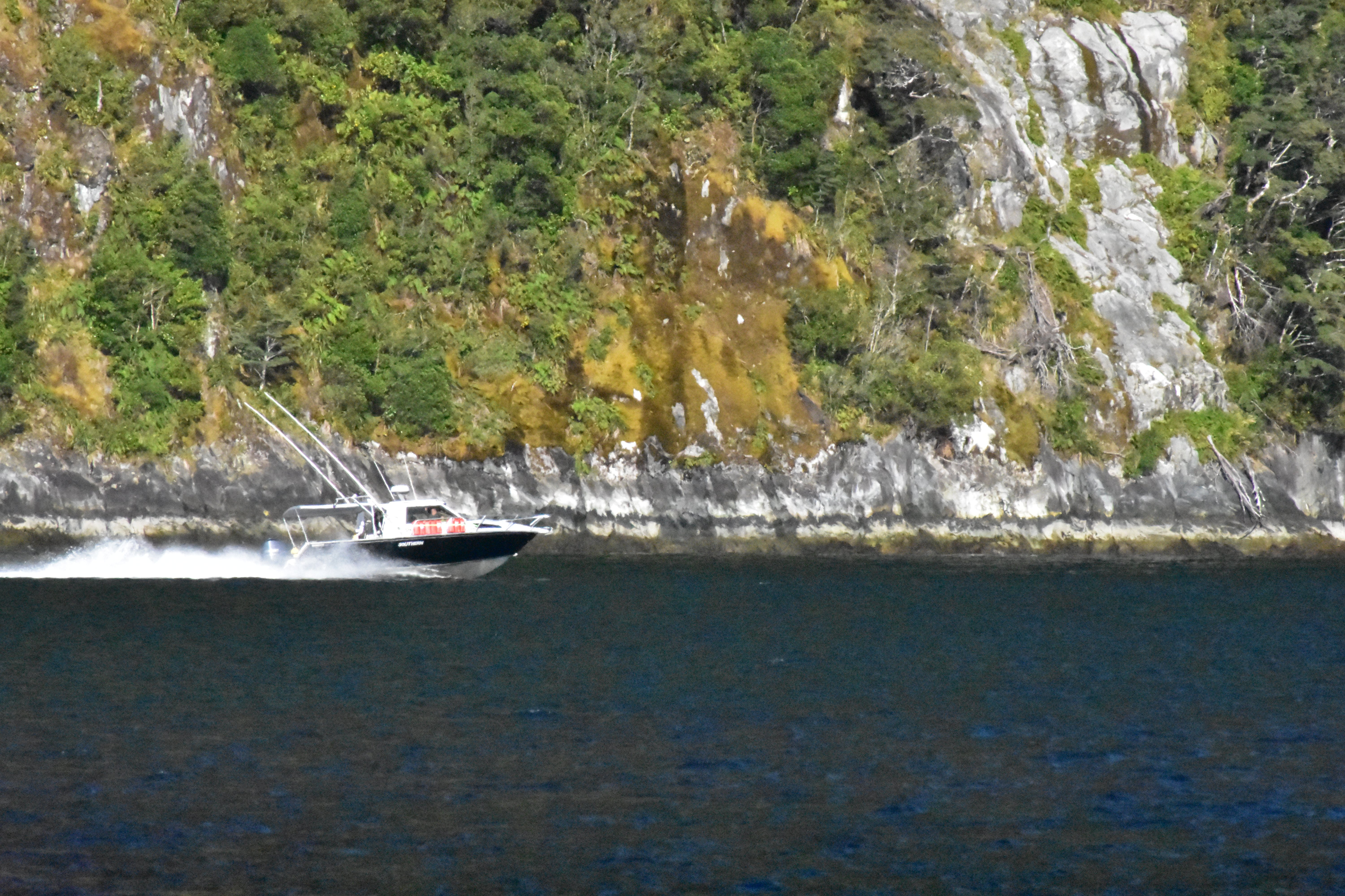
Here's my personal opinion about this picture. I believe that you selected the boat and it's wake as your main subject for this frame. If so, in my opinion, they are too hidden in the frame. There's nothing that makes them stand out; on the contrary, the cliffside hides it. You mentioned the contrast between the dark water and the brightness of the cliff side. I think that since both are part of the background, this big contrast actually deviates the attention from the main subject, the boat and it's wake. Normally, placing the boat on the right side would remove a part of the story (i.e., the destination of the boat, since it is a moving object). However, since one of the things that caught your attention of this scene was the boat's wake, I think including more of it makes sense. Then your story is not its destination anymore, but its speed, beauty, etc. Consider the stroy that you want to transmit when composing. Dead space is not a problem, the important thing is main subject and background separation (contrast), and main subject emphasis, both which could be improved in this frame.