this post was submitted on 09 Feb 2025
356 points (97.3% liked)
Science Memes
12060 readers
1386 users here now
Welcome to c/science_memes @ Mander.xyz!
A place for majestic STEMLORD peacocking, as well as memes about the realities of working in a lab.

Rules
- Don't throw mud. Behave like an intellectual and remember the human.
- Keep it rooted (on topic).
- No spam.
- Infographics welcome, get schooled.
This is a science community. We use the Dawkins definition of meme.
Research Committee
Other Mander Communities
Science and Research
Biology and Life Sciences
- [email protected]
- [email protected]
- [email protected]
- [email protected]
- [email protected]
- [email protected]
- [email protected]
- [email protected]
- [email protected]
- [email protected]
- [email protected]
- [email protected]
- [email protected]
- [email protected]
- [email protected]
- [email protected]
- [email protected]
- [email protected]
- [email protected]
- [email protected]
- [email protected]
- [email protected]
- [email protected]
- [email protected]
- !reptiles and [email protected]
Physical Sciences
- [email protected]
- [email protected]
- [email protected]
- [email protected]
- [email protected]
- [email protected]
- [email protected]
- [email protected]
- [email protected]
Humanities and Social Sciences
Practical and Applied Sciences
- !exercise-and [email protected]
- [email protected]
- !self [email protected]
- [email protected]
- [email protected]
- [email protected]
Memes
Miscellaneous
founded 2 years ago
MODERATORS
you are viewing a single comment's thread
view the rest of the comments
view the rest of the comments

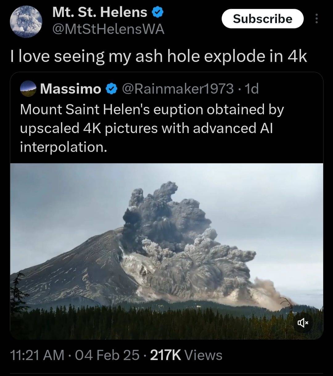
Fuck no. You're basically morphing between two or more existing images, not creating or enhancing or getting anything real just something that vaguely looks like a weirdly blurry slideshow
The creator of that apparently got really angry when people told them that it looked like garbage.
Damn that looked even worse than I imagined it would. The movement doesn't even naturally follow one shot to the next.
It explains why in the pinned comment:
Omg that garbage looks like an elephant toothpaste experiment.