this post was submitted on 10 Dec 2024
309 points (97.2% liked)
Map Enthusiasts
3596 readers
98 users here now
For the map enthused!
Rules:
-
post relevant content: interesting, informative, and/or pretty maps
-
be nice
founded 2 years ago
MODERATORS
you are viewing a single comment's thread
view the rest of the comments
view the rest of the comments

when?
in the summer or winter?
One of the many reasons this makes no sense.
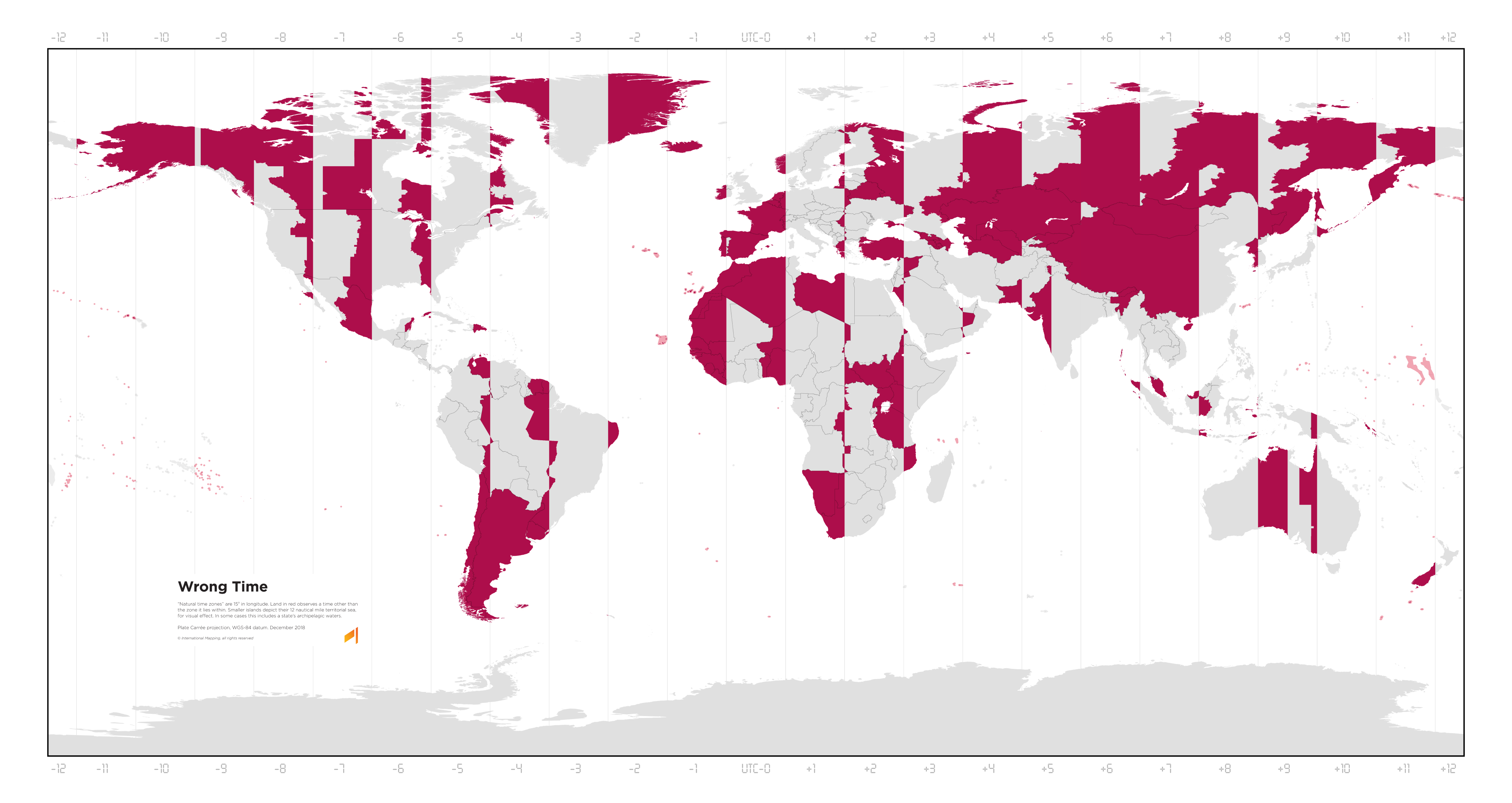
This uses standard time across the board. Because accounting for shifts due to pretendy-magic-time would be impossible in a static image.
We spend most of our year in daylight savings time. Standard time is the pretendy-magic-time.
Daylight saving time would take it from western Europe being red to almost all of Europe apart from Russia and Belarus being red. It would invert the parts of the contiguous US states so the current correct time places are wrong, and the current wrong parts are correct. Which means both the east and west coasts (the most populated parts by far) are now wrong. And incidentally, Alaska stays entirely red. It would make the western most edges of NSW and Victoria good, as well as the western half of South Australia, at the expense of Sydney, Melbourne, Adelaide, Canberra, and Hobart, nearly half the country's population, before you even begin to account for the rest of the southeast.
Just pointing out the ridiculousness of getting petty and insulting about the way other people define time scales because you don't agree. There is no objective truth here, just subjective opinions. ALL of those opinions and methods have flaws, especially your beloved "everyone should just use UTC". There is no such thing as "correct" here, so putting that word in your map's title and using "right" and "wrong" in this discussion is just naive.
The thing with DST is it's not just a matter of personal opinion. Studies have been done on it, and they universally come down on the idea that it's really bad. Heart attacks, traffic crashes, and suicides all go up as a result of DST. Economic productivity goes down. Here are a handful:
I'm particularly a fan of the penultimate one linked there, which states:
But also, you know I didn't make this map, right? It's just map that paints places in red if their solar noon is more than half an hour away from their clock's noon. Which is the "right" way to do things unless your goal is abolition of time zones entirely in favour of adapting working hours to the local conditions without adjusting clocks.
You're so wound up about making your point and defending your point of view that you're not actually comprehending my comments. It's your map in the sense that you are presenting it to us, who authored it isn't really relevant to this discussion.
Bruh, I just presented it because it was cool. You're the one getting hung up on whether the fairly basic premise of the chart is the best premise that could have been used.
But yes, that DST is bad is a hill I was absolutely die on. That shit is terrible, and I have zero patience for people who defend it once the reason for objecting to it is explained to them.
Bro, if you didn't want people to respond with genuine takes on what you post and if you're going to be so defensive, why are you even here?
Also, I'm not defending anything. DST should be the standard time because we spend most of the year in it anyway. But that's just my own opinion, which I feel no need to defend to you or anyone else.
Your opinion has as much relevance here as the opinion of climate change deniers.
Rude.