this post was submitted on 15 Nov 2024
294 points (94.0% liked)
Linux
50208 readers
1868 users here now
From Wikipedia, the free encyclopedia
Linux is a family of open source Unix-like operating systems based on the Linux kernel, an operating system kernel first released on September 17, 1991 by Linus Torvalds. Linux is typically packaged in a Linux distribution (or distro for short).
Distributions include the Linux kernel and supporting system software and libraries, many of which are provided by the GNU Project. Many Linux distributions use the word "Linux" in their name, but the Free Software Foundation uses the name GNU/Linux to emphasize the importance of GNU software, causing some controversy.
Rules
- Posts must be relevant to operating systems running the Linux kernel. GNU/Linux or otherwise.
- No misinformation
- No NSFW content
- No hate speech, bigotry, etc
Related Communities
Community icon by Alpár-Etele Méder, licensed under CC BY 3.0
founded 5 years ago
MODERATORS
you are viewing a single comment's thread
view the rest of the comments
view the rest of the comments

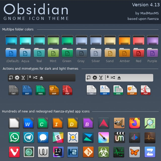
If I understood it correctly, in this context it means that the icons normally retain the original logo and color scheme, while incorporating them into a single style.
a skeuomorph (from greek, "tool/container-shape") is something that retains the characteristics of another thing that it is based on, even though those characteristics are no longer useful. think lamps shaped like candles, or the floppy disk save icon, or media player programs with volume knobs.
skeuomorphic UX is a good way to get users comfortable with a system by using designs they are already familiar with, and the original iphone used this to great effect.
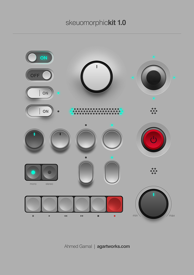
This is a good example of skeuomorphic UI:
all to say, I'm not entirely sure these icons are skeuomorphs. they're just glossy.
Yeh the files being little pieces of paper, and the folders being old office folios are skeumorphic. Skeumorphic was (or is?) sometimes used more generically for ui elements made to look physical so perhaps the pseudo 3D shading, dropshadows, bevels and highlights qualify much of OPs examples, though they aren't representing any specific type of physical object necessarily. Just objects to be grabbed and used (clicked).
I’m sure trends will bring us back to a similar style at some point like they often do.
it's weird that. it's obviously possible to have a flat-shaded skeuomorph, just look at basically all of windows 95, but for some reason we connect them to this particular graphical style. files and folders are both part of the old classic "desktop metaphor", so they basically have to be skeuomorphs. but like, the application icons are basically just mosaic tiles of the normal icons.
a proper skeuomorph would indicate what the program is for. krita and whatever map software that is are both good, if a little flat. but the libreoffice suite just being squares with a letter on them? have them be like, a spreadsheet for calc, a stack of cards for impress, and a printed page for write.
remember all the icons for windows 95 network utilities that have people in them? those are also (attempts at) skeumorphs because they're trying to communicate what the program does.
Wow that is a gorgeous image
Thanks! Learning more every day
Also, beautiful design, and probably not bad for a touchscreen (terrible for mouse though)