this post was submitted on 08 Oct 2024
156 points (94.8% liked)
Data is Beautiful
5338 readers
170 users here now
A place to share and discuss visual representations of data: Graphs, charts, maps, etc.
DataIsBeautiful is for visualizations that effectively convey information. Aesthetics are an important part of information visualization, but pretty pictures are not the sole aim of this subreddit.
A place to share and discuss visual representations of data: Graphs, charts, maps, etc.
  A post must be (or contain) a qualifying data visualization.

  Directly link to the original source article of the visualization
    Original source article doesn't mean the original source image. Link to the full page of the source article as a link-type submission.
    If you made the visualization yourself, tag it as [OC]

  [OC] posts must state the data source(s) and tool(s) used in the first top-level comment on their submission.

  DO NOT claim "[OC]" for diagrams that are not yours.

  All diagrams must have at least one computer generated element.

  No reposts of popular posts within 1 month.

  Post titles must describe the data plainly without using sensationalized headlines. Clickbait posts will be removed.

  Posts involving American Politics, or contentious topics in American media, are permissible only on Thursdays (ET).

  Posts involving Personal Data are permissible only on Mondays (ET).
Please read through our FAQ if you are new to posting on DataIsBeautiful. Commenting Rules
Don't be intentionally rude, ever.

Comments should be constructive and related to the visual presented. Special attention is given to root-level comments.

Short comments and low effort replies are automatically removed.

Hate Speech and dogwhistling are not tolerated and will result in an immediate ban.

Personal attacks and rabble-rousing will be removed.

Moderators reserve discretion when issuing bans for inappropriate comments. Bans are also subject to you forfeiting all of your comments in this community.
Originally r/DataisBeautiful
founded 2 years ago
MODERATORS
you are viewing a single comment's thread
view the rest of the comments
view the rest of the comments

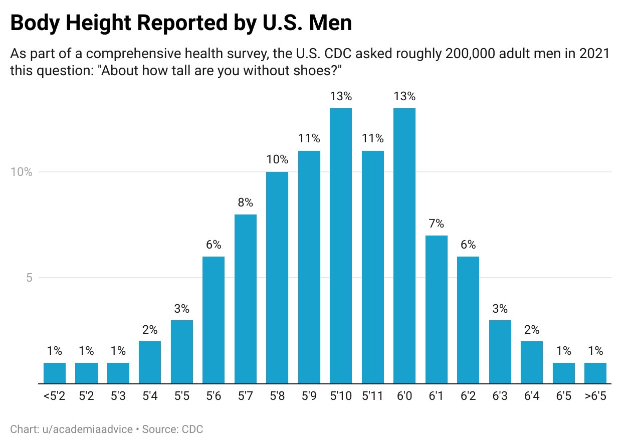
Just using this data to show how stupidly wealth is currently distributed in the country assuming 5'11" or 1.8 meters average if we converted this into 2022 wealth values with average income of 61,136, top 1% as 785,968 (12.9x), and 0.1% 2.8 million (458x) the top 1% height would be 23.22 meters and 0.1% would be 824.4 meters tall.
I'm pretty high and I can't make an ounce of sense of what you're on about
Naturally occurring normal numeric distributions will tend towards a bell shape, or curve, as you acquire observations. Artificial distributions like income will follow a different curve that is sometimes difficult to visualize especially when the differences are measured in millions or billions. It's easier to visualize the differences in artificial distributions if you use a natural distribution as a familiar basis.
Tl;Dr Do you think Paul Bunyan and Paul Blart are related?
Only if they both know who took Karl
This is a nicely symmetric bell curve but a similar wealth distribution graph will show a miles long tail