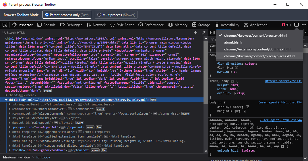
You could do this:
toolbar .toolbarbutton-1:not([disabled]):hover > :is(.toolbarbutton-icon, .toolbarbutton-text, .toolbarbutton-badge-stack){
  background-color: #6495ed !important;
}
But if you want to just change the background-color of all the elements where that same color gets used (so buttons, bookmark-items, tabs scrollbuttons, sidebar switcher button etc.) then it would be much easier to redefine the value for the variable they all use:
:root{
  --toolbarbutton-hover-background: #6495ed !important;
}


I mean, if that works for you the go for it, but that isn't quite the same thing. For you normal buttons in the toolbar, the hover background-color is not on the
<toolbarbutton>itself, but on the icon inside the button. The area of the icon is smaller than the button, so what happens is that you will be shown both colors which should be pretty visible especially if the theme you have uses some drastically different color. In addition, that will also apply to buttons inside panel menus, which may or may not be what you wanted.