Cocell

joined 11 months ago
MODERATOR OF
[–] Cocell 1 points 3 months ago

Wow thanks! :D

[–] Cocell 1 points 3 months ago

Heh, I could do that. In fact, that is what I actually thought I should do. But then, it would be more reliable to have the server based on Perchance itself, as Glitch tends to put projects to sleep that are inactive. And Glitch could also shut down any time, not that it is likely to happen.

And another thing is, so many people would then rely on my Glitch WebSocket, I think there are restrictions to how many requests can be sent to a Glitch App per hour.

A free Glitch account is only allowed 1000 hours in a month, though a month is around 744 hours.

And I don't want to bear liability for so many users as well.

[–] Cocell 2 points 3 months ago* (last edited 3 months ago) (1 children)

Wow, I was just about to make a post about this. What a coincidence.

Btw, Perchance Dev, I think this only happens with smaller screens, or to be precise, should I say this does not happen with only too large screens.

[–] Cocell 1 points 3 months ago

After looking into it a bit, it seems it only happens if there are network disturbance, which would prevent the ad from being displayed and which is interpreted as an ad blocker preventing the ad from being displayed.

[–] Cocell 1 points 4 months ago

I feel like you didn't finish your CSS course. 😨

[–] Cocell 1 points 4 months ago

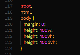
The CSS dvh unit stands for "Dynamic Viewport Height." It represents a portion of the height of the viewport, which can adjust dynamically as the viewport changes size, such as when a user groups tabs together in mobile, or resizes the window. It will take those elements into accounts as well when changing size.

Since the browser support is not solid, many people declare it after declaring a normal height: 100vh rule. You can understand it greatly via this short video.

About the ads, I will need a little time, I will experiment with it and see what I can find. For now, I know that almost every user with an unstable network is affected by this.

Also, I was creating a script to interact with Perchance via the NPM Puppeteer module. But whenever Perchance was loaded, all the UIs were gone, or at least supposed to be gone. I wanted to learn a bit about this.

The only problem it gave was that it was hard to login to my account via Puppeteer. The core reason I am using Puppeteer is so that I can push updates directly from my terminal. What do you think about that? There certainly are applications that can connect to a GitHub.

[–] Cocell 1 points 4 months ago

I tried the display block, it didn't work, that's why I suggested flex, since it is consistent in its layout.

[–] Cocell 1 points 4 months ago

I see that the one you are using is truly uneven.

Also, serious discussion in Discord, please be ready.

[–] Cocell 2 points 4 months ago

Perchance dev, I agree with this too. Even though this is not a big inconvenience, I constantly find myself rushing to set my new generators private.

[–] Cocell 1 points 4 months ago (3 children)

I think I now know your gender. :D

As for ads, yes it often refreshes the application even when we do not have an adblocker. Due to the recent protest in my country, I think it could be due to; a slow network, or a restriction. My country have restricted access to many websites, and I think it could contribute to why the application cannot display ads, I still lean towards the slow network scenario.

Also, I think you should use also use the dvh unit for as well, since in mobile, there is an issue where the application does not account for browser specific UI. I could show you some screenshots, but I don't have any. :\

And to avoid confusion, this is how I use the dvh unit.

[–] Cocell 1 points 4 months ago (1 children)

I have one question, which may be a bit personal... What is your gender? 😅

[–] Cocell 1 points 4 months ago

It is nothing much, I have seen this since like, last year. (Sorry I didn't report this 💀)

Most of the time it goes away when I refresh it, kinda like Lemmy, where it does not logs me in automatically until I refresh.

3
News and discussion (self.perchance)
submitted 6 months ago by Cocell to c/perchance
 

Hello everyone. Today I have found /huge-emoji-list.

And I duplicated it into /cocells-emoji.

But why am I speaking of this? Well, since the comment essentially relies on URL. And the list literally consists of almost 87k emojis.

I want to understand what fellow developers have to say about this? Because this generator is pre-loaded with so many resources, but the constrain lies in the URL. After all, it essentially contains 20000000+ characters, well, an estimate.


Perchance Dev,

Many thanks from the bottom of my heart for implementing the upload formatting methods. However I noticed something that might be erroneous and wanted to bring this to your attention.

Essentially, at the end it seems to reset the list. There is indeed a method to that warns the user about erroneous formatting, but it seems there is a need for another reinforcement as when the user does input undefined syntax, it also breaks the formatting.

5
Me is in. (self.casual_perchance)
submitted 6 months ago by Cocell to c/casual_perchance
 

I am in! :> I should have been in a few days ago. 💀(That is all.)

3
submitted 6 months ago* (last edited 6 months ago) by Cocell to c/perchance
 

Dear Perchance Dev,

I would like to make a request to be able to format the files' links and names at /upload.

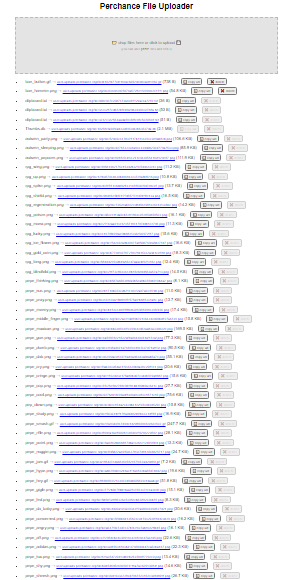
Currently, it displays them as: ${file_name} → ${file_url} (${file_size}) 📋 copy url ❌ delete however, I need to be able to format them as: ${file_name} /* without the extension */ = ${file_url} /* including 'https://' */.

The reason for this is because of the new custom emoji feature at the comment's plugin.

I could have made this suggestion sooner, but I did not because I had my own method to format them, however I know there are many people who will be needing this formatting method. That is because of this:

As you can see, I have an absurd amount of links, and formatting them one by one would not be efficient.

For that reason, I would like a formatting method at /upload.

  • EDIT: I believe the most flexible and powerful formatting options would be to take user input formatting in a text manner, for example a user could input; ${file_url} which would only display the URL. And this could be curated to their own needs.
 

Dear, Perchance Dev.

I want to inquire about what you are planning to do now that the canvas, aka tldraw is no longer working?

You did wrote something like this:

As you can see, the plugin is no longer working.

I am curious about your plans ahead, as tldraw/canvas was a vital component that users use beyond just drawing; but also sharing many medias.


Dear Perchance Dev,

I believe the emoji popup layout should be like this:

And not like this:

The reason to do this is because the one I introduced allows the full view of the emoji and its name, plus it becomes easy to select the desired emoji and it allows scrolling, meaning if there are too many emojis, it will not break. This is similar to Discord's emoji selection.

Next, I think the displayed emoji should be enlarged, a little. If not possible, there should be a method to enlarge it, either through the Perchance panel, or something like this, :toro_silly:(1.5). The unit displayed, (1.5) could be used via multiplication, the 1 unit would be the default size, while the, 1.5 would be the multiplied size.

Regardless, there should be a customization option for this directly in the perchance panel to change the default emoji size.


Dear Perchance Dev, I would like to make another request. It is about profile pictures and images. The process is simple, a user could be allowed to have a profile picture, this could be done via having a image uploaded to a CDN (Content Delivery Network) such as Perchance's own, or through other image hosting platform.

Just like how nicknames are set, a user profile could be set from the settings defined. The profile pictures could even be animated gif or WebP.

(Optional) However, the admins should have at least the ability to hide individual users' profile picture, as some users may choose to use inappropriate pictures which could be potentially harmful to many.


The image upload could be achieved using a similar method; linking an already uploaded image. Uploading images directly to Perchance's server might put a heavy load, thus linking them through link might be a better option. There should be another button for the image(s) to be linked.

Thank you very much.


I have noticed that the comments could be styled through the Perchance Panel, however I noticed that the style are not as comprehensive as using traditional CSS would be. It can be easily mitigated by using a CSS file and if there was a way to link the CSS file to the comments plugin. It can be easily achieved as well, if there was an option to write the URL of the CSS file, the comments plugin would only need to append a link with href and rel as style at the end of the iframe to use completely custom and comprehensive CSS.

I have many generators, and in all of them, I use darkmode, and since there were no darkmode buttons for the comments plugin, I just decided to use darkmode as default, however recently I have noticed that some people have eye condition where it is hard for them to read text in darkmode. So it would have been great if the dev could implement a message listener so I could post a message for darkmode from the parent window to the container, of course this would require the comments plugin to handle a darkmode function to apply the dark class to the body inside the iframe. If the dev is consider this, I believe not everyone uses dark as class, so I think making another option for the Perchance Panel as to what the class name could be is great.

Next up, I have thought about images, we upload images in the comments, however what if, we as creators were to predefine sets of images to be used? I think the smarter way would be to look for image links. However the reason I am proposing this is because I wanted to predefine sets of custom emoji, for example, :husk:, I could predefine it and the plugin could format them before sending.

Next, I have thoughts of being able to set up bots. It could be a great innovation. However I do not think this suggestion could be taken into consideration due to its complexity. Bots could be written through JS and the reason I am suggesting this is because I thought of being able to set up an AI using the Perchance AI Text plugin. If the dev is indeed considering this, I believe many people would create their own bots, and thus, there should be a way to share them, which could be done as pure codes, or shared links for files. This suggestion is extremely complex, but this is just my suggestions.

Next, the Perchance Comments Plugin by default has a border, which is completely fine, but I noticed that we are unable to remove that border even if we try to style the container in the Perchance Panel, I am merely bringing this up as a graphical issue, however this, too, should be solved upon being able to use custom comprehensive CSS.

In summary, what I would like are as follows:

  • Custom CSS Linking: I would appreciate adding an option to the Perchance Comments Plugin to allow users to specify a URL for a custom CSS file, allowing comprehensive styling beyond the current options.

  • Dark Mode Accessibility: Implement a message listener for dark mode toggling from the parent window to the plugin container, allowing users to switch between dark and light modes. Additionally, allow customization of the CSS class for dark mode (e.g., .dark).

  • Predefined Images and Custom Emoji: Allow creators to define sets of images to be used in comments. Also, enable the formatting of custom emoji (e.g., :husk:) by predefining them in the plugin.

  • Bots and AI Integration: Though complex, consider adding the ability to set up bots using JavaScript, along with perhaps the ability to use Perchance Plugins. Provide a means to share bot configurations, either as code or shared links for files.

  • Border Styling: Currently, the Perchance Comments Plugin has a default border that cannot be removed even with container styling. This issue should be addressed alongside the ability to use custom CSS.
6
Commenting Issue (self.perchance)
submitted 11 months ago by Cocell to c/perchance
 

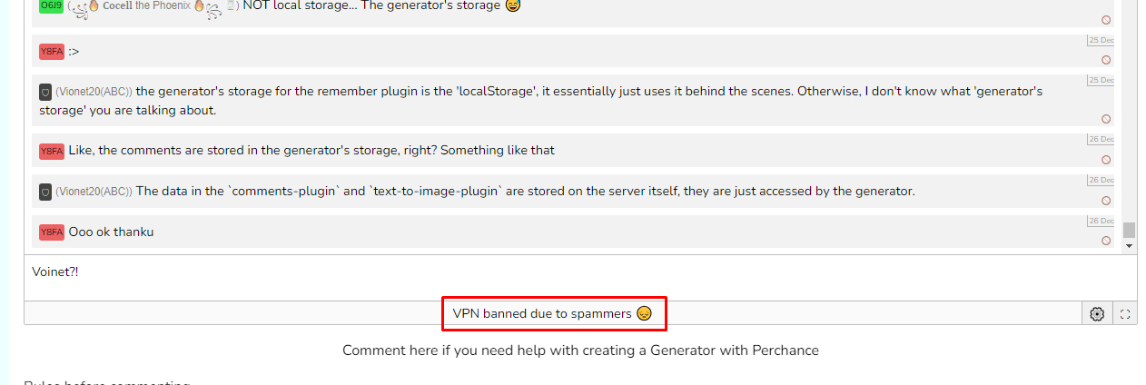
So, today in the morning I was able to comment just fine at Perchance, but this evening when I tried to comment I got this:

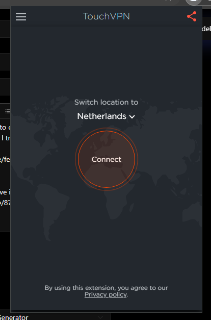
Even though the only extension I have is:

And even that is turned off:

So I decided to remove that one extension from my browser, which is Chrome (I tried in Edge yet it didnt work):

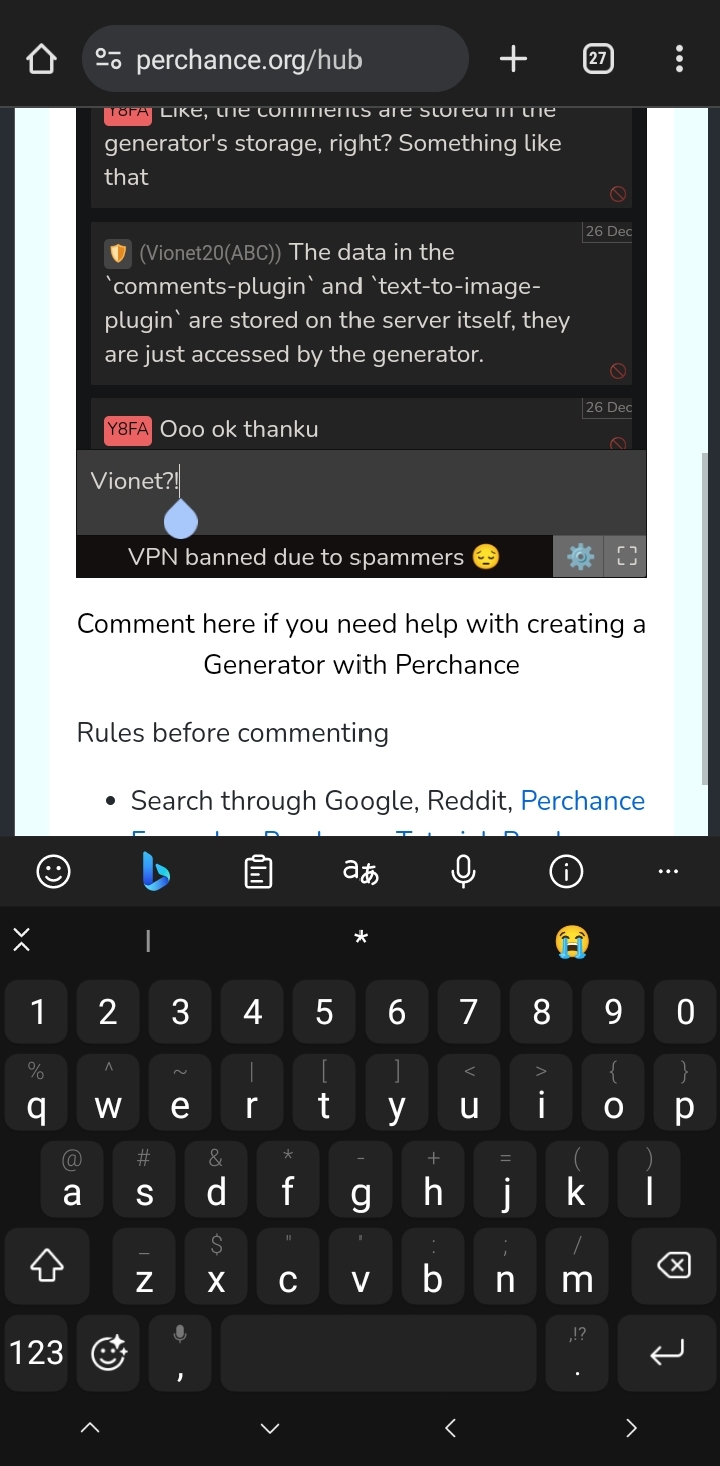
I then tested it out on my phone, and to my dismay... That didnt work either:

And now I am left on my own, thinking what to do... 😐 (Help)

view more: ‹ prev next ›