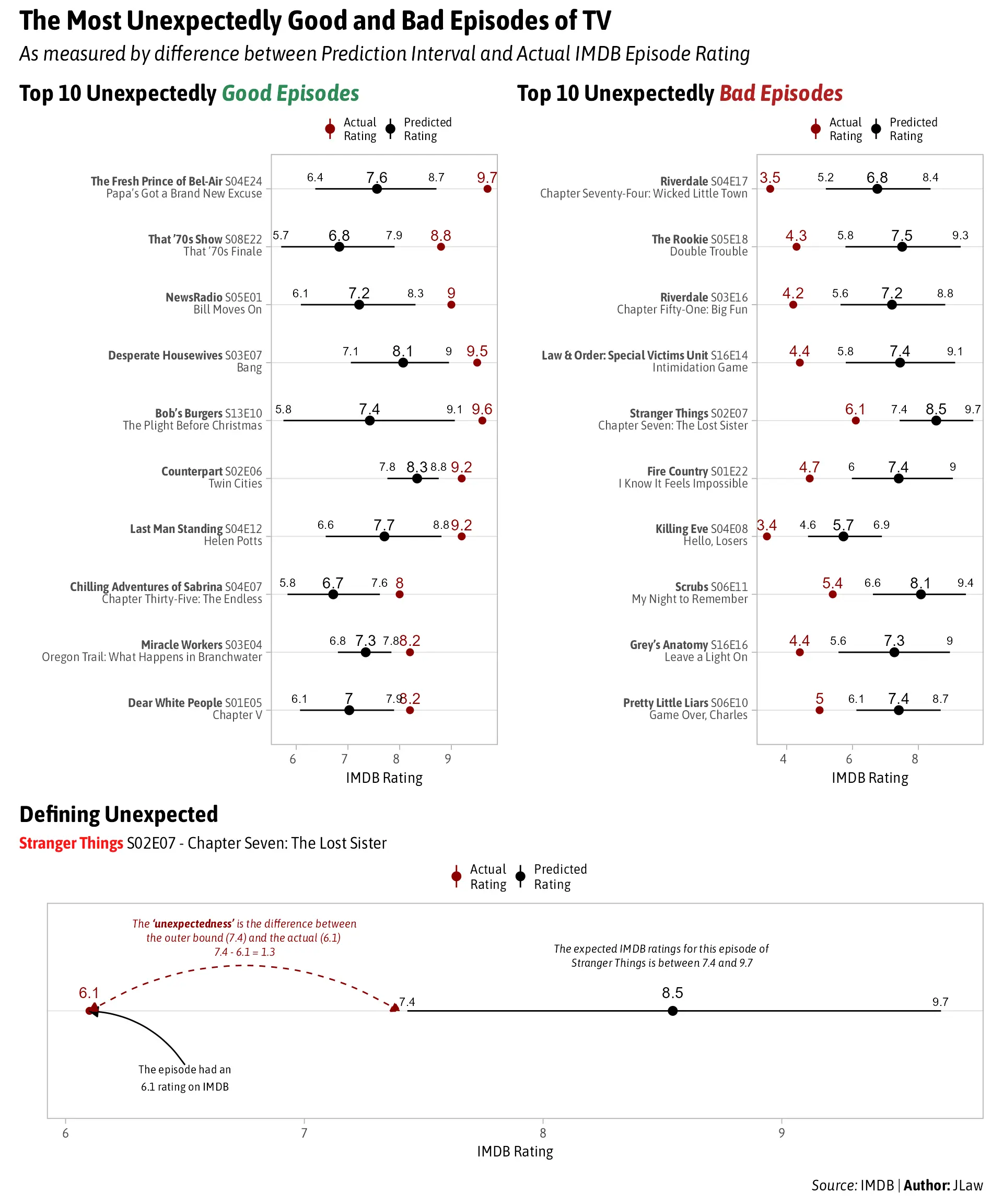
Is the predicted just average up to that time with error bars of confidence?
A place to share and discuss data visualizations. #dataviz
(under new moderation as of 2024-01, please let me know if there are any changes you want to see!)
Is the predicted just average up to that time with error bars of confidence?
I was guessing something like that. A quick google search show this was originally a reddit post, if you want to look there.
Not sure if used on this analysis, but something like the Cook distance can be used to find the data points on your data set that are worth checking.
Yeah that episode of the fresh prince is absolutely heartbreaking. Filled with tons of emotion for a usually funny show made it that more impactful
I saw "Highly rated episode of the Fresh Prince" and immediately knew which one it was.
That one hit hard.
That law and order one was about gamer gate, but made them look so evil it made the real group look like nuns. Also Logan Paul was in it
Dark red and black are not a good combination on a smartphone. I had to zoom in to see what the difference between average and predicted was. Bad data visualization.