this post was submitted on 28 Jul 2023
183 points (97.4% liked)

Connect for Lemmy App

2661 readers
1 users here now

A community for the mobile app Connect for Lemmy.

Links

founded 1 year ago
MODERATORS
 

Hi, apologies in the long delay on this release. It took a couple days for Google to approve it and it went through a number of beta rounds before the bugs were ironed out. This release brings swipe customization and a couple new settings. As always thank you everyone for your feedback!

Changes

  • Swipe customizations
  • Comment navigator now moves to where your previous comment was and not centered
  • Image caching should be a bit smarter now and release memory when not in view
  • volume navigation now defaults to OFF
  • edge to edge display now defaults to OFF
  • Image close gestures can now be controlled in settings
  • Post card layout UI improvements
  • Added setting for double tap to like posts
  • Post card is now affected by the 'handedness' setting
  • The list of moderated communities now shows up in the sidebar
  • Adds list of Admins/Mods to the about instance and about community pages
  • Current Sort title text is now in the tertiary theme colour to make it stand out a bit more, removed 'via ' text.
  • Added option to see full upvote and downvote counts on post cards
  • The top app bar should now appear sooner when scrolling up
  • !community markdown now correctly links to a community
  • Card view with height limited will crop the image versus displaying the image fitted to the container

Also I'm testing out a fix to some comments not appearing on 1.0.109 beta, let me know how that looks. Next on my list is either drafts or an improved video player.

Edit: 1.0.110 beta changelog

  • Adds draft functionality for posts and comments
  • Adds video player for most video types (still experimental, working out the bugs on this one)
  • Fixed going into comments from the inbox not scrolling the view

Links:

::: Test :::

-kuroneko
top 46 comments
sorted by: hot top controversial new old
[–] JDubbleu 10 points 1 year ago (1 children)

If I could make a suggestion, it'd be to have post bodies round off to the nearest word, and end in an ellipsis when they are too long for the post preview. It's a bit jarring seeing the body of many posts cut off mid word.

Also being able to download an image from the feed without needing to open it would be great.

Thanks for all your work! The app is really good and gets better with every update.

[–] [email protected] 3 points 1 year ago (1 children)

Thanks for the feedback! Agreed about ending at the nearest word, I'll see what I can do.

[–] JDubbleu 1 points 1 year ago

Just wanted to say thank you for implementing this. It feels much more natural, so much so that I didn't notice it until I was scrolling for quite a while.

[–] ODuffer 6 points 1 year ago (1 children)

Nice, refreshing to see an app so small these days, 1.5MB download.

[–] [email protected] 3 points 1 year ago

Indeed. No bloat and supports old hardware too.

[–] [email protected] 6 points 1 year ago (1 children)

Option to make both the comment icon and number on a post open the comments would be great. I basically never want to comment directly on a post without first opening it and I'm constantly fat fingering the icon when I want the number.

[–] [email protected] 4 points 1 year ago

Thanks for your feedback! I'll make this an option in the next release.

[–] [email protected] 6 points 1 year ago

Thanks for all your work on this app!

It's been awesome to see feedback and issue reports being addressed quickly.

[–] SheeEttin 5 points 1 year ago* (last edited 1 year ago) (1 children)

When posting a comment, it should show you the comment you posted. Currently, it says "posted comment", but it still shows the draft and you have to back out. And it also says you'll lose your draft, which doesn't make sense because the comment was already posted.

Ideally, I'd like behavior like I'm used to in Relay for Reddit, where you can back out of comment drafts to look at the comment thread, then go back in and resume writing my comment. And be able to back out of a post to the list view, then tap back into the same post and still be in the same spot (i.e. don't destroy the view when I leave it, only when opening a different post, e.g. so that I can change something in the app settings without losing my place).

Edit: currently on 1.0.109 if it matters.

Edit2: also when backing out of the comment draft it should just revert to where you were in the comments, not reload the comments entirely. Think pushing/popping a view stack.

[–] [email protected] 8 points 1 year ago

Thanks I'll look into it! It should go to the comment after posting so that is strange. RIF style drafts is coming soon!

[–] [email protected] 4 points 1 year ago

Thank you! 🙇‍♂️

[–] [email protected] 4 points 1 year ago (1 children)

Thank you for the great work as always! Any plans to add an option to be able to disable the confirmation on exit?

[–] [email protected] 5 points 1 year ago (1 children)

I wasn't but I can add it in the next release. Thanks!

[–] [email protected] 2 points 1 year ago

Thanks, that would be amazing!

[–] GrimChaos 3 points 1 year ago (1 children)

Thank you for that ability to disable tap/swipe to dismiss pictures!

[–] [email protected] 3 points 1 year ago

Yes! I thought I was going crazy every time I tried to zoom in and scroll an image. I didn't know it was a feature.

[–] [email protected] 3 points 1 year ago

Thank you for the great app!

[–] dmmeyournudes 3 points 1 year ago (1 children)

I have his problem where images will instantly close when I tap or push them to the top of the screen. I assume some of this functionality is intentional but it means if you zoom into an image it sometimes just closes or it closes when you try and pan around.

[–] [email protected] 3 points 1 year ago (1 children)

Does it close even when you're zoomed in?

[–] dmmeyournudes 2 points 1 year ago

it appears that the update might have fixed the issue. i haven't spent a lot of time with it atm though.

[–] Surp 3 points 1 year ago (2 children)

Why is it that when I try to expand a picture on my pixel 7 it closes the picture a second after with this app? What am I doing wrong. I don't get it. I used to be able to do that two finger expand gesture with most web apps but not this one.

[–] [email protected] 2 points 1 year ago

Just to check one thing, if you turn off 'vertical swipe to close' in settings does it still happen? In theory that only happens when the image is not zoomed but sounds like it's happening at any time.

[–] Riccosuave 1 points 1 year ago* (last edited 1 year ago)

I believe it is just a bug. What seems to be happening is that once an image is larger than the alloted width of the window it closes the image automatically. I agree it is quite annoying, but I think it will be ironed out in the future.

Edit: see this comment below, the issue may have already been resolved in this release.

https://lemmy.world/comment/1827235

[–] [email protected] 3 points 1 year ago

Thanks for all your work on this app!

It's been awesome to see feedback and issue reports being addressed quickly.

[–] [email protected] 2 points 1 year ago
[–] [email protected] 2 points 1 year ago* (last edited 1 year ago) (1 children)

Great update! The app feels more responsive now in addition to all the nice new features.

One thing I noticed is that disabling swiping up to close images also completely disabled the ability to drag images around the screen when not zoomed (i.e. scroll outside the image bounds. As someone who often uses Connect with other app windows displayed on too, it would be useful to still keep this ability even when swipe to close is off.

Also, going back from an image view (I use gesture control, so swiping away from the left/right edge) feels very slow and unresponsive compared to going back from a post comments view.

[–] [email protected] 3 points 1 year ago (1 children)

Ah I'll enable panning again, I wasn't sure anyone would find it useful while also disabling swipe to close. I'll look into closing image views from system gestures as well, it shouldn't be too slow to close. Thanks for the feedback!

[–] [email protected] 2 points 1 year ago

Awesome, thanks!

[–] kratoz29 2 points 1 year ago

Thanks a lot!

[–] [email protected] 2 points 1 year ago (2 children)

I used to use RIF back in the days, and there's one feature I sorely miss, maybe this could be implemented? RIF had the option to preselect TWO directories for (image) downloads, so you could have one for all the stuff you're willing to show your grandma and the ... rest.

[–] [email protected] 2 points 1 year ago

That, or the ability to ask where to save every one. It's a lot easier to sort the cat pictures from the meme pictures if I can just save them in different folders directly, for example.

[–] bemenaker 1 points 1 year ago

Well damn, i never knew this...

[–] [email protected] 2 points 1 year ago (1 children)

Inline video player is a game changer, thanks!!

Suggestion: have autoplay to be muted by default.

[–] [email protected] 1 points 1 year ago (1 children)
[–] [email protected] 1 points 1 year ago (1 children)

Volume is not normalized. Sometimes when scrolling it gets really fucking loud

[–] [email protected] 2 points 1 year ago

Muted inline playback coming soon! Will be in next release.

[–] GrimChaos 1 points 1 year ago* (last edited 1 year ago)

Edit: it was a double post. After submitting a comment it just stayed on the submit screen, it asked me if I wanted to discard. I assumed that the comment didn't go through so I submitted again, and it still started on that screen.... This is the long explanation of why there was a double post.

[–] Yoz 1 points 1 year ago

Thank you Kuro :) Thunder is catching up to Connect. There's huge UI improvement and is open source but connect seems to be my favorite because the search function only works on connect.

[–] Gazumbo 1 points 1 year ago* (last edited 1 year ago) (1 children)

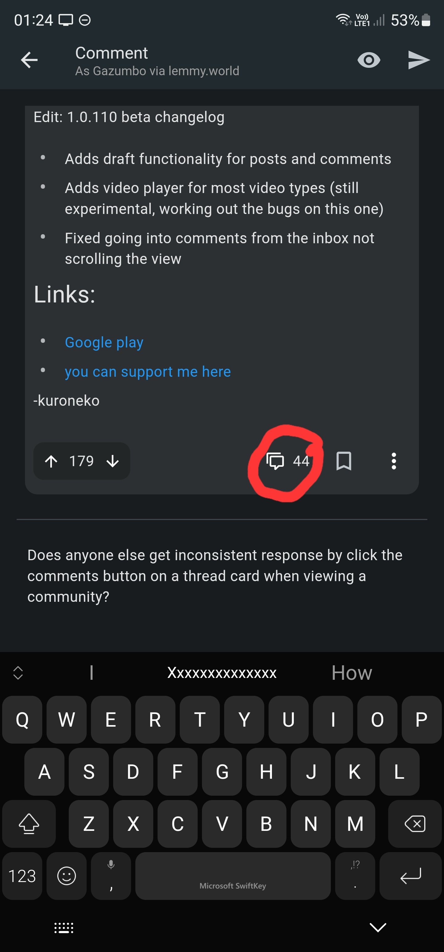
Does anyone else get inconsistent response by click the comments button on a thread card when viewing a community? I mean this one: this one

Sometimes it'll open the the thread and show me the comments. Other times it will open the reply box.

[–] [email protected] 1 points 1 year ago

Happens to me too. I'd just like to have an easy to press button to view the comments section.

[–] [email protected] 1 points 1 year ago (1 children)

I have the include instance tags in names enabled but I noticed if you have a display name set, your display name is shown rather than your actual username. For security reasons, I think with that option enabled, their actual username should be displayed before the @instance part. Maybe the display name could follow afterwards in brackets or something. You can change your display name to whatever you want and that could potentially be an identity issue.

[–] [email protected] 2 points 1 year ago

Yeah that's a good idea! I'll add that in the next release.

[–] [email protected] 1 points 1 year ago (1 children)

Any chance to have an option to disable the post hiding via long press? I have used that feature many times daily but 100% by accident.

[–] [email protected] 1 points 1 year ago (1 children)

Hi! Are you talking about long press on comments?

[–] [email protected] 1 points 1 year ago

Yes. I meant to say comments instead of posts.

load more comments
view more: next ›