this post was submitted on 18 Jul 2023
653 points (96.1% liked)

Voyager

5659 readers
66 users here now

The official lemmy community for Voyager, an open source, mobile-first client for lemmy.

Download on App Store

Download on Play Store

Use as a Web App

Download on F-Droid

Rules

  1. Be nice.
  2. lemmy.world instance policy

Sponsor development! 👇

Number of sponsors badge

💙

founded 1 year ago
MODERATORS
 

Voting has ended! Congrats to @[email protected] with option B. Thanks everyone for participating! :)


First off, thanks to everyone that participated in our icon contest last week!

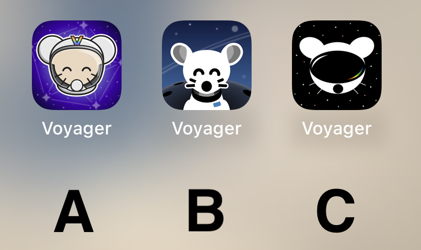
I'm excited to show the final three options for you to vote on below!

Overview

Option A

Option B

Option C

🗳️ Vote!

⚠️ BEFORE VOTING I encourage you to tap through the links above to see what it's like on your homescreen!

Results of the poll will not be available until it has ended, so no need to make a rushed decision.

~~VOTE HERE: https://strawpoll.com/BDyNEbKeqZR~~

Strawpoll privacy

~~Polling ends in ~24 hours! If there is a tie, I will cast the final vote.~~

top 50 comments
sorted by: hot top controversial new old
[–] [email protected] 179 points 1 year ago (5 children)
load more comments (5 replies)
[–] Ginjutsu 136 points 1 year ago* (last edited 1 year ago) (3 children)

I think B looks the nicest of the three by far. Good use of a monochromatic color scheme, nice balance between background and foreground elements, perfectly readable at a distance.

The design direction of A is a bit busy and stands out a little too much IMO, it looks kind of out of place next to stock iOS apps. C looks a bit too amateur, and has several tangents in it that really bother me - I do like the overall idea of it, but it could really use a rework.

[–] aeharding 16 points 1 year ago (1 children)

If one is chosen, I’ll give the author the opportunity to tweak :)

load more comments (1 replies)
[–] Humanbiscuit 16 points 1 year ago

I started with C, but then clicked the links to compare what hey all looked like on a Home Screen (yes, I eventually followed instructions .. look at me go). B is clearly the standout for me.

[–] [email protected] 70 points 1 year ago (1 children)

My vote is for B, but I think it would look good with a splash of the multicolor like the other two do.

[–] [email protected] 11 points 1 year ago (1 children)

I like the lack of multicolor for an icon. I also liked the ability to change icons in Apollo if I was feeling colorful during that period of my life.

load more comments (1 replies)
[–] 8bit 45 points 1 year ago* (last edited 11 months ago) (1 children)

I hate to say it but the options are a bit disappointing. I wish the top community upvoted submission was considered:

https://lemmy.world/comment/1114273

load more comments (1 replies)
[–] minishoemaze 41 points 1 year ago (3 children)

I like B personally, but the choices aren't adaptable icons on Android 🥲 if anyone knows a good way of forcing that on Nova launcher let me know

load more comments (3 replies)
[–] [email protected] 34 points 1 year ago* (last edited 1 year ago) (1 children)

Add me to the “unfortunately I don’t think any of them are great and can’t/won’t single out one to vote for, but truly appreciate all the effort that’s been put in” list

load more comments (1 replies)
[–] Thteven 33 points 1 year ago

I'm going with C. A is pretty cute too though.

[–] [email protected] 29 points 1 year ago (1 children)
[–] infotainment 11 points 1 year ago

I don't really get what's going on with C, it seems like it's the Lemmy logo wearing a VR headset.

[–] droidiac 28 points 1 year ago

The current one is way better than any of these. No offense to the designers they look great but I just don’t think they beat out what’s already there.

[–] orphiebaby 28 points 1 year ago* (last edited 1 year ago) (1 children)

I like B the most.

C isn't bad. Give it the smiling eyes in white and it'll probably be better.

A is too busy.

[–] [email protected] 14 points 1 year ago (2 children)
load more comments (2 replies)
[–] Z4rK 25 points 1 year ago* (last edited 1 year ago) (2 children)

My primary vote goes to D - The current icon. My secondary vote would go to C but much more colorful.

Edit: “VPN user voting is not allowed”. Really? We’re afraid someone will use VPN to brigade this icon vote?

load more comments (2 replies)
[–] [email protected] 24 points 1 year ago

I'm not voting because none of them look good, sorry :(

[–] OutdoorDining 22 points 1 year ago* (last edited 1 year ago)
[–] [email protected] 22 points 1 year ago* (last edited 1 year ago) (1 children)

The voting should’ve let us rank the icons instead of just choosing one (or at least choose multiple). That way, your second wish could count if the first one didn’t make it. Now, if the votes are split 1/3 each, you could end up with an icon that only 1/3 want, even if 2/3 preferred one of the other ones.

The winner-takes-it-all voting is a bad idea.

load more comments (1 replies)
[–] [email protected] 21 points 1 year ago

None, they are all markedly worse than the current icon.

[–] sknob 21 points 1 year ago (4 children)

Another vote for the current icon. These are all a lot worse.

load more comments (4 replies)
[–] [email protected] 21 points 1 year ago
[–] [email protected] 20 points 1 year ago (2 children)

Is there an option to keep the current icon?

load more comments (2 replies)
[–] [email protected] 17 points 1 year ago

B is a cutie 🥰

[–] ruud 16 points 1 year ago (1 children)

A, but I like the current icon better.

load more comments (1 replies)
[–] TwoGems 16 points 1 year ago* (last edited 1 year ago) (1 children)
load more comments (1 replies)
[–] [email protected] 15 points 1 year ago

B is really the best of the 3 and by a long margin.

[–] [email protected] 15 points 1 year ago

B is the best looking design.

[–] Vub 15 points 1 year ago

No offence to the creators of A and C but they both completely lack the right spacing, centering, decent line widths etc to suit an app icon. They both look broken.

So … B. By far.

But I almost like the current icon more because it is so colourful, it just needs a modified lemming.

[–] Xanadia 15 points 1 year ago

C, as it looks timeless

[–] jiji 15 points 1 year ago (1 children)

I know it’s not productive to say but I don’t like any of them more than the current rainbow one. 😢

load more comments (1 replies)
[–] [email protected] 14 points 1 year ago

I am new here so haven't seen the previous suggestions but all three here are not ideal. Actually far from it.

I'd suggest letting people donate for a pro to make a few suggestions instead

[–] ClarkDoom 14 points 1 year ago* (last edited 1 year ago)
[–] [email protected] 13 points 1 year ago

None. (⁠╯⁠°⁠□⁠°⁠)⁠╯⁠︵⁠ ⁠┻⁠━⁠┻

[–] Ghostalmedia 12 points 1 year ago

B.

Although I’m kinda bummed that only one of the community’s top three made it into the final around. 😔

[–] phoneymouse 11 points 1 year ago
[–] [email protected] 11 points 1 year ago
[–] robocall 11 points 1 year ago
[–] [email protected] 11 points 1 year ago
[–] [email protected] 11 points 1 year ago

B and it's not even close

[–] RIM74 11 points 1 year ago

I like the C option best for its simplicity

load more comments
view more: next ›