this post was submitted on 27 Mar 2024
49 points (93.0% liked)

Sync for Lemmy

15161 readers
5 users here now

๐Ÿ‘€


Welcome to Sync for Lemmy!

Download Sync for Lemmy


Welcome to the official Sync for Lemmy community.

The rules for posting and commenting, besides the rules defined here for lemmy.world, are as follows:

Community Rules


1- No advertising or spam.

All types of advertising and spam are restricted in this community.


Community Credits

Artwork and community banner by: @[email protected]


founded 1 year ago
MODERATORS
 

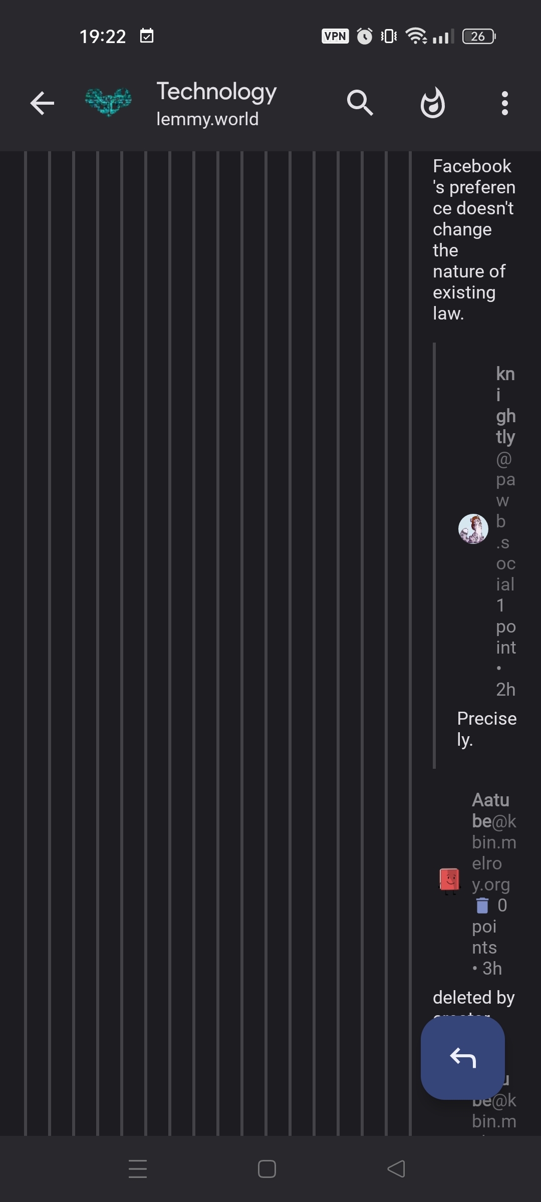
This old thing that sometimes happened in Sync for Reddit seems to happen again here, where comments are always indented even to the point of not rendering correctly because they reached the right border. If I'm remembering correctly, this was fixed by giving the user the option to "Load more comments" in the old app, which opened a new screen starting back at the left border. Can we get something like that again?

Post in question: https://pawb.social/comment/7430106

Device information

Sync version: v24.03.26-14:56    
Sync flavor: googlePlay    

View type: Slides    

Device: RMX3085L1    
Model: realme RMX3085    
Android: 13
you are viewing a single comment's thread
view the rest of the comments
[โ€“] [email protected] 2 points 8 months ago (3 children)

For me it's "Material (medium padding)", I'm guessing it's similar to yours since our screenshots look decidedly similar.

[โ€“] [email protected] 5 points 7 months ago (1 children)

sync classic all the way for me

[โ€“] scottywh 1 points 7 months ago

Same here and it definitely doesn't exhibit the described behavior.

[โ€“] [email protected] 4 points 8 months ago

Material minimum padding, I guess that's why.

[โ€“] [email protected] 2 points 8 months ago

Correct. I assume that's the default.