this post was submitted on 30 Jan 2024
57 points (86.1% liked)
pics
20079 readers
167 users here now
Rules:
1.. Please mark original photos with [OC] in the title if you're the photographer
2..Pictures containing a politician from any country or planet are prohibited, this is a community voted on rule.
3.. Image must be a photograph, no AI or digital art.
4.. No NSFW/Cosplay/Spam/Trolling images.
5.. Be civil. No racism or bigotry.
Photo of the Week Rule(s):
1.. On Fridays, the most upvoted original, marked [OC], photo posted between Friday and Thursday will be the next week's banner and featured photo.
2.. The weekly photos will be saved for an end of the year run off.
Instance-wide rules always apply. https://mastodon.world/about
founded 2 years ago
MODERATORS
you are viewing a single comment's thread
view the rest of the comments
view the rest of the comments


Absolutely not. You're kidding right?
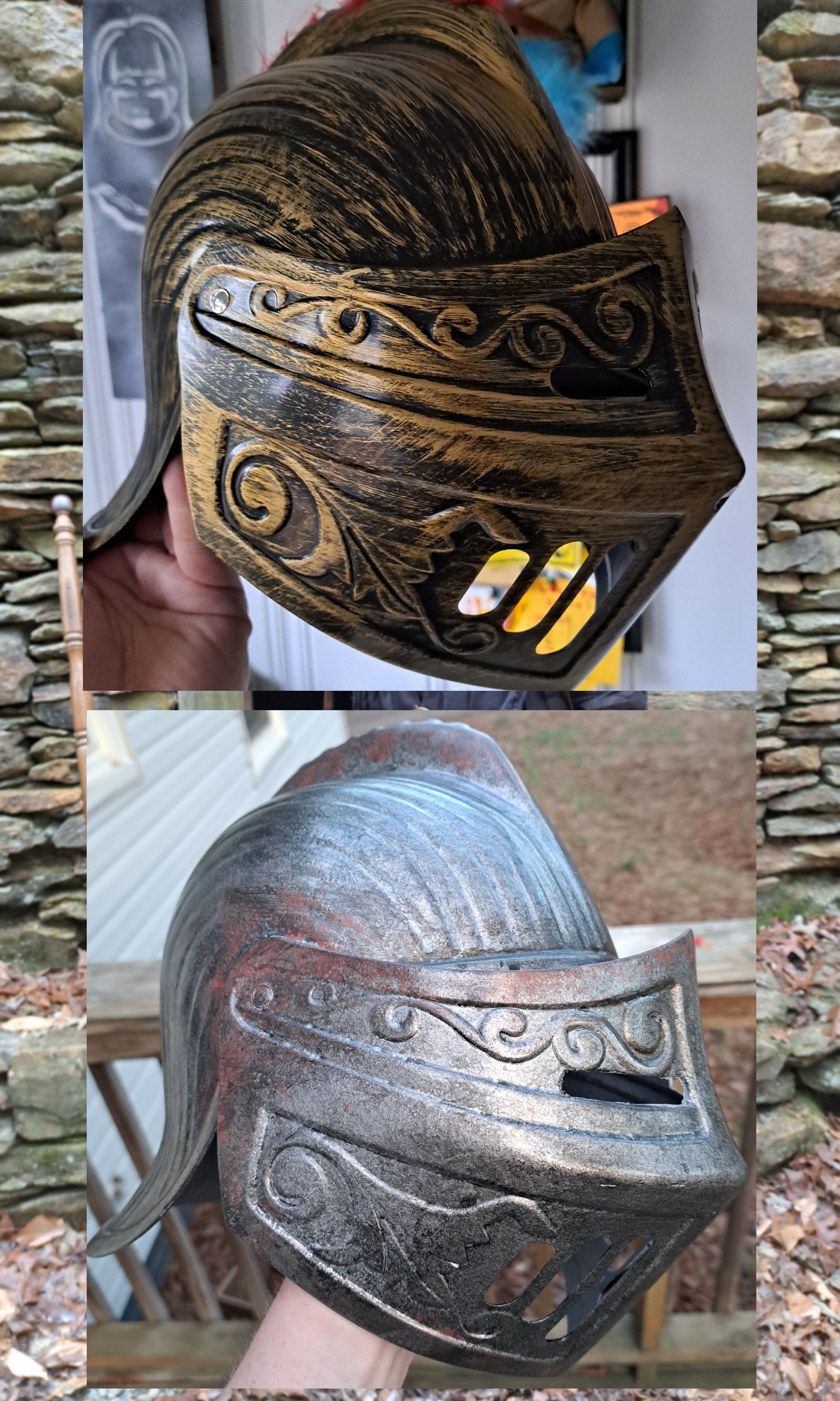
So you just hit it with silver spray paint then? Top one looks nice
I gave it a base coat of textured paint, used acrylics and different weathering techniques to give it more texture and depth. Added a rust effect as well. The rust color is a little off from how it normally looks.
Might just be the fact it's plastic.
Used the same techniques on this one as my other helmets and projects.
https://imgur.com/gallery/FgjXBOe
I like the grimdark aesthetic so that's normally what I go for.
You seem to be good at this, it has to be the plastic.
Yeah. Might need to add more "grime" to it.
These are plastic and they came out great.
Hmm
OH MY GOD YOU'RE THAT GUY 👏🏻👏🏻👏🏻
Yuppers. Sure am.
I disagree. Top looks tacky and costumey. I like the bottom more
I will agree it needs a touch more work tho. Needs a bit more "grime" and dirt. Darken up the low spots a bit more.
That’s what threw me off at first, the bottom is very nice. I think some grime and darkness in places, maybe even corrosion would give it some life. It looks too “new” you know? Almost like a 3d model. I think if you could make the raised portions more defined (with shadows via airbrushing, doesn’t need to be a physical change) it would make the helmet more defined. If you haven’t seen that one Mythbuster detail models, I highly recommend giving Adam Savage’s YouTube channel a watch!
That's actually where I learned some of my process as well as my friend who showed me how to do this.
Honestly looking at it in person it looks so much better than this image.
I am definitely going to darken the low spots to make the relief show up better.
That’s what threw me off at first, the bottom is very nice. I think some grime and darkness in places, maybe even corrosion would give it some life. It looks too “new” you know? Almost like a 3d model. I think if you could make the raised portions more defined (with shadows via airbrushing, doesn’t need to be a physical change) it would make the helmet more defined. If you haven’t seen that one Mythbuster detail models, I highly recommend giving Adam Savage’s YouTube channel a watch!
That’s what threw me off at first, the bottom is very nice. I think some grime and darkness in places, maybe even corrosion would give it some life. It looks too “new” you know? Almost like a 3d model. I think if you could make the raised portions more defined (with shadows via airbrushing, doesn’t need to be a physical change) it would make the helmet more defined. If you haven’t seen that one Mythbuster detail models, I highly recommend giving Adam Savage’s YouTube channel a watch!