this post was submitted on 20 Dec 2023
74 points (84.9% liked)
Map Enthusiasts
3596 readers
233 users here now
For the map enthused!
Rules:
-
post relevant content: interesting, informative, and/or pretty maps
-
be nice
founded 2 years ago
MODERATORS
you are viewing a single comment's thread
view the rest of the comments
view the rest of the comments


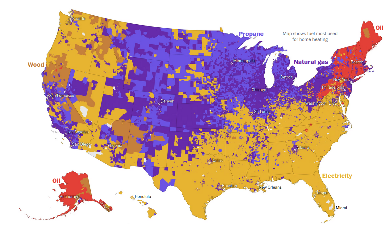
RIGHT? It's almost like it was designed to make you puzzle over it for longer than you should have to. The second image is easier to digest-- It's labeled properly, and you can sort of tell that areas would overlap.
First one could be redeemed with a little bit of information hierarchy, but it's pretty obtuse as-is.