Android
DROID DOES
Welcome to the droidymcdroidface-iest, Lemmyest (Lemmiest), test, bestest, phoniest, pluckiest, snarkiest, and spiciest Android community on Lemmy (Do not respond)! Here you can participate in amazing discussions and events relating to all things Android.
The rules for posting and commenting, besides the rules defined here for lemmy.world, are as follows:
Rules
1. All posts must be relevant to Android devices/operating system.
2. Posts cannot be illegal or NSFW material.
3. No spam, self promotion, or upvote farming. Sources engaging in these behavior will be added to the Blacklist.
4. Non-whitelisted bots will be banned.
5. Engage respectfully: Harassment, flamebaiting, bad faith engagement, or agenda posting will result in your posts being removed. Excessive violations will result in temporary or permanent ban, depending on severity.
6. Memes are not allowed to be posts, but are allowed in the comments.
7. Posts from clickbait sources are heavily discouraged. Please de-clickbait titles if it needs to be submitted.
8. Submission statements of any length composed of your own thoughts inside the post text field are mandatory for any microblog posts, and are optional but recommended for article/image/video posts.
Community Resources:
We are Android girls*,
In our Lemmy.world.
The back is plastic,
It's fantastic.
*Well, not just girls: people of all gender identities are welcomed here.
Our Partner Communities:
view the rest of the comments
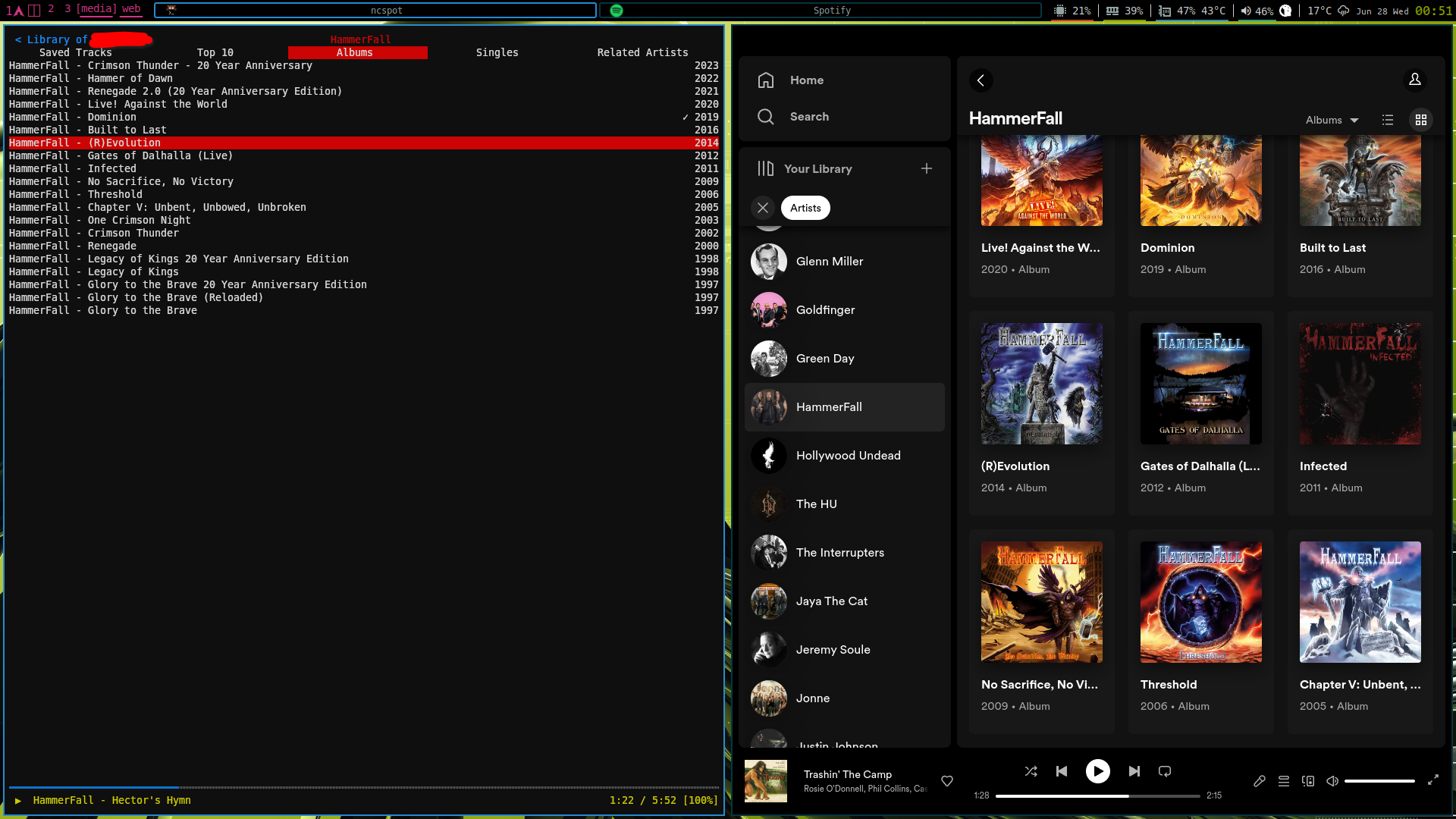
While you're here, I'm curious about your opinion on the latest Spotify client design. It feels like they want to bring the desktop design closer to the touch screen client (maybe to reduce the codebase not shared by the projects). Personally, having grown up with Winamp, I find it very uncomfortable how images are dominant in both list and grid views, and how much space is left (really wasted) around texts. I think it's just a very inefficient interface with way too much useless visual fluff.
spoiler
(the application on the left is a terminal-based client that really only needs a tiny corner on the screen)
Not who you’re replying to, but I don’t like the giant album art menus. Save that for a now playing screen that should still be able to be shrunk down.
My initial reaction was it sucks. It wasn’t great to begin with, but this felt like a major downgrade to me.